DSCI_531_viz-1
Lecture 1 Worksheet
In this worksheet, we’ll be exploring various plot types (i.e., geometric objects), only using the x and y aesthetics (and group).
We’ll be jumping straight into the ggplot() function, instead of the more limited qplot() function.
- To get started, load the
tidyverseandgapminderR packages.
suppressPackageStartupMessages(library(tidyverse))
library(gapminder)
Scatterplot
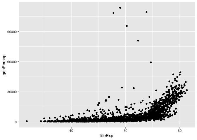
Let’s look at a scatterplot of gdpPercap vs. lifeExp.
- Fill out the grammar components below. Again, bold must be specified to make a
ggplot2plot.- We’ll ignore “coordinate system” and “facetting” after this.
| Grammar Component | Specification |
|---|---|
| data | gapminder |
| aesthetic mapping | x=lifeExp and y=gdpPercap |
| geometric object | point |
| scale | linear |
| statistical transform | none |
| coordinate system | rectangular/cartesian |
| facetting | none |
- Populate the data and aesthetic mapping in
ggplot. What is returned? What’s missing?
ggplot(data=gapminder, mapping=aes(x=lifeExp, y=gdpPercap)) +
    geom_point()
ggplot(gapminder, aes(lifeExp, gdpPercap)) +
    geom_point()

ggplot(gapminder) +
    geom_point(aes(x=lifeExp, y=gdpPercap))

3. Add the missing component as a layer.
Notice the “metaprogramming” again!
- You must remember to put the aesthetic mappings in the
aesfunction! What happens if you forget?
#ggplot(gapminder) +
#    geom_point(x = lifeExp, y = gdpPercap)
- Put the x-axis on a log scale, first by transforming the x variable.
- Note:
ggplot2does some data wrangling and computations itself! We don’t always have to modify the data frame.
- Note:
ggplot(gapminder, aes(lifeExp, gdpPercap)) +
    geom_point() +
    scale_y_log10()

ggplot(gapminder, aes(lifeExp, log(gdpPercap))) +
    geom_point()
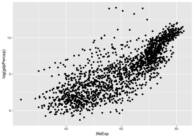
6. Try again, this time by changing the scale (this way is better).
7. The aesthetic mappings can be specified on the geom layer if you want, instead of the main ggplot call. Give it a try:
- Optional: git stage and commit
Uses of a scatterplot:
- Visualize 2-dimensional distributions; dependence.
- 2 numeric variables
Histograms, and Kernel Density Plots
Let’s build a histogram of life expectancy.
- Fill out the grammar components below. Again, bold must be specified to make a
ggplot2plot.
| Grammar Component | Specification |
|---|---|
| data | gapminder |
| aesthetic mapping | x=lifeExp, y=count (corrected from before) |
| geometric object | histogram |
| scale | x and y both linear |
| statistical transform | count |
- Build the histogram of life expectancy.
ggplot(gapminder, aes(lifeExp)) +
    geom_histogram(bins=50)
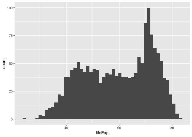
3. Change the number of bins to 50.
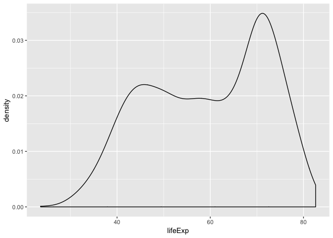
- Instead of a histogram, let’s create a kernel density plot.
ggplot(gapminder, aes(lifeExp)) +
    geom_density()
- Optional: git stage and commit
Uses of a histogram: Explore the distribution of a single numeric variable.
Box plots, and violin plots
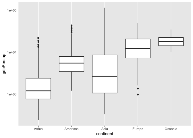
Let’s make box plots of population for each continent. Note: y-axis is much better on a log scale!
- Fill out the grammar components below. Again, bold must be specified to make a
ggplot2plot.
| Grammar Component | Specification |
|---|---|
| data | gapminder |
| aesthetic mapping | x=continent, y=gdpPercap |
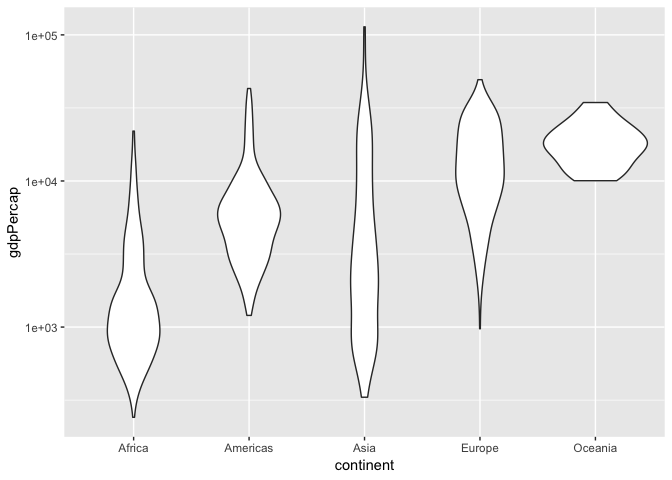
| geometric object | boxplot OR violin |
| scale | log-y; x is linear |
| statistical transform | boxplot: 5 number summary; violinplot: density estimate |
- Initiate the
ggplotcall, with the log y scale, and store it in the variablea. Print outa.
a <- ggplot(gapminder, aes(continent, gdpPercap)) +
    scale_y_log10()
- Add the boxplot geom to
a.
a + geom_boxplot()
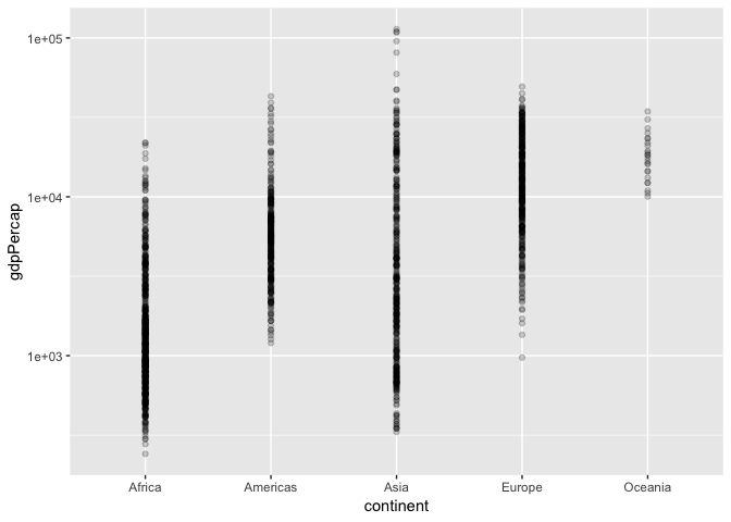
a + geom_point(alpha=0.2)
- A violin plot is a kernel density on its side, made symmetric. Add that geom to
a.- What’s better here, boxplots or violin plots? Why?
a + geom_violin()
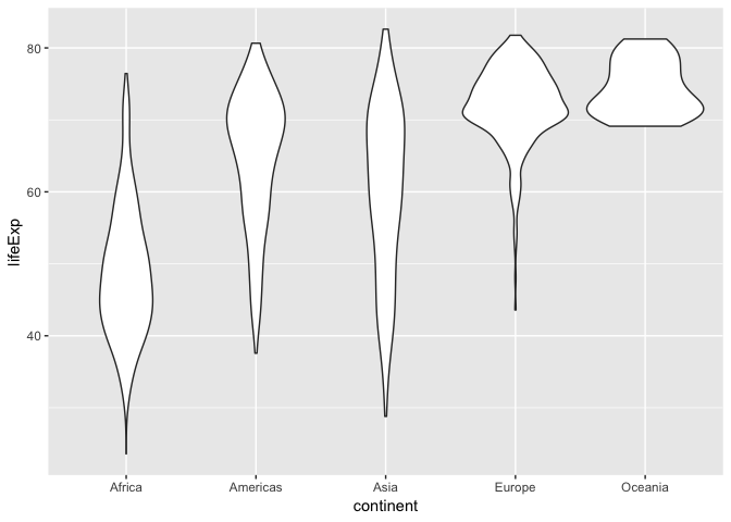
ggplot(gapminder, aes(continent, lifeExp)) +
    geom_violin()
- Optional: git stage and commit
Use of boxplot: Visualize 1-dimensional distributions (of a single numeric variable).
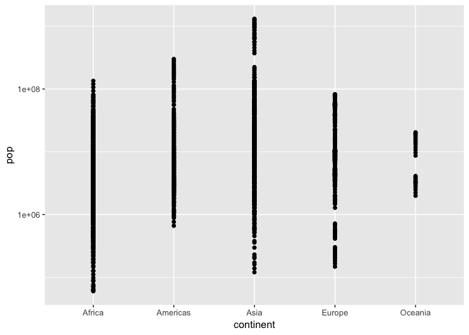
Jitter plots
Let’s work up to the concept of a jitter plot. As above, let’s explore the population for each continent, but using points (again, with the y-axis on a log scale).
Let’s hold off on identifying the grammar.
- Initiate the
ggplotcall to make a scatterplot ofcontinentvspop; initiate the log y scale. Store the call in the variableb.
b <- ggplot(gapminder, aes(continent, pop)) +
    scale_y_log10()
- Add the point geom to
b. Why is this an ineffective plot?
b + geom_point()
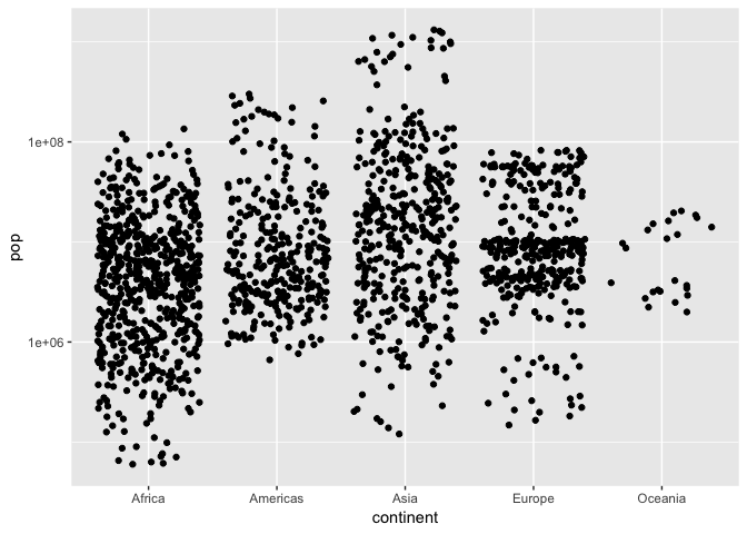
- A solution is to jitter the points. Add the jitter geom. Re-run the command a few times – does the plot change? Why?
b + geom_jitter()
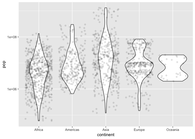
b + geom_violin() + geom_jitter(alpha=0.1)
- How does the grammar differ from a box plot or violin plot?
- ANSWER:
-
We can add multiple geom layers to our plot. Put a jitterplot overtop of the violin plot, starting with our base
b. Try vice-versa. - Optional: git stage and commit
Uses of jitterplot: Visualize 1-dimensional distributions, AND get a sense of the sample size.