DSCI_531_viz-1
Lecture 3 Worksheet
library(tidyverse)
## ── Attaching packages ───────────────────────────────────────────────────────────────────────────────────── tidyverse 1.2.1 ──

## ✔ ggplot2 3.0.0     ✔ purrr   0.2.5
## ✔ tibble  1.4.2     ✔ dplyr   0.7.6
## ✔ tidyr   0.8.1     ✔ stringr 1.3.1
## ✔ readr   1.1.1     ✔ forcats 0.3.0

## ── Conflicts ──────────────────────────────────────────────────────────────────────────────────────── tidyverse_conflicts() ──
## ✖ dplyr::filter() masks stats::filter()
## ✖ dplyr::lag()    masks stats::lag()
library(gapminder)
library(RColorBrewer)
library(scales)
##
## Attaching package: 'scales'

## The following object is masked from 'package:purrr':
##
##     discard

## The following object is masked from 'package:readr':
##
##     col_factor
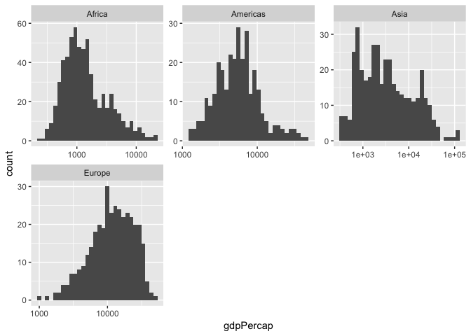
Facetting
Make histograms of gdpPercap for each (non-Oceania) continent by adding a line to the following code.
- Try facetting by
qualLifeExp. - Try the
scalesandncolarguments of the facet layer.
gapminder %>%
    filter(continent != "Oceania") %>%
    mutate(qualLifeExp = if_else(lifeExp > 60, "high", "low")) %>%
    ggplot(aes(x=gdpPercap)) +
    geom_histogram() +
    scale_x_log10() +
    facet_wrap(~ continent, scales = "free", ncol = 3)
## `stat_bin()` using `bins = 30`. Pick better value with `binwidth`.
| Grammar Component | Specification |
|---|---|
| data | gapminder |
| statistical transform | histogram (binning and counting) |
| aesthetic mapping | x=gdpPercap; y=count |
| geometric object | histogram |
| scale | x is log10; y is linear. |
| coordinate system | Rectangular/Cartesian |
| facetting | continent |
Theming
Question: What makes a plot “publication quality”?
Changing the look of a graphic can be achieved through the theme() layer.
There are “complete themes” that come with ggplot2, my favourite being theme_bw (I’ve grown tired of the default gray background, so theme_bw is refreshing).
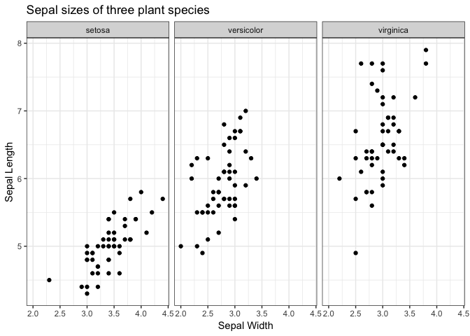
- Change the theme of the following plot to
theme_bw():
ggplot(iris, aes(Sepal.Width, Sepal.Length)) +
     facet_wrap(~ Species) +
     geom_point() +
     labs(x = "Sepal Width",
          y = "Sepal Length",
          title = "Sepal sizes of three plant species") +
    theme_bw()
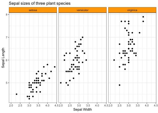
- Then, change font size of axis labels, and the strip background colour. Others?
ggplot(iris, aes(Sepal.Width, Sepal.Length)) +
     facet_wrap(~ Species) +
     geom_point() +
     labs(x = "Sepal Width",
          y = "Sepal Length",
          title = "Sepal sizes of three plant species") +
    theme_bw() +
    theme(strip.background = element_rect(fill="orange"))
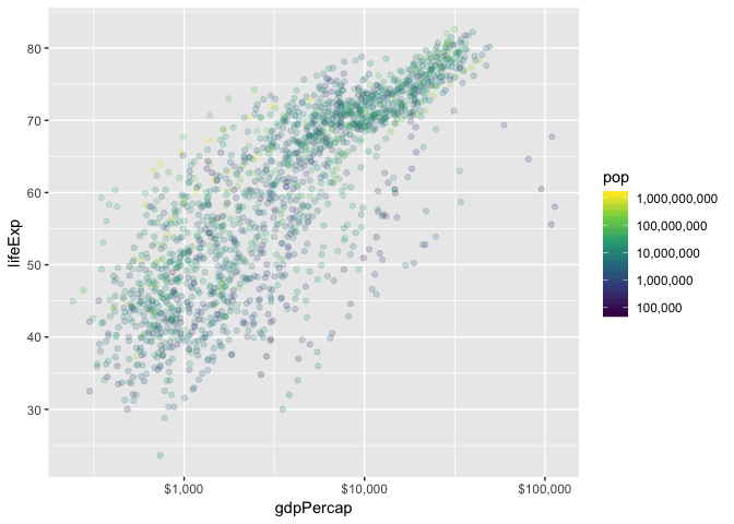
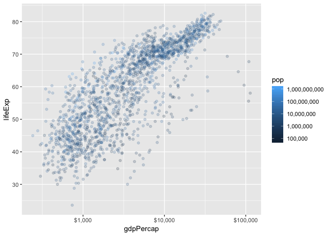
Scales; Colour
Scale functions in ggplot2 take the form scale_[aesthetic]_[mapping]().
Let’s first focus on the following plot:
p_scales <- ggplot(gapminder, aes(gdpPercap, lifeExp)) +
     geom_point(aes(colour=pop), alpha=0.2)
p_scales +
    scale_x_log10() +
    scale_colour_continuous(trans="log10")

- Change the y-axis tick mark spacing to 10; change the colour spacing to include all powers of 10.
# p_scales +
#     scale_x_log10() +
#     scale_colour_continuous(
#         trans  = "log10",
#         breaks = FILL_IN_BREAKS
#     ) +
#     FILL_IN_SCALE_FUNCTION(breaks=FILL_IN_BREAKS)
- Specify
scales::*_formatin thelabelsargument of a scale function to do the following:- Change the x-axis labels to dollar format (use
scales::dollar_format()) - Change the colour labels to comma format (use
scales::comma_format())
- Change the x-axis labels to dollar format (use
p_scales +
    scale_x_log10(labels=dollar_format()) +
    scale_colour_continuous(
        trans  = "log10",
        breaks = 10^(1:10),
        labels = comma_format()
    ) +
    scale_y_continuous(breaks=10*(1:10))
- Use
RColorBrewerto change the colour scheme.- Notice the three different types of scales: sequential, diverging, and continuous.
## All palettes the come with RColorBrewer:
# RColorBrewer::display.brewer.all()
# p_scales +
#     scale_x_log10(labels=dollar_format()) +
#     FILL_IN_WITH_RCOLORBREWER(
#         trans   = "log10",
#         breaks  = 10^(1:10),
#         labels  = comma_format(),
#         palette = FILL_THIS_IN
#     ) +
#     scale_y_continuous(breaks=10*(1:10))
- Run the following code to check out the
viridisscale for a colour-blind friendly scheme.- Hint: add
scale_colour_viridis_c(cstands for continuous;ddiscrete). - You can choose a palette with
option.
- Hint: add
p_scales +
    scale_x_log10(labels=dollar_format()) +
    scale_colour_viridis_c(
        trans   = "log10",
        breaks  = 10^(1:10),
        labels  = comma_format()
    ) +
    scale_y_continuous(breaks=10*(1:10))