How Can We Visualize Data?
There are two types of visualization approaches
When learning about data visualization, it is helpful to distinguish between the following two approaches to visualization:
- Imperative
- Declarative
Imperative (low level) plotting focuses on plot mechanics
- Focus on plot construction details.
- Often includes loops, low-level drawing commands, etc.
- Specify how something should be done
- “Draw a red point for every observation that has value X in column A, a blue point for every observation that has value Y in column A, etc.”
- Minute control over plotting details, but laborious for complex visualization.
The data we will be plotting
| Country | Area | Population |
|---|---|---|
| Russia | 17098246 | 144386830 |
| Canada | 9984670 | 38008005 |
| China | 9596961 | 1400050000 |
Example of imperative plotting
# Pseudocode
colors = ['blue', 'red', 'yellow']
plot = create_plot()
for row_number, row_data in enumerate(dataframe):
plot.add_point(x=row_data['Area'], y=row_data['Population'], color=colors[row_number])Declarative (high level) plotting focuses on the data
- Focus on data and relationships.
- Often includes linking columns to visual channels.
- Specify what should be done
- “Assign colors based on the values in column A”
- Smart defaults give us what we want without complete control over minor plotting details.
Example of declarative plotting
A high-level grammar of graphics helps us compose plots effectively
- Simple grammatical components combine to create visualizations.
- Visualization grammars often consist of three main components:
- Create a chart linked to a dataframe.
- Add graphical elements (such as points, lines, etc).
- Encode dataframe columns as visual channels (such as x, etc).
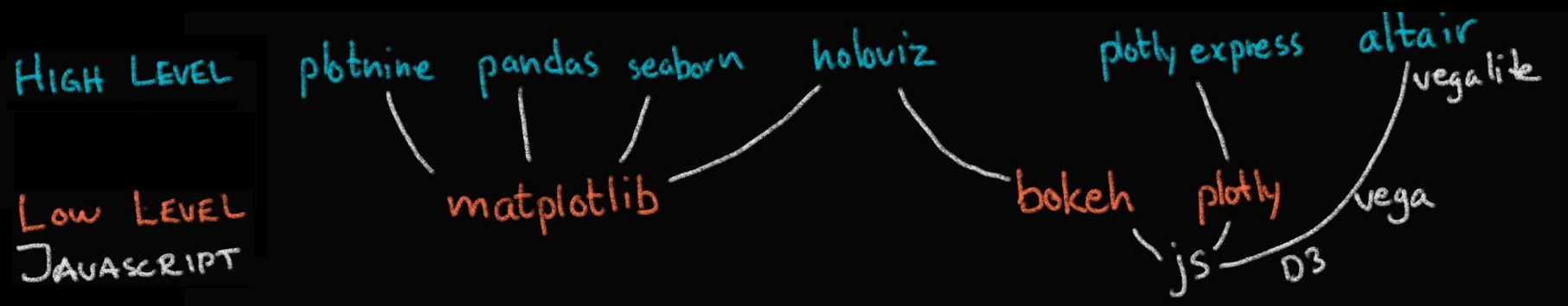
The Python plotting landscape
Sample data can be found in Altair’s companion package vega_datasets
| Name | Miles_per_Gallon | Cylinders | Displacement | ... | Weight_in_lbs | Acceleration | Year | Origin | |
|---|---|---|---|---|---|---|---|---|---|
| 0 | chevrolet chevelle malibu | 18.0 | 8 | 307.0 | ... | 3504 | 12.0 | 1970-01-01 | USA |
| 1 | buick skylark 320 | 15.0 | 8 | 350.0 | ... | 3693 | 11.5 | 1970-01-01 | USA |
| 2 | plymouth satellite | 18.0 | 8 | 318.0 | ... | 3436 | 11.0 | 1970-01-01 | USA |
| ... | ... | ... | ... | ... | ... | ... | ... | ... | ... |
| 403 | dodge rampage | 32.0 | 4 | 135.0 | ... | 2295 | 11.6 | 1982-01-01 | USA |
| 404 | ford ranger | 28.0 | 4 | 120.0 | ... | 2625 | 18.6 | 1982-01-01 | USA |
| 405 | chevy s-10 | 31.0 | 4 | 119.0 | ... | 2720 | 19.4 | 1982-01-01 | USA |
406 rows × 9 columns