cereal
77 rows × 16 columns
import altair as alt
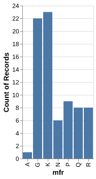
chart0 = alt.Chart(cereal).mark_bar().encode(
    x='mfr',
    y='count()'
)
chart0
alt.chart(...)...
alt.chart(cereal)
alt.chart(cereal).mark_bar()...
alt.chart(cereal).mark_bar().encode(
  x='mfr',
  y='count()')
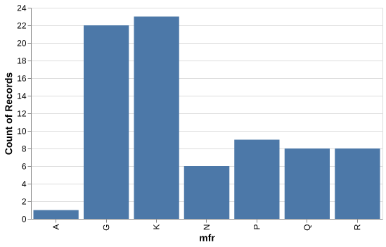
chart1 = alt.Chart(cereal, width=500, height=300).mark_bar().encode(
    x='mfr',
    y='count()'
)
chart1
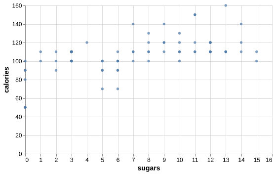
chart2 = alt.Chart(cereal, width=500, height=300).mark_circle().encode(
    x='sugars',
    y='calories'
)
chart2
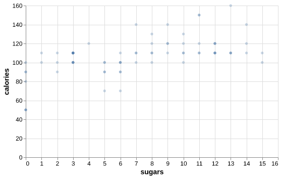
chart3 = alt.Chart(cereal, width=500, height=300).mark_circle(opacity=0.3).encode(
    x='sugars',
    y='calories'
)
chart3
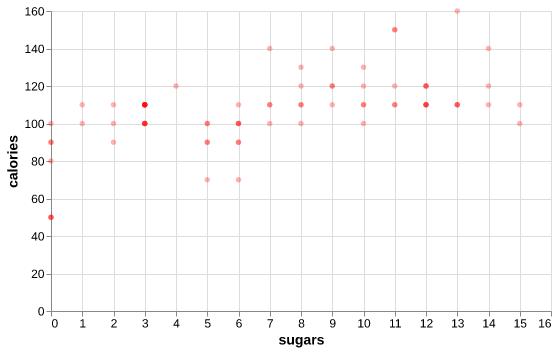
chart4 = alt.Chart(cereal, width=500, height=300).mark_circle(color='red', opacity=0.3).encode(
    x='sugars',
    y='calories'
)
chart4
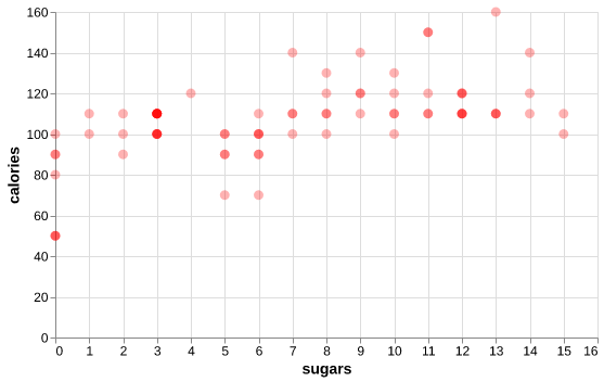
chart5 = alt.Chart(cereal, width=500, height=300).mark_circle(color='red', size=80, opacity=0.3).encode(
    x='sugars',
    y='calories'
)
chart5
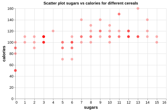
chart6 = alt.Chart(cereal, width=500, height=300).mark_circle(color='red', size=80, opacity=0.3).encode(
    x='sugars',
    y='calories'
).properties(title="Scatter plot sugars vs calories for different cereals")
chart6