cereal = pd.read_csv('data/cereal.csv')More plotting tricks using Altair
import altair as alt

chart0 = alt.Chart(cereal, width=500, height=300).mark_circle().encode(
    x='mfr',
    y='calories'
).properties(title="Scatter plot of manufacturer calorie content")

chart0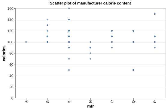
chart1 = alt.Chart(cereal_modified, width=500, height=300).mark_circle().encode(
                   x='mfr',
                   y='calories'
         ).properties(title="Scatter plot of manufacturer calorie content")

chart1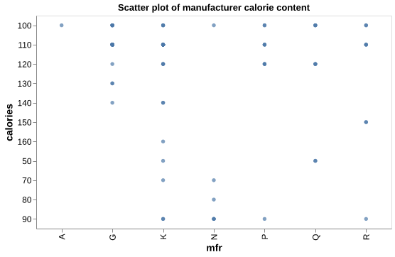
chart2 = alt.Chart(cereal_modified, width=500, height=300).mark_circle().encode(
                   x='mfr:N',
                   y='calories:Q'
                  ).properties(title="Scatter plot of manufacturer calorie content")

chart2
chart3 = alt.Chart(cereal, width=500, height=300).mark_circle().encode(
                   x='sugars:Q',  # set the sugars column as quantitative
                   y='rating:Q'   # set the rating column as quantitative
         ).properties(title="Scatter plot of cereal rating vs sugar content")

chart3
Variable types
chart4 = alt.Chart(cereal, width=500, height=300).mark_circle().encode(
                   x=alt.X('sugars:Q'), # use alt.X() to map the x-axis
                   y=alt.Y('rating:Q')  # use alt.Y() to map the y-axis
         ).properties(title="Scatter plot of cereal rating vs sugar content")

chart4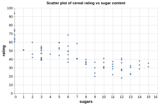
Histograms
chart5 = alt.Chart(cereal, width=500, height=300).mark_bar().encode(
                   x=alt.X('calories:Q', bin=True), # set x-axis as calories
                   y=alt.Y('count():Q')             # set the y-axis as the occurrence count for each calorie value
         ).properties(title="Histogram plot of cereal calorie content")
chart5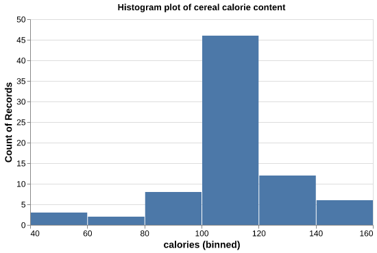
Bins
chart6 = alt.Chart(cereal, width=500, height=300).mark_bar().encode(
                   x=alt.X('calories:Q', bin=alt.Bin(maxbins=20)), # set max number of bins to 20
                   y=alt.Y('count():Q')
         ).properties(title="Histogram of cereal calorie content with bins = 20")
chart6
chart7 = alt.Chart(cereal, width=500, height=300).mark_bar().encode(
                   x=alt.X('calories:Q', bin=alt.Bin(maxbins=20), title="Calorie Content"), # use alt.X() to label the x-axis
                   y=alt.Y('count():Q', title="Number of Cereals")                          # use alt.Y() to label the y-axis
        ).properties(title="Histogram plot of cereal calorie content")
chart7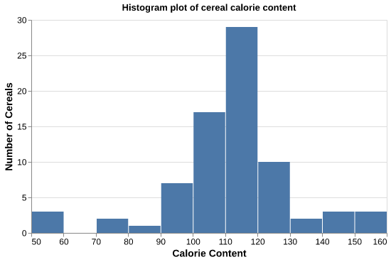
chart8 = alt.Chart(mfr_mean, width=500, height=300).mark_bar().encode(
                   x=alt.X('mfr:N', title="Manufacturer"),
                   y=alt.Y('sugars:Q', title="Mean sugar content")
         ).properties(title="Bar plot of manufacturers mean sugar content")
chart8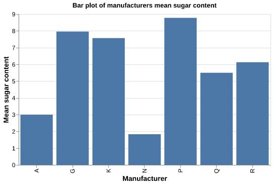
Sorting
chart9 = alt.Chart(mfr_mean, width=500, height=300).mark_bar().encode(
                   x=alt.X('mfr:N', sort="y", title="Manufacturer"),  # use sort="y" to sort in ascending order
                   y=alt.Y('sugars:Q', title="Mean sugar content")
        ).properties(title="Bar plot of manufacturers mean sugar content in ascending order")
chart9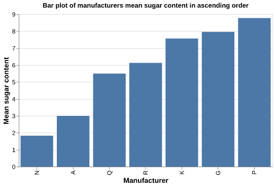
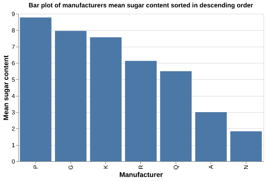
chart10 = alt.Chart(mfr_mean, width=500, height=300).mark_bar().encode(
    x=alt.X('mfr:N', sort="-y", title="Manufacturer"),  # use sort="-y" to sort in descending order
    y=alt.Y('sugars:Q', title="Mean sugar content")
).properties(title="Bar plot of manufacturers mean sugar content sorted in descending order")
chart10