Warning signs and tools to stop the spread of misinformation.
Have you ever seen an over-enthusiastic advertisement and wondered how much of it was true? If so, you’re already one step ahead of 67% of people! Okay… that was completely made up. But hopefully, you can see how easy it can be to trust numbers as facts, especially when they are embedded in nice compliments. With a world of information right at our fingertips, it has become increasingly difficult to decipher what’s true, what’s false, and what’s true with a little twist.
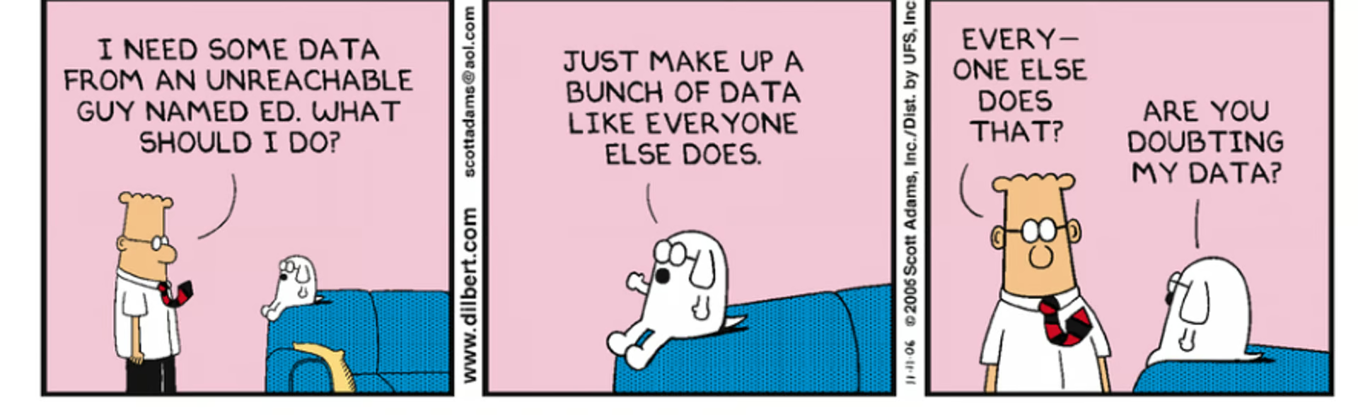
A classic example of misleading information was an advertisement for Colgate toothpaste that claimed that “more than 80% of dentists recommend Colgate”. Anyone who reads this would likely believe that 80% of dentists recommended Colgate as the best option over other toothpaste brands. However, dentists taking the survey were allowed to select more than one option [1]. With this extra piece of information about how the data was collected, we can understand more of the truth behind this statistic. We can say that 80% of dentists recommend Colgate as one of the best toothpaste brands, but not as THE best toothpaste brand. There is quite a big difference between those two interpretations.
It can be a bit disconcerting once you realize how easy it is to spread misinformation with a sleight of words. As a young, naive undergraduate student in neuroscience, I was drilled by my professors to think critically about the information presented to me and assess whether it was accurate, reliable, and logically sound, especially when the information was presented in the name of “science.” I started to notice the many ways it was possible to manipulate data and information at any step of the scientific process to get desirable results, and with that realization came a daunting sense of responsibility.
Now, as a data scientist in training, I have come to appreciate the level of awareness I have acquired about the process of gathering, analyzing and representing data, and the many ways misleading information could arise from each step. Luckily, data scientists are some of the most capable professionals of noticing the signs that information might be straying from the truth, and thus, are greatly responsible for informing others of these false notions and upholding transparent, ethical practices in their work.
As told by Spiderman’s wisest uncle Ben, “With great power comes great responsibility.” It may sound dramatic to suggest data scientists have that much power. However, data science projects have a wide range of applications, including retail and marketing, city planning and transportation, as well as medical diagnosis and healthcare procedures. Many of these projects lead to high-impact products and insights that can affect various stakeholders, giving data scientists the power to change the world, one code chunk at a time. As data science expands and deepens its reach into a world filled with so much misinformation, it is becoming increasingly important for data scientists and their colleagues to hold each other accountable and uphold ethical practices that promote transparency and fairness.
In this blog, we will be discussing some of the most prominent ways that biases and misleading statistics can arise in the field of data science, both intentional and accidental, as well as highlighting some tools and practices to mitigate the spread of misinformation. To discuss the many ways misleading statistics can arise, we will break down the data science process into 4 main stages:
- Data collection: gathering the raw data.
- Data processing: cleaning and preparing the data for analysis.
- Data modelling and/or analysis: using machine learning and statistical analysis to draw insights from the data.
- Data visualization: presenting and communicating insights with visuals and words.
Data Collection
Improper data collection methods could result in misleading results in a number of ways known as selection bias [2]. The first is coverage bias when the data is not collected from the population or group it is meant to represent. For example, imagine if a research study wanted to explore how caffeine consumption affects sleep quality in first-year undergraduate students, but they collect their data through a survey sent out through the university newsletter. Anyone who sees the survey could fill it out, including higher-year undergraduates, graduate students, alumni, and faculty members. The data gathered by the survey will do a poor job of representing the first-year student body, so any insights gathered from analyzing that data would be extremely inaccurate and misleading!
The other extreme would be if the data is not collected randomly, which can lead to sampling bias and result in inaccurate conclusions about the group of interest [2]. In the case of our caffeine study, imagine if the survey was sent out only to first-year students in the Faculty of Science. Any insights gathered from this data would be biased toward science students and cannot be generalized to first-year students in other faculties.
This leads us to our first tool: Define your group of interest as clearly and specifically as possible. When you have a detailed definition of what your group of interest is (and is not), you can set out the proper constraints for how the data will be collected to ensure that the data is sampled randomly from within the defined population.
This step in the data collection process is within our control and can be done responsibly. However, there can be other sources of bias in our data due to factors out of our control, such as participation bias, where certain groups of people are less likely to participate in the data collection method such that their input is not represented in the data set, resulting in conclusions that are biased towards the groups of people who participate more [2]. This is analogous to the caffeine researchers sending out their survey to a random sample of first-year students of all backgrounds, but most of the respondents turn out to be psychology students. This is potentially how demographic biases could arise in data science projects, which can lead to products and conclusions that may unintentionally propagate discrimination based on gender, race, socioeconomic status and other social factors.
Although it may be difficult to eliminate participation bias, some methods can be implemented to offset the imbalanced data and produce more accurate results. One method is to add weights to the data to balance out the differences in response rates among different groups. Another method, known as hot-deck imputation, involves filling in more values for low-response groups based on data points collected from “similar” respondents [3]. Although this method has its limitations, one being that the variability within low-response groups will not be captured by the data, it can help mitigate the effect of participation bias.
Data Processing
Cleaning data may be everyone’s least favourite part of their analysis, but it is a vital step in the process for good reason. Raw data often contains errors and inconsistencies such as missing values, outliers, or duplicate data points. These “messy” factors can taint the analysis and lead to inaccurate conclusions being drawn from the data. It is crucial to the analysis to identify these errors and replace or delete them accordingly.
The tricky part here is that there is no one-size-fits-all procedure for cleaning data, and the best method is largely dependent on the data and the problem at hand. Unfortunately, this room for discretion may open doors to use the data cleaning step as a chance to manipulate the outcome, for example, by cherry-picking data points that are more likely to support a desired outcome, or selectively ignoring outliers that don’t support certain conclusions. This is severely problematic since conclusions drawn from data manipulated in such a way are not only falsely claimed, but are likely to be over-exaggerations of the truth, which can mislead and disproportionately influence decisions made by stakeholders.
The biggest red flag to look out for regarding data processing is a lack of transparency and reproducibility of how the data was cleaned. The data cleaning step is often uninteresting and rarely discussed in detail. However, it should be documented thoroughly enough that others can understand where, how, and why the data was cleaned up the way it was, as well as be able to replicate the same process and get the same results. Allowing transparency in this step allows others to critique data cleaning methods to ensure that best practices are used and to suggest improvements where necessary.
Data Modelling
Now, this is everyone’s favourite part! Data modelling is the stage where we build machine learning (ML) algorithms that model the relationships in the data we are trying to understand and draw insights from. One of the most fundamental rules of ML is to never train the algorithm using the data used to test the model’s performance. Breaking this rule will result in an over-enthusiastic score of the model’s performance, tragically misguiding people to rely on the predictions of a model that does not perform as well as it’s claimed to. This is another stage where transparency and reproducibility are crucial in allowing others to ensure that proper techniques are used and that conclusions made using the model are not misleading.
These algorithms are used to make decisions about everything, from helping banks predict fraudulent transactions to guiding policymakers in public health. As these algorithms are increasingly used in ways that impact people’s lives, there has been higher concern regarding the risks of unintentional biases in models, which can result in certain groups of stakeholders being affected unfairly [4]. Contrary to popular belief, ML algorithms are not completely objective. The model’s predictions are susceptible to the same biases that might be found in the data used to train it, such as those discussed in the data collection stage, or the biases held by the people curating the training data. A popular saying in ML is “garbage in, garbage out,” meaning that the accuracy and performance of the model are dependent on the quality of the data used to train it.
So, once the data has been collected and processed according to best practices, how do we identify and deal with outstanding biases in our ML model? The Center for Data Science and Public Policy at the University of Chicago developed an open-source bias audit toolkit, called Aequitas, which you can learn about in more detail here. Aequitas is composed of tools to assess bias and fairness metrics in predictive ML models, allowing the user to make more informed decisions about the impact of their model before developing it further and deploying it into real-world applications. These tools may not necessarily “fix” the model to become unbiased. However, they certainly bring the model a step closer to fairness by providing an assessment of the disparities in the training data and guidance to the user in finding the appropriate remedy.
Data Visualization
Finally, visualizing and communicating the results of an analysis is arguably the most important stage in stopping the spread of misinformation. The insights and conclusions drawn from the analysis are typically presented in plots to portray a certain relationship or trend. These visualizations can be intentionally or accidentally designed to mislead the audience. For example, consider the plots below showing the change in interest rates over the years. Although the data presented is accurate in both plots, the scale of the y-axis drastically changes the interpretation of the trend in interest rates.
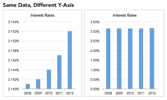
This leads us to our final warning sign when looking out for misleading information: pay attention to the axes and axis labels of any visualization. They should have a context-appropriate scale and a clear, interpretable label. Unlabelled or hidden axes may suggest that the author does not want to reveal the true nature of the results.
Other Tools
There is only so much we can do to ensure the conclusions of our analysis are reliable and correct. The overarching theme of the tools we have discussed so far is to conduct our analysis while aiming for transparency, fairness, and reproducibility. Two more tools to prevent the spread of misleading information are 1) discussing the limitations of the analysis and 2) putting the project under peer review before proclaiming any new insights or deploying algorithms into the world. Every development will have some limitations that should be communicated honestly and clearly to ensure stakeholders are fully informed on the outcome of the analysis. Additionally, undergoing thorough peer review is essential for catching issues and biases that were overlooked by the project contributors. Having a diverse set of collaborators and reviewers can bring in different perspectives to help mitigate empty gaps of knowledge in the project that could lead to the spread of misinformation.
Conclusion
We have covered some of the most prominent ways that misinformation can arise from any stage of a data science project, and yet, there are still many other sources of bias and misleading statistics that we have not discussed here. Hopefully, you now have a better idea of how misinformation could arise and have become more equipped to critically assess and evaluate the reliability of information presented to you.
Thank you for reading.
Authors:
Marian Agyby is a 2023 Master of Data Science graduate and Process Improvement Analyst based in Alberta.
Sources:
- https://www.datapine.com/blog/misleading-statistics-and-data/
- https://towardsdatascience.com/types-of-biases-in-data-cafc4f2634fb
- https://www.ncbi.nlm.nih.gov/pmc/articles/PMC3130338/
- http://www.datasciencepublicpolicy.org/our-work/tools-guides/aequitas/