7. Confidence intervals, figure layouts, and interactivity#
Lecture learning goals
By the end of the lecture you will be able to:
Create and understand how to interpret confidence intervals and confidence bands.
Layout plots in panels of a figure grid.
Create selections within a plot in Altair
Link selections between plots to highlight and select data.
Required activities
After class:
Review the lecture notes.
This 30 min video on confidence intervals and figure layouts (it starts a bit abruptly).
Section 16 on visualizing uncertainty (some of this will be repetition from 552).
Lecture slides
7.1. Confidence intervals#
7.1.1. Py#
To show the confidence interval of the points as a band,
we can use mark_errorband.
By default this mark show the standard deviation of the points,
but we can change the extent to use bootstrapping on the sample data
to construct the 95% confidence interval of the mean.
import altair as alt
import pandas as pd
from vega_datasets import data

# Simplify working with large datasets in Altair
alt.data_transformers.enable('vegafusion')

# Load the R cell magic
%load_ext rpy2.ipython
Error importing in API mode: ImportError("dlopen(/Users/andytai/miniforge3/envs/531/lib/python3.11/site-packages/_rinterface_cffi_api.abi3.so, 0x0002): Library not loaded: /Library/Frameworks/R.framework/Versions/4.5-arm64/Resources/lib/libRblas.dylib\n Referenced from: <20FB70DB-7E84-3375-A520-E0350E06C060> /Users/andytai/miniforge3/envs/531/lib/python3.11/site-packages/_rinterface_cffi_api.abi3.so\n Reason: tried: '/Library/Frameworks/R.framework/Versions/4.5-arm64/Resources/lib/libRblas.dylib' (no such file), '/System/Volumes/Preboot/Cryptexes/OS/Library/Frameworks/R.framework/Versions/4.5-arm64/Resources/lib/libRblas.dylib' (no such file), '/Library/Frameworks/R.framework/Versions/4.5-arm64/Resources/lib/libRblas.dylib' (no such file)")
Trying to import in ABI mode.
cars = data.cars()
points = alt.Chart(cars).mark_point(opacity=0.3).encode(
alt.X('Year'),
alt.Y('Horsepower'),
alt.Color('Origin')
)
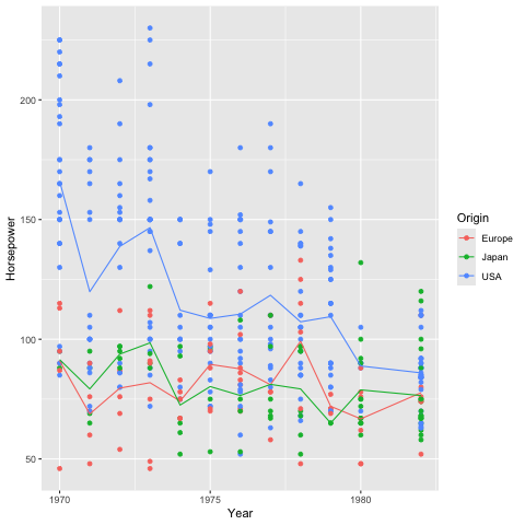
points
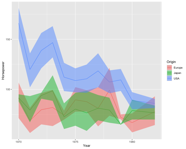
points.mark_errorband(extent='ci')
We can add in the mean line.
points.mark_errorband(extent='ci') + points.encode(y='mean(Horsepower)').mark_line()
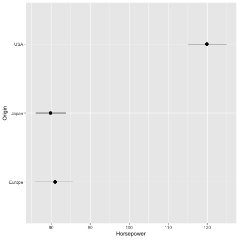
We can use mark_errorbar to show the standard deviation or confidence interval around a single point.
alt.Chart(cars).mark_errorbar(extent='ci', rule=alt.LineConfig(size=2)).encode(
    x='Horsepower',
    y='Origin'
)
Also here, it is helpful to include an indication of the mean.
err_bars = alt.Chart(cars).mark_errorbar(extent='ci', rule=alt.LineConfig(size=2)).encode(
    x='Horsepower',
    y='Origin'
)

err_bars + err_bars.mark_point(color='black').encode(x='mean(Horsepower)')
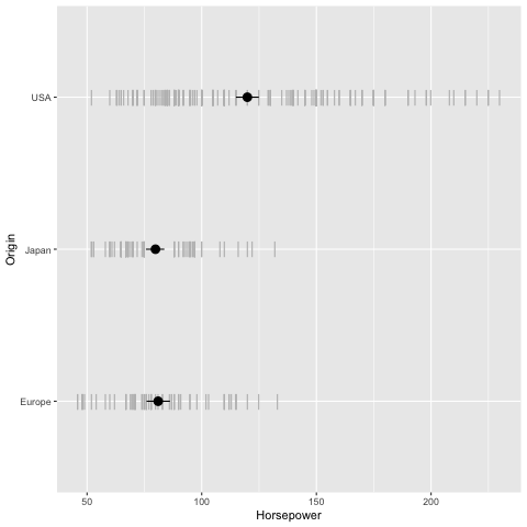
An particularly usful visualization is to combine the above with an indication of the distribution of the data, e.g. as a faded violinplot in the background or as faded marks for all observations. This gives the reader a chance to study the raw data in addition to seeing the mean and its certainty.
err_bars = alt.Chart(cars).mark_errorbar(extent='ci', rule=alt.LineConfig(size=2)).encode(
    x='Horsepower',
    y='Origin'
)

(err_bars.mark_tick(color='lightgrey')
 + err_bars
 + err_bars.mark_point(color='black').encode(x='mean(Horsepower)'))
7.1.2. R#
In ggplot, we can create confidence bands via geom_ribbon.
Previously we have passed specific statistic summary functions to the fun parameter,
but here we will use fun.data because we need both the lower and upper bond
of where to plot the ribbon.
Whereas fun only allows functions that return a single value which decides where to draw the point on the y-axis
(such as mean),
fun.data allows functions to return three values (the min, middle, and max y-value).
The mean_cl_boot function is especially helpful here,
since it returns the upper and lower bound of the bootstrapped CI
(and also the mean value, but that is not used by geom_ribbon).
You need the Hmisc package installed in order to use mean_cl_boot,
if you don’t nothing will show up but you wont get an error,
so it can be tricky to realize what is wrong.
%%R -i cars

library(tidyverse)

ggplot(cars) +
    aes(x = Year,
        y = Horsepower,
        color = Origin) +
    geom_point() +
    geom_line(stat = 'summary', fun = 'mean')
── Attaching core tidyverse packages ──────────────────────── tidyverse 2.0.0 ──
✔ dplyr     1.1.4     ✔ readr     2.1.5
✔ forcats   1.0.0     ✔ stringr   1.5.1
✔ ggplot2   3.5.2     ✔ tibble    3.3.0
✔ lubridate 1.9.4     ✔ tidyr     1.3.1
✔ purrr     1.1.0
── Conflicts ────────────────────────────────────────── tidyverse_conflicts() ──
✖ dplyr::filter() masks stats::filter()
✖ dplyr::lag()    masks stats::lag()
ℹ Use the conflicted package (<http://conflicted.r-lib.org/>) to force all conflicts to become errors
R callback write-console: In addition:
R callback write-console: Warning messages:
R callback write-console: 1: Removed 6 rows containing non-finite outside the scale range
(`stat_summary()`).
R callback write-console: 2: Removed 6 rows containing missing values or values outside the scale range
(`geom_point()`).
%%R -w 600
ggplot(cars) +
    aes(x = Year,
        y = Horsepower,
        color = Origin,
        fill = Origin) +
    geom_ribbon(stat = 'summary', fun.data = mean_cl_boot, alpha=0.5, color = NA)
    # `color = NA` removes the ymin/ymax lines and shows only the shaded filled area
R callback write-console: In addition:
R callback write-console: Warning message:
R callback write-console: Removed 6 rows containing non-finite outside the scale range
(`stat_summary()`).

We can add a line for the mean here as well.
%%R -w 600
ggplot(cars) +
    aes(x = Year,
        y = Horsepower,
        color = Origin,
        fill = Origin) +
    geom_line(stat = 'summary', fun = mean) +
    geom_ribbon(stat = 'summary', fun.data = mean_cl_boot, alpha=0.5, color = NA)
R callback write-console: In addition:
R callback write-console: Warning messages:
R callback write-console: 1: Removed 6 rows containing non-finite outside the scale range
(`stat_summary()`).
R callback write-console: 2: Removed 6 rows containing non-finite outside the scale range
(`stat_summary()`).
To plot the confidence interval around a single point,
we can use geom_pointrange,
which also plots the mean
(so it uses all three values return from mean_cl_boot).
%%R
ggplot(cars) +
    aes(x = Horsepower,
        y = Origin) +
    geom_pointrange(stat = 'summary', fun.data = mean_cl_boot)
R callback write-console: In addition:
R callback write-console: Warning message:
R callback write-console: Removed 6 rows containing non-finite outside the scale range
(`stat_summary()`).
And finally we can plot the observations in the backgound here.
%%R
ggplot(cars) +
    aes(x = Horsepower,
        y = Origin) +
    geom_point(shape = '|', color='grey', size=5) +
    geom_pointrange(stat = 'summary', fun.data = mean_cl_boot, size = 0.7)
R callback write-console: In addition:
R callback write-console: Warning messages:
R callback write-console: 1: Removed 6 rows containing non-finite outside the scale range
(`stat_summary()`).
R callback write-console: 2: Removed 6 rows containing missing values or values outside the scale range
(`geom_point()`).
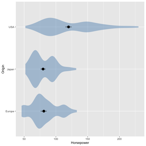
%%R
ggplot(cars) +
    aes(x = Horsepower,
        y = Origin) +
    geom_violin(color = NA, fill = 'steelblue', alpha = 0.4) +
    geom_pointrange(stat = 'summary', fun.data = mean_cl_boot, size = 0.7)
R callback write-console: In addition:
R callback write-console: Warning messages:
R callback write-console: 1: Removed 6 rows containing non-finite outside the scale range
(`stat_ydensity()`).
R callback write-console: 2: Removed 6 rows containing non-finite outside the scale range
(`stat_summary()`).
7.2. Figure composition#
7.2.1. Py#
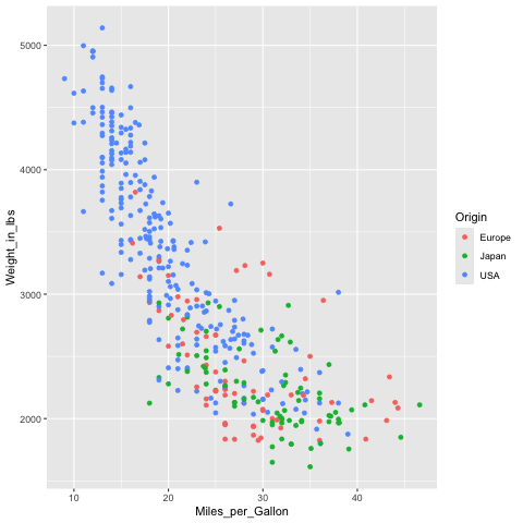
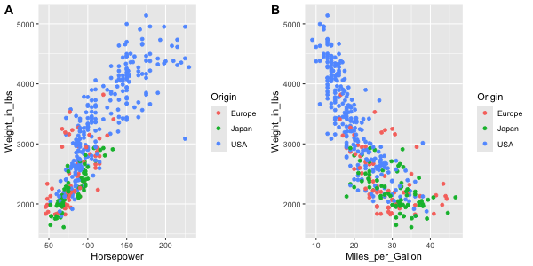
Let’s create two figures to layout together. The titles here are a bit redundant, they’re just mean to facilitate spotting which figure goes where in the multi-panel figure.
import altair as alt
from vega_datasets import data

cars = data.cars()
mpg_weight = alt.Chart(cars, title='x = mpg').mark_point().encode(
    x=alt.X('Miles_per_Gallon'),
    y=alt.Y('Weight_in_lbs'),
    color='Origin'
)
mpg_weight
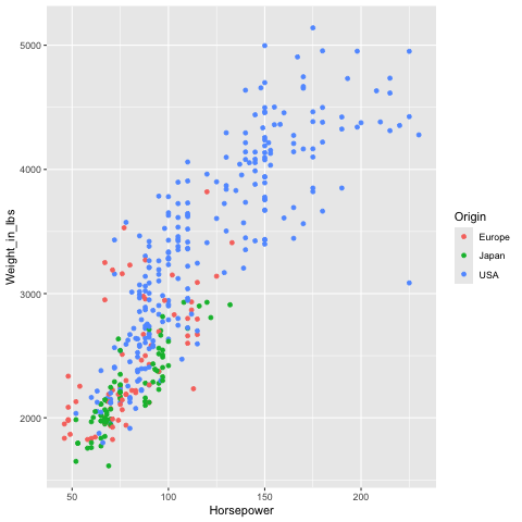
If a variable is shared between two figures, it is a good idea to have it on the same axis. This makes it easier to compare the relationship with the previous plot.
hp_weight = alt.Chart(cars, title='x = hp').mark_point().encode(
    x=alt.X('Horsepower'),
    y=alt.Y('Weight_in_lbs'),
    color='Origin'
)
hp_weight
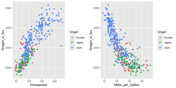
To concatenate plots vertically, we can use the ampersand operator.
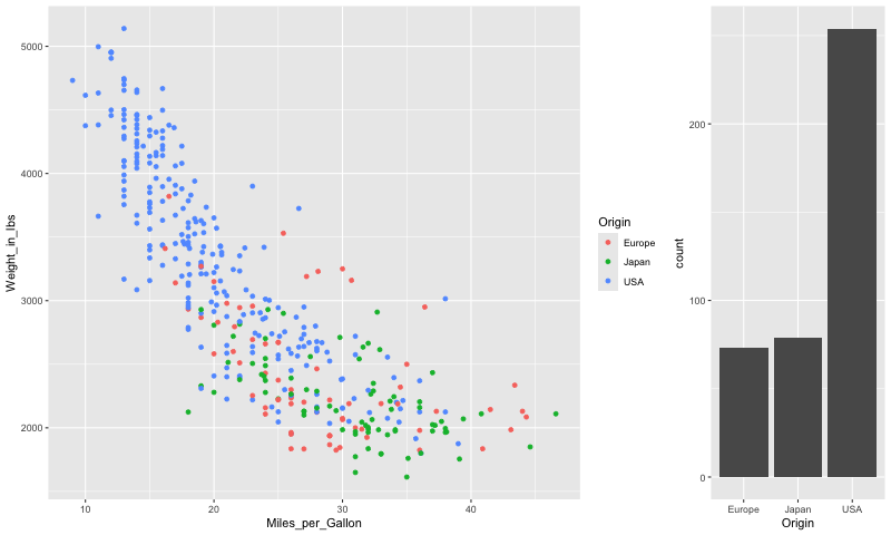
mpg_weight & hp_weight
To concatenate horizontally, we use the pipe operator.
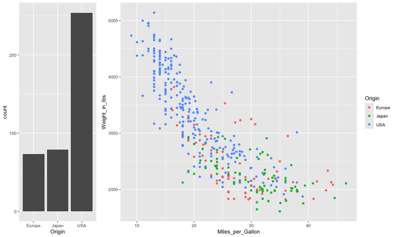
mpg_weight | hp_weight
To add an overall title to the figure,
we can use the properties method.
We need to surround the plots with a parentheis
to show that we are using properties of the composed figures
rather than just hp_weight one.
(mpg_weight | hp_weight).properties(title='Overall title')
In addition to & and |,
we could use the functions vconcat and hconcat.
You can use what you find the most convenient,
this is how to add a title with one of those functions.
alt.hconcat(mpg_weight, hp_weight, title='Overall title')
We can also build up a figure with varying sizes for the different panels, e.g. adding marginal distribution plots to a scatter plot.
mpg_hist = alt.Chart(cars).mark_bar().encode(
    alt.X('Miles_per_Gallon').bin(),
    y='count()'
).properties(
    height=100
)
mpg_hist
weight_ticks = alt.Chart(cars).mark_tick().encode(
    x='Origin',
    y='Weight_in_lbs',
    color='Origin'
)
weight_ticks
mpg_weight | weight_ticks
Just adding operations after each other can lead to the wrong grouping of the panels in the figure.
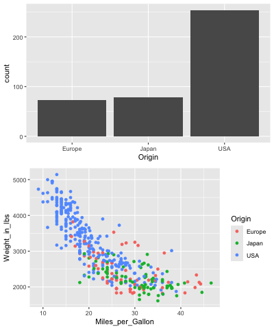
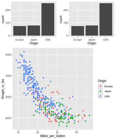
mpg_hist & mpg_weight | weight_ticks
Adding parenthesis can indicate how to group the different panels.
mpg_hist & (mpg_weight | weight_ticks)
7.2.2. R#
%%R
library(tidyverse)
%%R -i cars
mpg_weight <- ggplot(cars) +
    aes(x = Miles_per_Gallon,
        y = Weight_in_lbs,
        color = Origin) +
    geom_point()
mpg_weight
R callback write-console: In addition:
R callback write-console: Warning message:
R callback write-console: Removed 8 rows containing missing values or values outside the scale range
(`geom_point()`).
%%R -i cars
hp_weight <- ggplot(cars) +
    aes(x = Horsepower,
        y = Weight_in_lbs,
        color = Origin) +
    geom_point()
hp_weight
R callback write-console: In addition:
R callback write-console: Warning message:
R callback write-console: Removed 6 rows containing missing values or values outside the scale range
(`geom_point()`).
Laying out figures is not built into ggplot,
but the functionality is added in separate packages.
patchwork is similar to the operator-syntax we used with Altair,
and cowplot works similar to the concatenation functions in Altair.
Here I will be showing the latter,
but you’re free to use either
(“cow” are the author’s initials,
Claus O Wilke, the same person who wrote Fundamentals of Data Visualization).
%%R -w 600 -h 300
library(cowplot)

plot_grid(hp_weight, mpg_weight)
Attaching package: ‘cowplot’

The following object is masked from ‘package:lubridate’:

    stamp

In addition: Warning messages:
1: Removed 6 rows containing missing values or values outside the scale range
(`geom_point()`).
2: Removed 8 rows containing missing values or values outside the scale range
(`geom_point()`).
Panels can easily be labeled.
%%R -w 600 -h 300
plot_grid(hp_weight, mpg_weight, labels=c('A', 'B'))
In addition: Warning messages:
1: Removed 6 rows containing missing values or values outside the scale range
(`geom_point()`).
2: Removed 8 rows containing missing values or values outside the scale range
(`geom_point()`).
And this can even be automated.
%%R -w 600 -h 300
plot_grid(hp_weight, mpg_weight, labels='AUTO')
In addition: Warning messages:
1: Removed 6 rows containing missing values or values outside the scale range
(`geom_point()`).
2: Removed 8 rows containing missing values or values outside the scale range
(`geom_point()`).
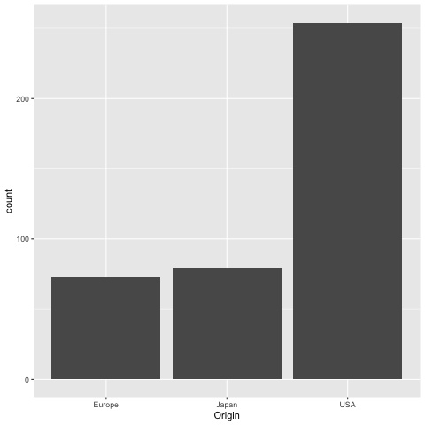
Let’s create a composite figure with marginal distribution plots.
%%R
ggplot(cars) +
    aes(x = Origin) +
    geom_bar()
If we were to present this barplot as a communication firgure, the bars should not be that wide. It is more visually appealing with narrower bars.
%%R -w 200
ggplot(cars) +
    aes(x = Origin) +
    geom_bar()
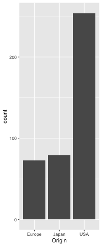
%%R -w 200
origin_count <- ggplot(cars) +
    aes(x = Origin) +
    geom_bar()
origin_count
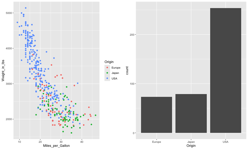
To set the widths of figures in the composition plot,
we can use rel_widths.
%%R -w 800
plot_grid(mpg_weight, origin_count)
In addition: Warning message:
Removed 8 rows containing missing values or values outside the scale range
(`geom_point()`).
%%R -w 800
plot_grid(mpg_weight, origin_count, rel_widths=c(3, 1))
In addition: Warning message:
Removed 8 rows containing missing values or values outside the scale range
(`geom_point()`).
It is not that nice to see the legend between the plots, so lets reorder them.
%%R -w 800
plot_grid(origin_count, mpg_weight, rel_widths=c(1, 3))
In addition: Warning message:
Removed 8 rows containing missing values or values outside the scale range
(`geom_point()`).
To concatenate vertically, we set the number of columns to 1.
%%R -w 400
plot_grid(origin_count, mpg_weight, ncol=1)
In addition: Warning message:
Removed 8 rows containing missing values or values outside the scale range
(`geom_point()`).
Finally, we can nest plot grids within each other.
%%R -w 400
top_row <- plot_grid(origin_count, origin_count)
plot_grid(top_row, mpg_weight, ncol=1, rel_heights=c(1,2))
In addition: Warning message:
Removed 8 rows containing missing values or values outside the scale range
(`geom_point()`).
There are some more tricks in the readme,
including how to add a common title for the figures
via ggdraw.
7.3. Interactivity between plots using Altair#
One of the unique features of Altair is that it does not only define a grammar of graphics, but also a grammar of interactivity, which makes it intuitive to add many of the plot-to-plot interactions. This can be beneficial both for exploring data ourselves and for letting others explore our figures in a richer context. This interactivity is specified in the Altair/Vega-lite spec, so when you export your plot to HTML files, the interactivity is still there in the HTML and JS code, even after you shut down your Python/JupyterLab. This is called client side interactivity and is great for emailing someone an interactive chart. In contrast, buidling dashboards as we will learn about in viz 2 often requires an active Python server running for interactivity to work.
7.3.1. Tooltips#
Hover over the points to see the information in a tooltip.
alt.Chart(cars).mark_circle().encode(
    x='Horsepower',
    y='Miles_per_Gallon',
    tooltip='Name'
)
Multiple fields can be included as a list to a tooltip.
alt.Chart(cars).mark_circle().encode(
    x='Horsepower',
    y='Miles_per_Gallon',
    tooltip=['Name', 'Origin']
)
7.3.2. Panning and zooming#
alt.Chart(cars).mark_circle().encode(
    x='Horsepower',
    y='Miles_per_Gallon',
    tooltip=['Name', 'Origin']
).interactive()
7.3.3. Interval selections#
Let’s add a selection that lets us drag and drop with the mouse to create an interval of selected points. An interval selection is often called a “brush” and connecting two plots is often referred to as “linked brushing”.
brush = alt.selection_interval()

alt.Chart(cars).mark_circle().encode(
    x='Horsepower',
    y='Miles_per_Gallon'
).add_params(
    brush
)
7.3.4. Highlighting points with selections#
It would be nice if the points were highlighted when selected.
Altair has a built in if/else function called condition
that checks if an event is present (such as selection)
and then lets us define what to do if it is True and if it is False.
alt.condition(check-this, if-true-do-this, if-false-do-this)
brush = alt.selection_interval()

alt.Chart(cars).mark_circle().encode(
    x='Horsepower',
    y='Miles_per_Gallon',
    color=alt.condition(brush, 'Origin', alt.value('lightgray'))
).add_params(
    brush
)
We could change along which dimensions the selection is active. By default is is both x and y for scatter plots.
brush = alt.selection_interval(encodings=['x'])

alt.Chart(cars).mark_circle().encode(
    x='Horsepower',
    y='Miles_per_Gallon',
    color=alt.condition(brush, 'Origin', alt.value('lightgray'))
).add_params(
    brush
)
7.3.5. Linking selections across plots#
Selections are automatically linked between plots. This is great for comparing the same observations across multiple dimensions.
brush = alt.selection_interval()

points = alt.Chart(cars).mark_circle().encode(
    x='Horsepower',
    y='Miles_per_Gallon',
    color=alt.condition(brush, 'Origin', alt.value('lightgray'))
).add_params(
    brush
)

points | points.encode(y='Weight_in_lbs')
There is only one interval selection above,
if I start dragging in another plot,
the first selection disappears.
I can modify this behavior
and change it so that each subplot gets its own selection
and that points within any section are highlighted within all plots
by setting resolve='union'.
brush = alt.selection_interval(resolve='union')  # The default is 'global'

points = alt.Chart(cars).mark_circle().encode(
    x='Horsepower',
    y='Miles_per_Gallon',
    color=alt.condition(brush, 'Origin', alt.value('lightgray'))
).add_params(
    brush
)

points | points.encode(y='Weight_in_lbs')
I could modify this behavior so that only points that fall within the intersection of all the selections are highlighted.
brush = alt.selection_interval(resolve='intersect')

points = alt.Chart(cars).mark_circle().encode(
    x='Horsepower',
    y='Miles_per_Gallon',
    color=alt.condition(brush, 'Origin', alt.value('lightgray'))
).add_params(
    brush
)

points | points.encode(y='Weight_in_lbs')
7.3.6. Click selections#
In addition to interval/drag interactivity, there is also interactivity via clicking. Let’s add add a bar chart that changes the opacity of bars when not clicked. You can hold shift to select multiple.
brush = alt.selection_interval()
click = alt.selection_point(fields=['Origin'])

points = alt.Chart(cars).mark_circle().encode(
    x='Horsepower',
    y='Miles_per_Gallon',
    color=alt.condition(brush, 'Origin', alt.value('lightgray'))
).add_params(
    brush
)

bars = alt.Chart(cars).mark_bar().encode(
    x='count()',
    y='Origin',
    color='Origin',
    opacity=alt.condition(click, alt.value(0.9), alt.value(0.2))
).add_params(
    click
)

points & bars
We can change the interaction that controls the clicks by setting on='mouseover'.
Now the bars are selected while just hovering,
no clicking needed.
brush = alt.selection_interval()
click = alt.selection_point(on='mouseover', fields=['Origin'])

points = alt.Chart(cars).mark_circle().encode(
    x='Horsepower',
    y='Miles_per_Gallon',
    color=alt.condition(brush, 'Origin', alt.value('lightgray'))
).add_params(
    brush
)

bars = alt.Chart(cars).mark_bar().encode(
    x='count()',
    y='Origin',
    color='Origin',
    opacity=alt.condition(click, alt.value(0.9), alt.value(0.2))
).add_params(
    click
)

points & bars
7.3.7. Linking selection on charts with different encodings#
It would be cool if selection in one chart was reflected in the other one… Let’s link the charts together! For the bar chart selector, we need to specify which field/column we should be selecting on since the x and y axis are not the same between the two plots so Altair can’t link them automatically like the two scatters with the same axes.
brush = alt.selection_interval()
click = alt.selection_point(fields=['Origin'])
# `encodings` could also be used like this
# click = alt.selection_multi(encodings=['y'])

points = alt.Chart(cars).mark_circle().encode(
    x='Horsepower',
    y='Miles_per_Gallon',
    color=alt.condition(brush, 'Origin', alt.value('lightgray')),
    opacity=alt.condition(click, alt.value(0.9), alt.value(0.2))
).add_params(
    brush
)

bars = alt.Chart(cars).mark_bar().encode(
    x='count()',
    y='Origin',
    color='Origin',
    opacity=alt.condition(click, alt.value(0.9), alt.value(0.2))
).add_params(
    click
)

points & bars
7.3.8. Legend selections#
It is often nice to include legend interactivity in scatter plots. For this we could use the same technique as above and specify that we want to bind it to the legend. We also need to add the selection to the combined chart instead of to the bar chart since the legend belongs to both of them.
brush = alt.selection_interval()
click = alt.selection_point(fields=['Origin'], bind='legend')

points = alt.Chart(cars).mark_circle().encode(
    x='Horsepower',
    y='Miles_per_Gallon',
    color=alt.condition(brush, 'Origin', alt.value('lightgray')),
    opacity=alt.condition(click, alt.value(0.9), alt.value(0.2))
).add_params(
    brush
)

bars = alt.Chart(cars).mark_bar().encode(
    x='count()',
    y='Origin',
    color='Origin',
    opacity=alt.condition(click, alt.value(0.9), alt.value(0.2))
)

(points & bars).add_params(click)
7.3.9. Filtering data based on a selection#
Another useful type of interactivity is to actually filter the data
based on a selection,
rather than just styling the graphical elements differently as we have done so far.
We can do this by adding transform_filter(brush) to out bar plot.
We mention transform_filter briefly in 531,
they can perform similar filter operations as pandas,
but are not as powerful in general
so they are best used for operations like this where we can’t use pandas.
This type of interaction is sometimes called a dynamic query.
brush = alt.selection_interval()
click = alt.selection_point(fields=['Origin'], bind='legend')

points = alt.Chart(cars).mark_circle().encode(
    x='Horsepower',
    y='Miles_per_Gallon',
    color=alt.condition(brush, 'Origin', alt.value('lightgray')),
    opacity=alt.condition(click, alt.value(0.9), alt.value(0.2))
).add_params(
    brush
)

bars = alt.Chart(cars).mark_bar().encode(
    x='count()',
    y='Origin',
    color='Origin',
    opacity=alt.condition(click, alt.value(0.9), alt.value(0.2))
).transform_filter(
    brush
)

(points & bars).add_params(click)
7.3.10. Binding selection to other chart attributes#
We can also bind the selection to other attributes of our plot. For example, a selection could bound to the domain of the scale which sets the axis range. This way one chart could be used as a minimap to navigate another chart.
source = data.sp500.url

base = alt.Chart(source, width=600).mark_area().encode(
    x = 'date:T',
    y = 'price:Q')

brush = alt.selection_interval(encodings=['x'])
lower = base.properties(height=60).add_params(brush)

upper = base.encode(alt.X('date:T').scale(domain=brush))

upper & lower