Plot a line chart using ggplot
plot_metric.RdPlot a line chart using ggplot
plot_metric(
  df,
  loc_val = "Canada",
  metric = "positive_rate",
  date_from = NULL,
  date_to = NULL,
  location = NULL,
  new_cases = NULL
)
Arguments
- df
Data frame of the selected COVID data from get_data()
- loc_val
A character vector of target country name. By default c('Canada)
- metric
A character vector with, at most, one element.
- date_from
A character vector having the starting date, one element.
- date_to
A character vector having the end date, one element.
- location
A character vector containing the locations around the world
- new_cases
A character vector containing aggregated total new COVID cases
Value
A ggplot line chart
Examples
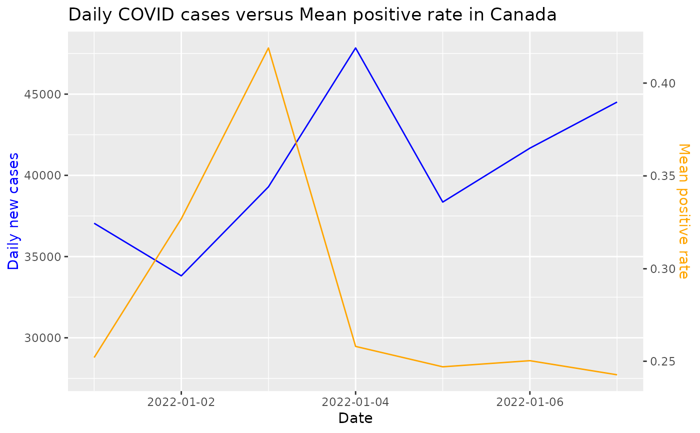
data <- get_data(date_from = "2022-01-01", date_to = "2022-01-07")
#> Rows: 159553 Columns: 67
#> ── Column specification ────────────────────────────────────────────────────────
#> Delimiter: ","
#> chr   (4): iso_code, continent, location, tests_units
#> dbl  (62): total_cases, new_cases, new_cases_smoothed, total_deaths, new_dea...
#> date  (1): date
#>
#> ℹ Use `spec()` to retrieve the full column specification for this data.
#> ℹ Specify the column types or set `show_col_types = FALSE` to quiet this message.
loc <- c("Canada")
x <- "positive_rate"
plot_metric(df = data, loc_val = loc, metric = x, date_from = "2022-01-01", "2022-01-15")