Introduction to covizr
covizr-vignette.RmdThe covizr package provides easy access to Covid-19 data from Our World in Data, as well as functions to generate relevant Covid-19 charts and summaries easily. We aim to make covizr simple and easy to use. Our goal is to enable anyone with basic R programming knowledge to access and visualize Covid-19 data, and make their own informed decisions and conclusions.
We aim to provide simple visualization functions that allow users to answer questions regarding the Covid-19 pandemic as quickly as possible.
This document introduces you to to the basics of using covizr, and shows you how to apply the function.
To use the function, first install the package according to the steps in README, and import the the library with the following code:
library(covizr)Data
To explore the usage of covizr, you do not need extra data. Run the following function as the beginning of the code:
df <- get_data()
df
#> # A tibble: 1,505 × 67
#>    iso_code continent location date       total_cases new_cases new_cases_smoot…
#>    <chr>    <chr>     <chr>    <date>           <dbl>     <dbl>            <dbl>
#>  1 AFG      Asia      Afghani… 2022-01-29      161290       233             249.
#>  2 AFG      Asia      Afghani… 2022-01-30      162111       821             352.
#>  3 AFG      Asia      Afghani… 2022-01-31      162926       815             433.
#>  4 AFG      Asia      Afghani… 2022-02-01      163555       629             472.
#>  5 AFG      Asia      Afghani… 2022-02-02      164190       635             500.
#>  6 AFG      Asia      Afghani… 2022-02-03      164727       537             532.
#>  7 AFG      Asia      Afghani… 2022-02-04      165358       631             614.
#>  8 ALB      Europe    Albania  2022-01-29      254126         0            1102
#>  9 ALB      Europe    Albania  2022-01-30      255741      1615            1096.
#> 10 ALB      Europe    Albania  2022-01-31      258543      2802            1496.
#> # … with 1,495 more rows, and 60 more variables: total_deaths <dbl>,
#> #   new_deaths <dbl>, new_deaths_smoothed <dbl>, total_cases_per_million <dbl>,
#> #   new_cases_per_million <dbl>, new_cases_smoothed_per_million <dbl>,
#> #   total_deaths_per_million <dbl>, new_deaths_per_million <dbl>,
#> #   new_deaths_smoothed_per_million <dbl>, reproduction_rate <dbl>,
#> #   icu_patients <dbl>, icu_patients_per_million <dbl>, hosp_patients <dbl>,
#> #   hosp_patients_per_million <dbl>, weekly_icu_admissions <dbl>, …
By default the function returns the last 7 days of data around the world. There are a few options you can parse into the function for more specific data selection:
- date_from: Start date of the data range with format of ‘YYYY-MM-DD’.
- date_to: End date of the data range with format of ‘YYYY-MM-DD’.
- location: Character vector of target country names.
For example, to retrieve the data between ‘2021-05-01’ to ‘2021-07-01’ of Canada and United Kingdom:
loc <- c('Canada', 'United Kingdom')
df <- get_data(date_from = "2021-05-01", date_to = "2021-07-01", location = loc)
df
#> # A tibble: 124 × 67
#>    iso_code continent location date       total_cases new_cases new_cases_smoot…
#>    <chr>    <chr>     <chr>    <date>           <dbl>     <dbl>            <dbl>
#>  1 CAN      North Am… Canada   2021-05-01     1227807      7429            7881.
#>  2 CAN      North Am… Canada   2021-05-02     1234733      6926            7891.
#>  3 CAN      North Am… Canada   2021-05-03     1243845      9112            7905.
#>  4 CAN      North Am… Canada   2021-05-04     1250657      6812            7842.
#>  5 CAN      North Am… Canada   2021-05-05     1258014      7357            7790.
#>  6 CAN      North Am… Canada   2021-05-06     1266137      8123            7747.
#>  7 CAN      North Am… Canada   2021-05-07     1274073      7936            7671.
#>  8 CAN      North Am… Canada   2021-05-08     1280731      6658            7561.
#>  9 CAN      North Am… Canada   2021-05-09     1287175      6444            7492.
#> 10 CAN      North Am… Canada   2021-05-10     1294712      7537            7267.
#> # … with 114 more rows, and 60 more variables: total_deaths <dbl>,
#> #   new_deaths <dbl>, new_deaths_smoothed <dbl>, total_cases_per_million <dbl>,
#> #   new_cases_per_million <dbl>, new_cases_smoothed_per_million <dbl>,
#> #   total_deaths_per_million <dbl>, new_deaths_per_million <dbl>,
#> #   new_deaths_smoothed_per_million <dbl>, reproduction_rate <dbl>,
#> #   icu_patients <dbl>, icu_patients_per_million <dbl>, hosp_patients <dbl>,
#> #   hosp_patients_per_million <dbl>, weekly_icu_admissions <dbl>, …
Visualization functions
Summarising a specified variable and value using plot_summary
Use plot_summary when you want to find out what is the top variables (var) from a particular aggregated value (val) or metrics. As with all plotting function in this package, you need to call get_data() first and pass the data frame into the plotting function.
For example, we can see which are the top 10 countries with highest new Covid-19 cases in the first 14 days of 2022 using the following code:
plot_df <- get_data(date_from = "2022-01-01", date_to = "2022-02-01")
plot_summary(plot_df, var = "location", val = "new_cases", date_from = "2022-01-01", date_to = "2022-01-14", top_n = 10)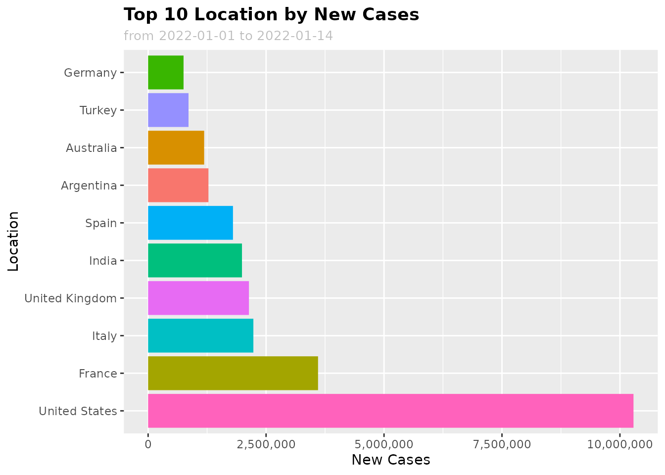
var: Use a categorical variable likelocation,continentval: Use a numeric variable likenew_cases,new_vaccinations,icu_patients
By default, we use sum to aggregate your value of interest. You can use other aggregation function like mean as well, just specify the function name as a string in the argument (e.g. fun = "mean").
Presenting specific countries’ Covid information using plot_spec
We could also get information from specific countries that interest us. By default, this plot_spec function will plot the last 7 days’ new cases trend for Canada. There are a few options you can parse into the function:
- df: Data frame of the selected covid data from get_data(), note that the date range used in get_data function must match or cover the date range here, in order to get complete result
- location: Character vector of target country names.
- val: Quantitative values to be aggregated. Must be numeric variable. Also known as a ‘measure’. Available options including new_deaths, reproduction_rate, icu_patients, hosp_patients, etc.
- date_from: Start date of the data range with format of ‘YYYY-MM-DD’.
- date_to: End date of the data range with format of ‘YYYY-MM-DD’.
- title: The title of the plot.
For example, this plot_spec function below draws the trend of new death cases in Canada and United Kingdom over the first two weeks of January 2022.
df <- get_data(date_from="2022-01-01", date_to="2022-01-15", location = loc)
plot_spec(df, location = c('Canada', 'United Kingdom'), val="new_deaths", date_from="2022-01-01",
          date_to="2022-01-15", title="Death cases in Canada and United Kingdom")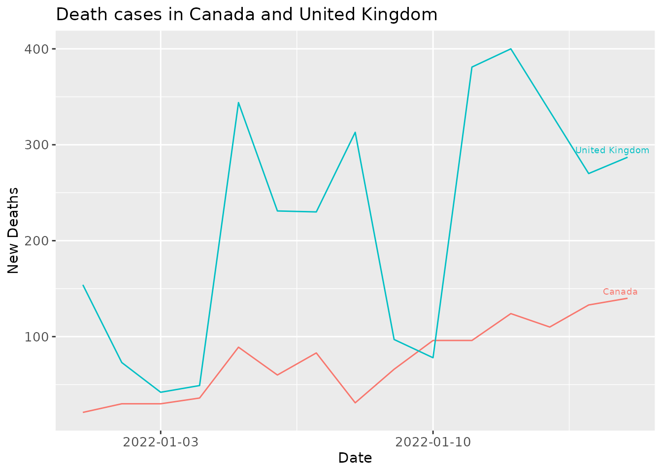
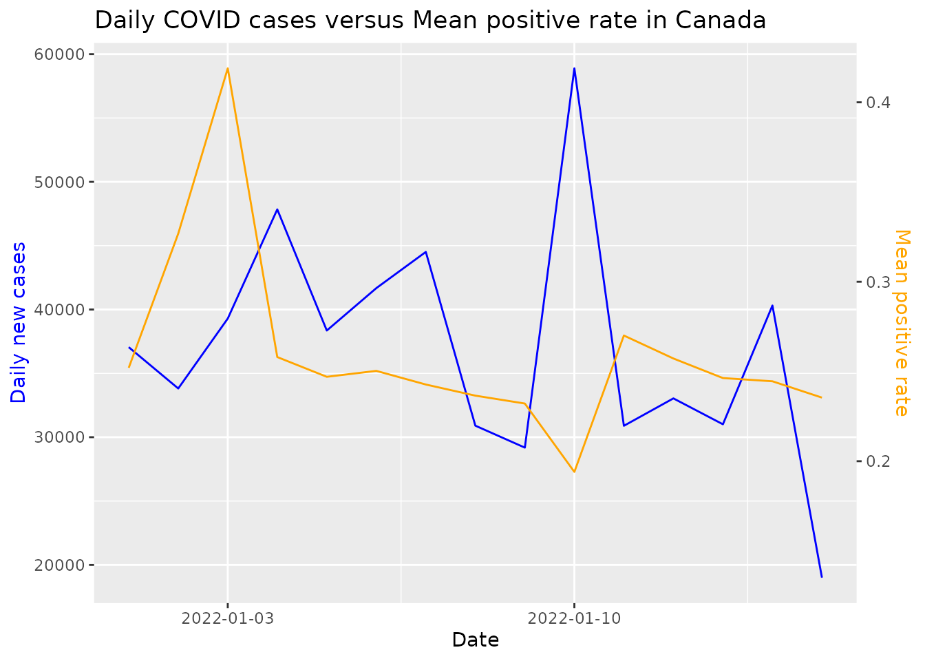
Presenting Covid total new cases verses another metric using plot_metric
After looking at the trend for COVID related cases for specific countries, we can dive deeper into a particular count and visualize the trend of COVID cases with another metric. Some examples of metric which can be used are positive_rate, total_vaccinations, total_deaths, etc. The list of arguments which can be used are provided below:
- df: Data frame of the selected covid data from get_data(), note that the date range used in get_data function must match or cover the date range here, in order to get complete result
- loc_val: Character vector containing a single country.
- metric: Character vector containing a numeric column of the data frame.
- date_from: Start date of the data range with format of ‘YYYY-MM-DD’.
- date_to: End date of the data range with format of ‘YYYY-MM-DD’.
The plot_metric function below charts trend of daily new COVID-19 cases versus the positive rates in Canada for the first two weeks of January 2022.
df <- get_data(date_from="2022-01-01", date_to="2022-01-15", location = c("Canada"))
plot_metric(df, loc_val = c("Canada"), metric = "positive_rate", date_from = "2022-01-01", "2022-01-15")