Create a line chart presenting specific country/countries COVID information within a time period
plot_spec.RdCreate a line chart presenting specific country/countries COVID information within a time period
Arguments
- df
Data frame of the selected covid data from get_data()
- location
Charactor vector of target country names. By default c('Canada)
- val
Quantitative values to be aggregated. Must be numeric variable. Also known as a 'measure'. By default 'new_cases'
- date_from
Start date of the data range with format like '2021-10-31'. By default 'NULL' is used to represent 7 days prior to today's date
- date_to
End date of data range with format like '2021-10-31'. By default 'NULL' is used to represent 7 days prior to today's date
- title
The title of the plot. By default will be generated based on val
Value
A ggplot line chart
Examples
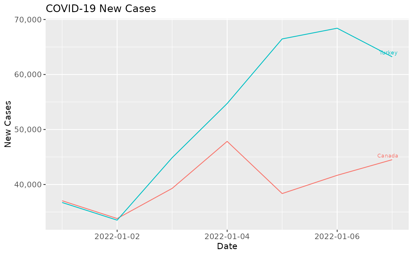
df <- get_data(date_from = "2022-01-01", date_to = "2022-01-07")
#> Rows: 159553 Columns: 67
#> ── Column specification ────────────────────────────────────────────────────────
#> Delimiter: ","
#> chr   (4): iso_code, continent, location, tests_units
#> dbl  (62): total_cases, new_cases, new_cases_smoothed, total_deaths, new_dea...
#> date  (1): date
#>
#> ℹ Use `spec()` to retrieve the full column specification for this data.
#> ℹ Specify the column types or set `show_col_types = FALSE` to quiet this message.
plot_spec(df, date_from = "2022-01-01", date_to = "2022-01-07", location = c("Canada", "Turkey"))