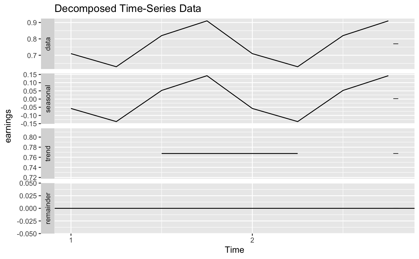
Convert a dataframe into a time series object, decompose it into trend, seasonality/cyclicity and noise/remainder/error and plot the raw data and the decomposed components. If the time series can't be decomposed, the function will just return the line chart of the raw data.
ts_plot(data, col, frequency)
Arguments
| data | dataframe: should be data.frame or tibble |
|---|---|
| col | str: the column to be analyzed |
| frequency | int: should choose from 1, 4, 12, 52 |
Value
ggplot Object
Examples
time <- c("1950 Q1", "1950 Q2", "1950 Q3", "1950 Q4", "1951 Q1", "1951 Q2", "1951 Q3", "1951 Q4") earnings <- c(0.71, 0.63, 0.82, 0.91, 0.71, 0.63, 0.82, 0.91) ts_data <- tibble::tibble(time, earnings) ts_plot(data=ts_data, col="earnings", frequency=4)#> #> #>