library(ggexpress)When conducting Exploratory Data Analysis it is useful to plot the variables in the data to get an initial sense of the distribution and potential behaviour of the data. If the dataset contains many variables creating separate plots for each one could become tedious. This package automates the plot configuration process and generates basic graphics that summarize the data.
This package contains 4 functions; two for general purpose exploratory tasks and two that are more specific.
Creates a basic histogram that indicates the position of the mean and median and displays the standard deviation.
gghist
Creates a scatterplot and calculates the correlation coefficient.
ggscatter
Creates a Fourier transform plot.
fourier_transform
Converts time series data into 4 subplots displaying the raw data, trend, seasonal and noise components.
ts_plot
Data: gapminder
The gapminder::gapminder dataset will be used to explore the basic functionality of each of the plots.
library(gapminder)
gapminder::gapminder
#> # A tibble: 1,704 x 6
#>    country     continent  year lifeExp      pop gdpPercap
#>    <fct>       <fct>     <int>   <dbl>    <int>     <dbl>
#>  1 Afghanistan Asia       1952    28.8  8425333      779.
#>  2 Afghanistan Asia       1957    30.3  9240934      821.
#>  3 Afghanistan Asia       1962    32.0 10267083      853.
#>  4 Afghanistan Asia       1967    34.0 11537966      836.
#>  5 Afghanistan Asia       1972    36.1 13079460      740.
#>  6 Afghanistan Asia       1977    38.4 14880372      786.
#>  7 Afghanistan Asia       1982    39.9 12881816      978.
#>  8 Afghanistan Asia       1987    40.8 13867957      852.
#>  9 Afghanistan Asia       1992    41.7 16317921      649.
#> 10 Afghanistan Asia       1997    41.8 22227415      635.
#> # … with 1,694 more rows
Obtain a histogram and basic summary statistics with gghist()
This plot displays the position of the mean and median of life expectancy from the gapminder dataset. In addition, the plot also displays the value of the mean, median and standard deviation.
gghist(data = gapminder, variable = lifeExp)
#> `stat_bin()` using `bins = 30`. Pick better value with `binwidth`.
#> `stat_bin()` using `bins = 30`. Pick better value with `binwidth`.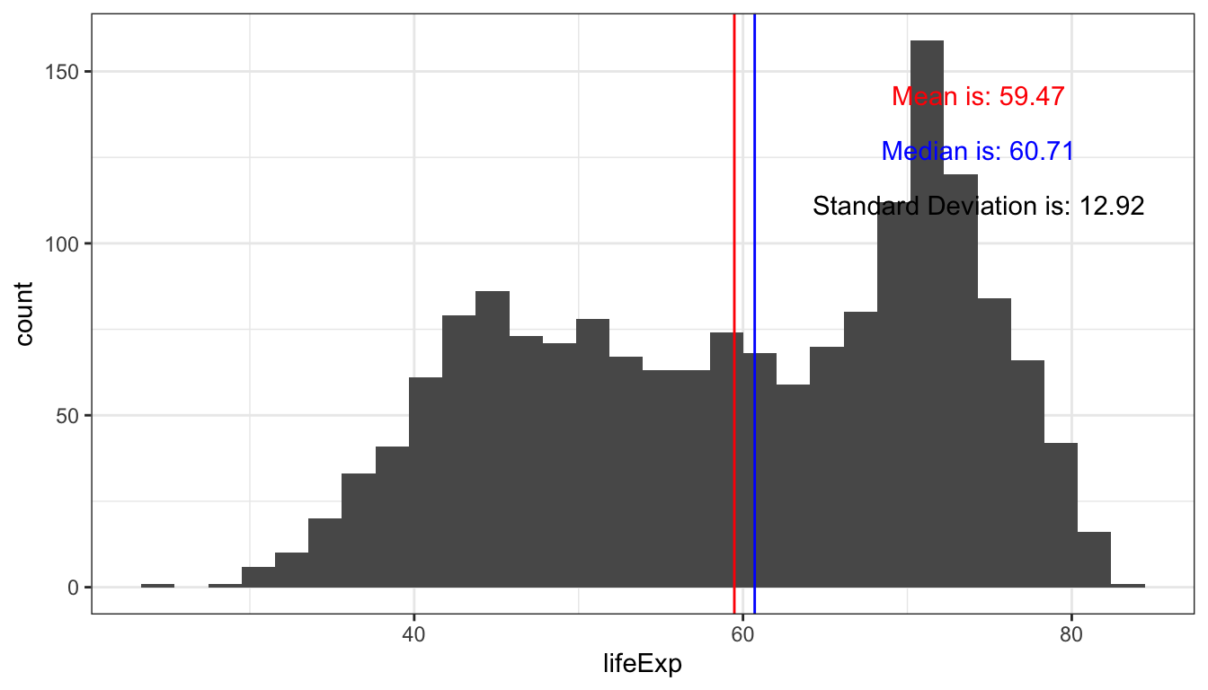
This plot shows the distribution of gdp per capita.
gghist(data = gapminder, variable = gdpPercap)
#> `stat_bin()` using `bins = 30`. Pick better value with `binwidth`.
#> `stat_bin()` using `bins = 30`. Pick better value with `binwidth`.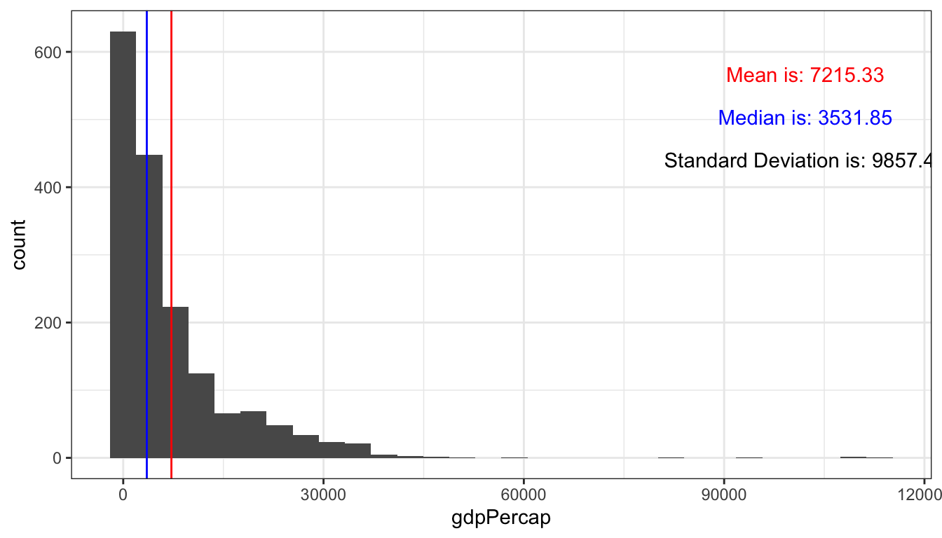
Obtain a scatterplot with scatter_express()
The
scatter_express()returns a basic scatterplot but also returns the correlation coefficient between the two variables. The plot below shows the relationship between petal length and petal width in iris flowers.
scatter_express(df = iris,
                xval = Petal.Length,
                yval = Petal.Width)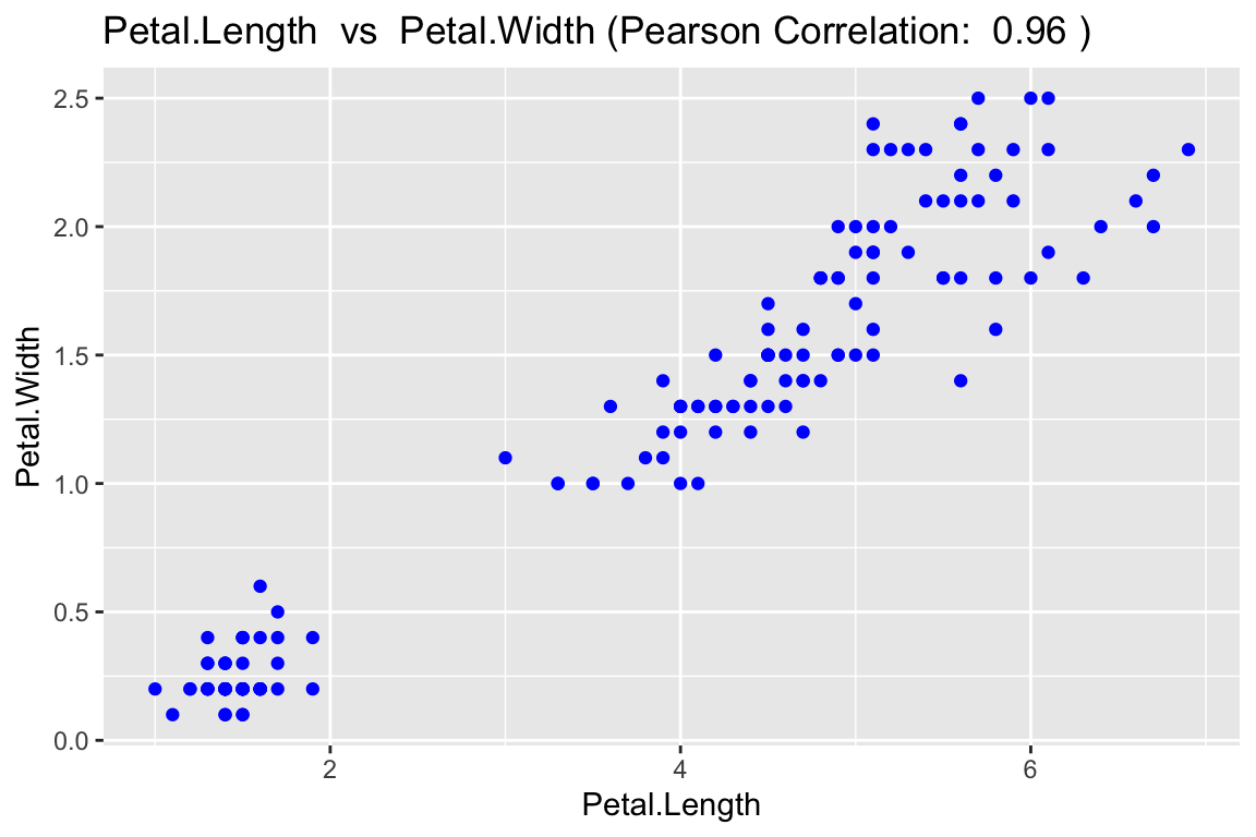
In addition, scatter_express() provides the option display the data on a log transformed scale for data with non-linear relationships. The first plot displays the GDP per capita vs the life expectancy before before log transformation.
scatter_express(df = gapminder,
                xval = gdpPercap,
                yval = lifeExp)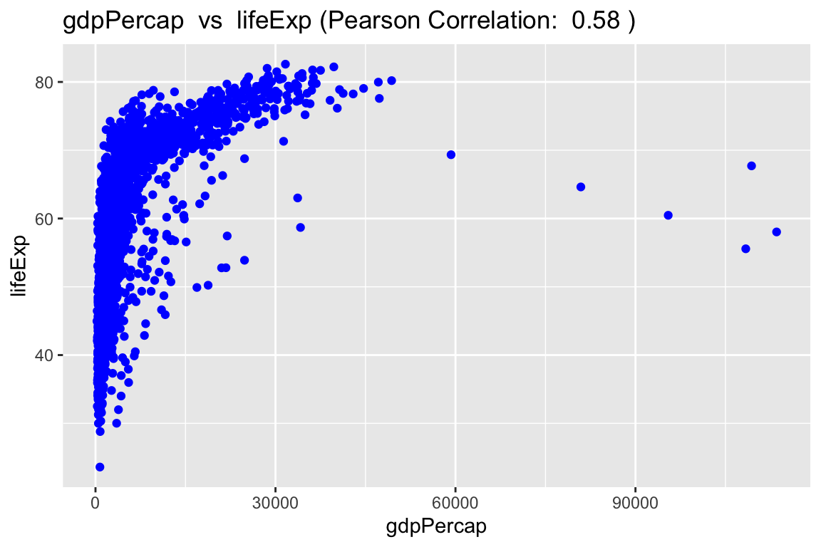
Once the log tranform is applied, a linear trend beetween GDP per capita and life expectancy becomes more apparent.
scatter_express(df = gapminder,
                xval = gdpPercap,
                yval = lifeExp,
                x_transform = TRUE,
                y_transform = TRUE)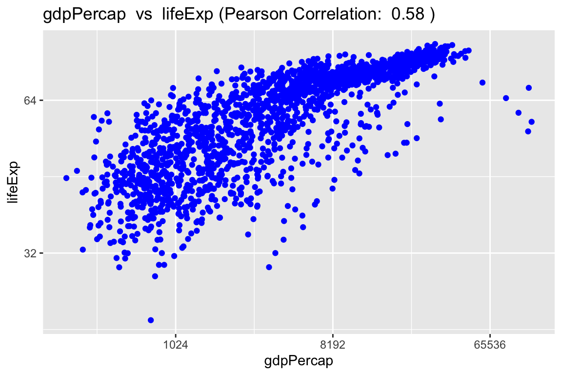
Time Series Decomposition with ts_plot()
This function, ts_plot(), is able to take in a time stamped dataframe and convert it into a time series object. The time series is then decomposed into its trend, seasonsal and white noise components.
# sample data
time <- c("1950 Q1", "1950 Q2", "1950 Q3", "1950 Q4",
          "1951 Q1", "1951 Q2", "1951 Q3", "1951 Q4",
          "1952 Q1", "1952 Q2", "1952 Q3", "1952 Q4")
 earnings <- c(0.71, 0.63, 0.82, 0.91,
               0.51, 1.31, 1.82, 2.01,
               0.63, 0.82, 0.91, 0.71)
ts_data <- tibble::tibble(time, earnings)

ts_plot(ts_data, "earnings", 4)
#> Registered S3 method overwritten by 'quantmod':
#>   method            from
#>   as.zoo.data.frame zoo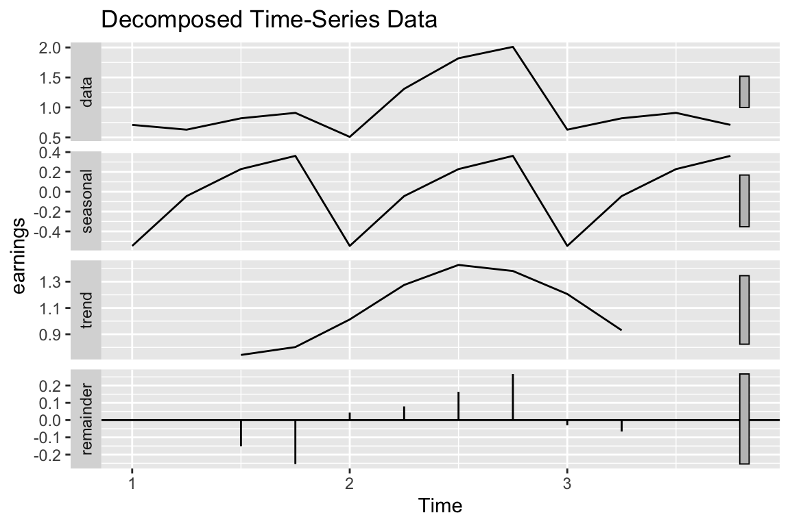
Fourier Transform plot with fourier_transform()
# sample data
my_data = tibble::tibble(time_series =  c(0, 1, 2, 3), signal = c(2, 3, 4, 6))

fourier_transform(data = my_data,
                  time_col = "time_series",
data_col = "signal")![]()