Methods
Contents
Methods#
Data#
The heart disease data set [Janosi et al., 1988]used in this project is obtained from the UC Irvine machine learning repository [Dua and Graff, 2017]. The creators Andras et al. originally donated the dataset in 1988 with 76 features. Nevertheless, the dataset we use contains 13 features with a binary target variable of 0 and 1, where 0 indicates no presence of heart and 1 indicates presence. Out of the 13 features, there are 8 categorical features and 5 numeric features. These features includes various physiological parameters like resting blood pressure and serum cholestoral levels, as well as potential signs of heart disease like chest pain. The original paper utilized Bayesian model to estimate the probability of having heart disease presence [Detrano et al., 1989].
There are 303 observations in the heart disease dataset with no missing values. We have a slightly imbalance dataset: there are 165 positive cases (i.e. presence of heart disease) and 138 negative cases. We split the dataset into training and test data in a stratified fashion. The number of cases in the two splits is shown in the table below:
import pandas as pd
pd.read_csv("../../results/class_count.csv", index_col = 0)
| Presence of HD: | No presence of HD: | |
|---|---|---|
| Training | 138 | 104 |
| Test | 27 | 34 |
EDA and Methods#
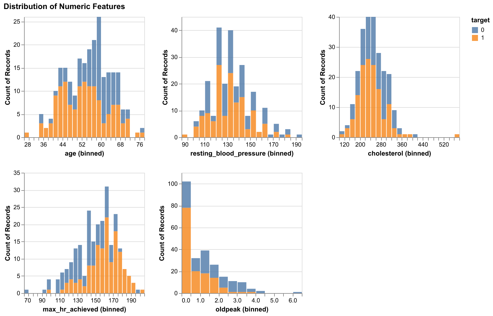
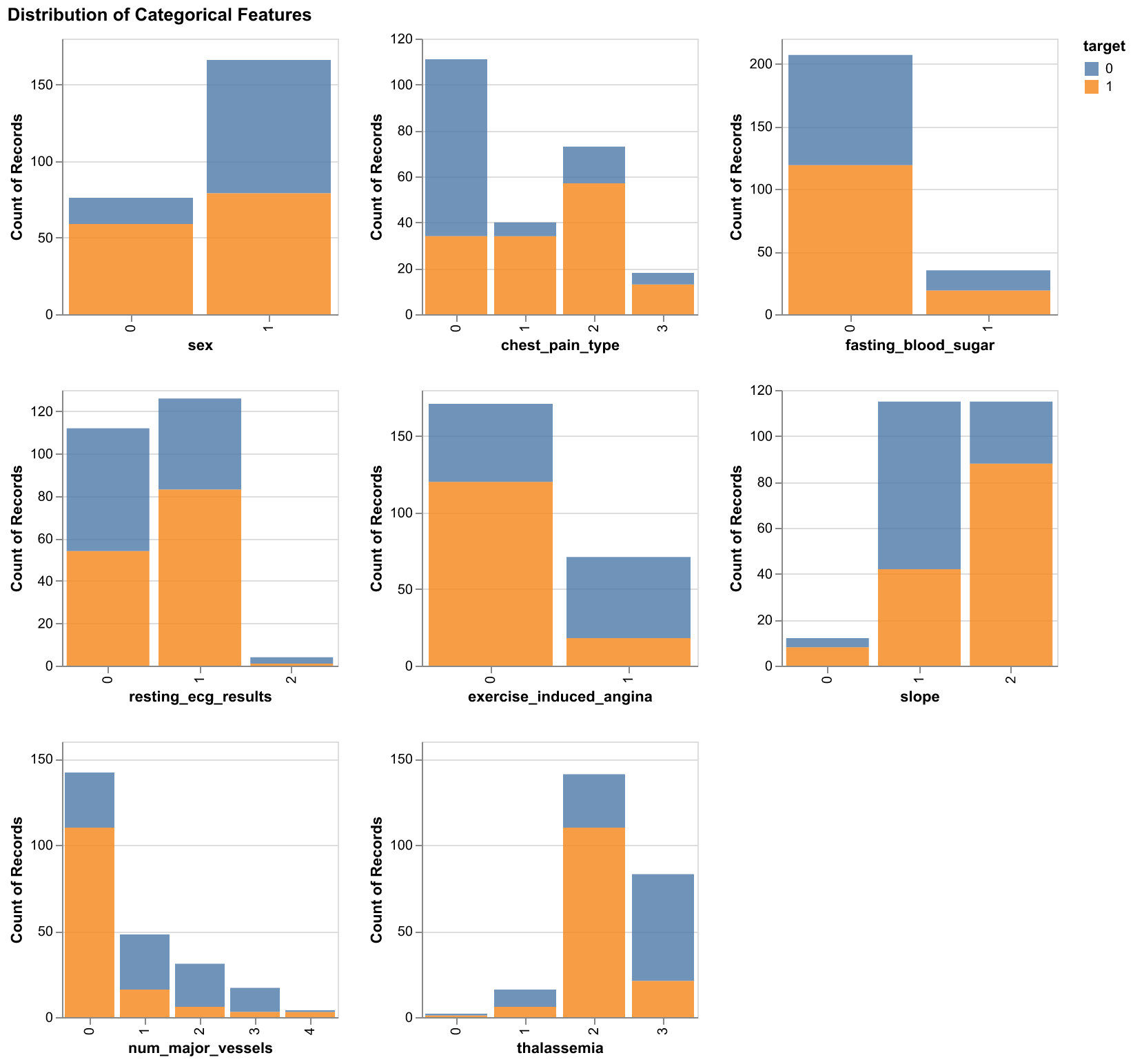
During the EDA stage, we first created histograms for the numeric features and bar plots for the categorical features, all of them were colored by the target.

Figure 1. Histograms of numeric features with respect to two target classes

Figure 2. Bar plots of categorical features with respect to two target classes
The two plots above demonstrated the varying ranges of the feautres and it helps to highlight what sort of preprocessing will be needed in order to incorporate the features into our predictive model.
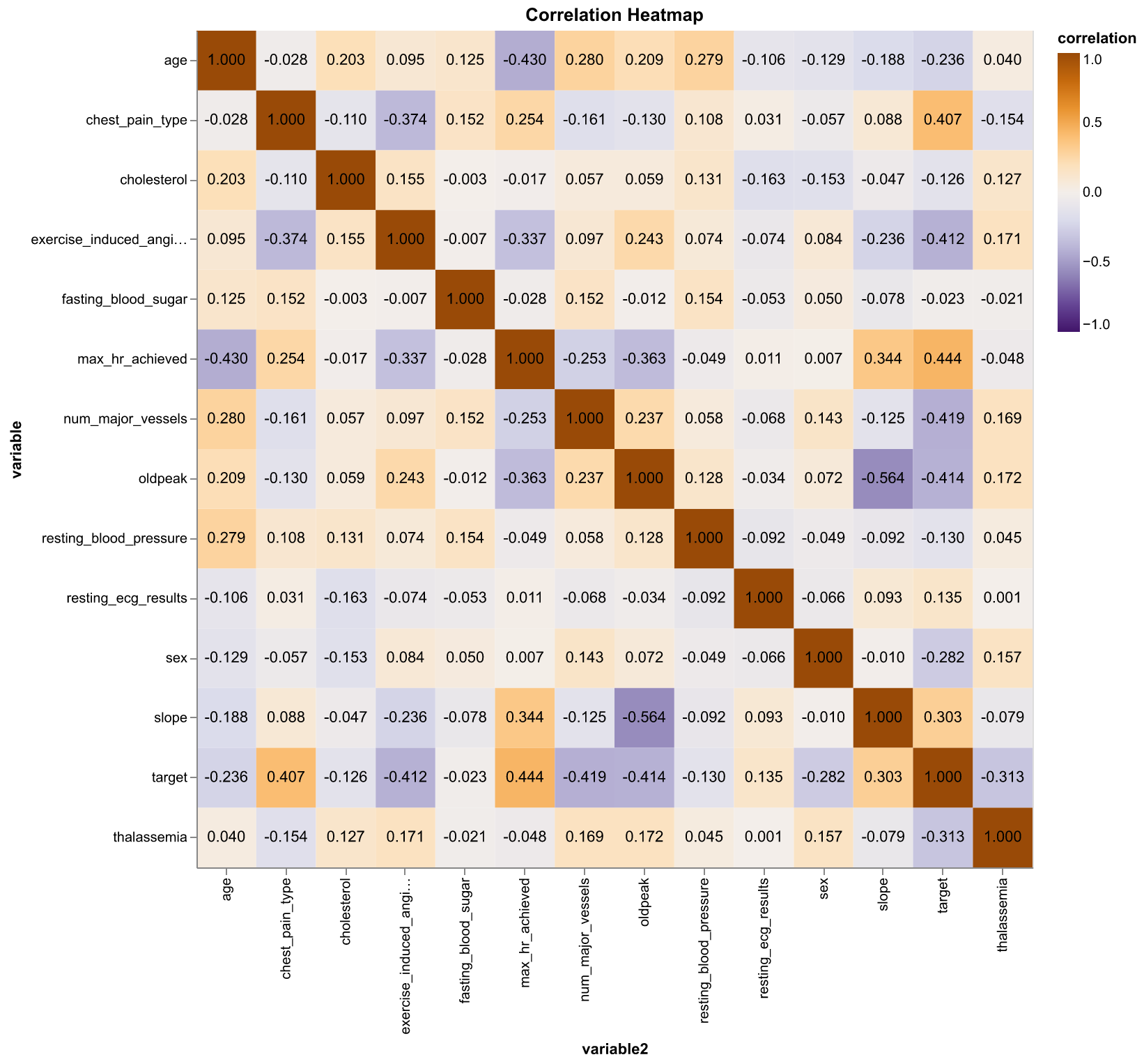
Next, we created a pairwise correlation matrix for all the features and also the target to see if any particular feature might be more useful when predicting the target class.

Figure 3. Correlation heatmap of numeric features and the target class. Orange indicates positive correlation and purple indicates negative correlation (Pearson correlation coefficient)
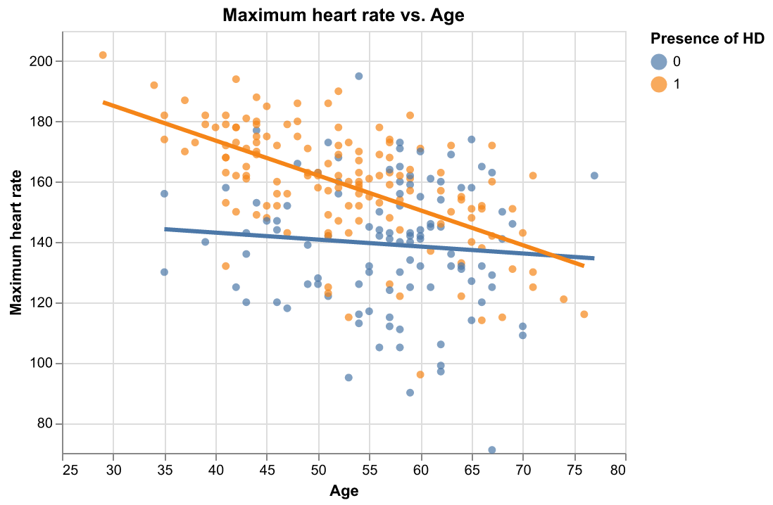
It seems that there are some moderate correlations between some pairs of features. Also, max_hr_achieved has the highest correlation with target (\(\rho = 0.44\)) while max_hr_achieved have a moderate negative correlation with age (\(\rho = -0.41\)). We plot max_hr_achieved against age and colored the plot by age; in addition, we fit two simple linear regression line to see if the distinction of target class is large enough just by using these two features.

Figure 4. Scatter plot of maximum heart rate achieved versus age with respect to the two target classes with fitted regression lines.
For our project, we used Python as the language of our analysis pipeline [Perez et al., 2011]. In the EDA stage, the plots and tables are created using Altair [VanderPlas et al., 2018] and Pandas [Wes McKinney, 2010]. Machine learning models were built using the scikit-learn library [Pedregosa et al., 2011] and Scipy is also used to generate hyperparameter distributions [Virtanen et al., 2020]. Other python libraries used for our project also include docopt [de Jonge, 2020], Vega-Lite [Satyanarayan et al., 2017] and Numpy [Harris et al., 2020].
