After eight months of coursework, the UBC Master of Data Science (MDS) program concludes with a 2-month Capstone project. We partnered with Ido Roll from UBC’s Centre for Teaching, Learning and Technology (CTLT) to analyze data from UBC’s massive open online courses (MOOCs). UBC offers dozens of MOOCs to thousands of students through the edX platform. Unlike in-person classes, in a MOOC the instructor cannot observe student engagement directly. Instead, they must infer student engagement from recorded events (for example, a student pausing a video). A single course can involve millions of events in its lifetime, which means there was lots of data for us to look through. Our task was to build a dashboard to help MOOC instructors answer the following questions:
- Who are my students?
- How do students watch/use course videos?
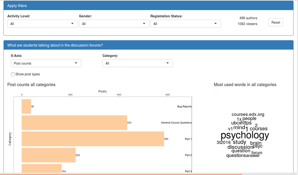
- What are students talking about in the discussion forums?
- How well are my students doing on problems and assignments?
- What supplementary material are my students using?
A Tour of the Dashboards
Below I describe four of the visualizations included in our project.
Demographics
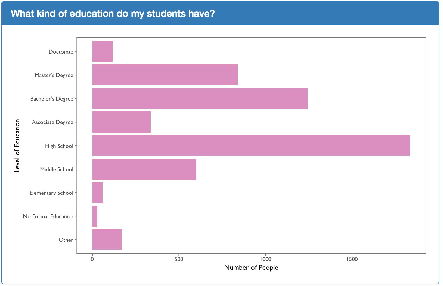
A common question that instructors asked was, “Who are my students?” One can filter this visualization by gender, engagement time, and if a user paid for the course. We chose the bar plot for many of our visualizations. Bar plots provide instructors with an easy way to interpret the distribution of data. This bar plot shows the number of users at each education level in a course.
Video Watch Rates
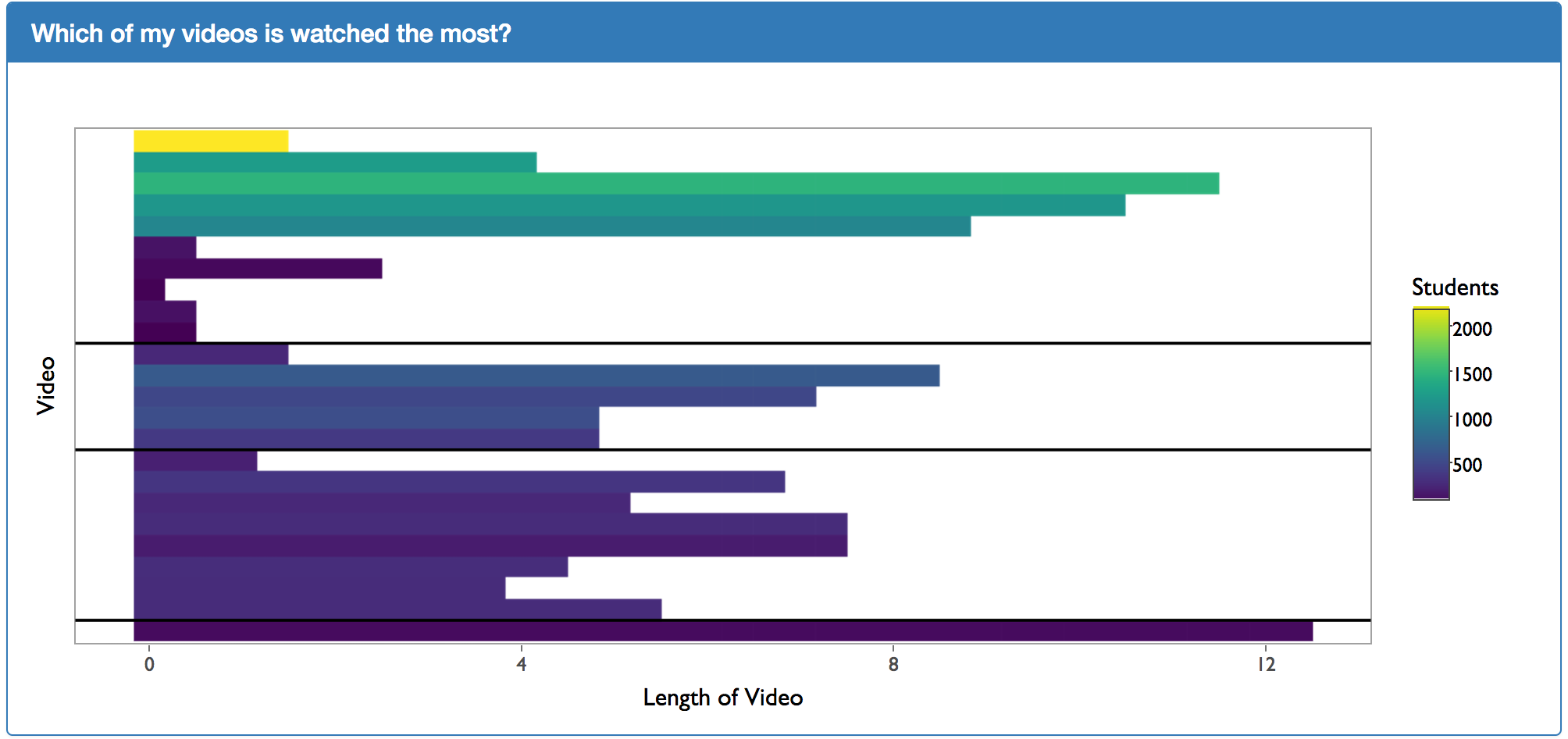
We received feedback that our more complicated video plots were difficult to interpret. Our solution was to provide this simple bar plot to anchor the instructor. This plot shows where the video appears in the course (the start of the course is at the top) and how long the videos were. We found that if we included the names of the videos on the plot, it looked too busy. To remedy this, we used a mouseover to display the name and more detailed information.
Detecting High and Low Watch Rates
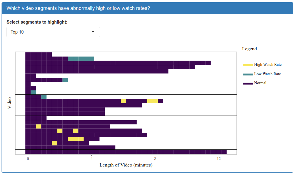
In all the courses we observed, users watched the first video more than any other. We also found that users watched the first 30 seconds of a video more than any other segment. Thus, showing video watch rates would mostly just echo these trends. To address this issue, we created a visualization that highlights video segments that deviate from this expectation. To do so, we created a linear regression model to find the expected watch rate for each video segment in each video. We then display the deviation of the actual watch rate from the expected one.
Forums Word Cloud and Bar Plot
No existing edX dashboard shows the topics that forum users are discussing. To remedy this, we created a linked bar plot and word cloud. The bar plot shows where student activity occurs, and the word cloud shows the most prominent topics that they discuss. The instructor can drill down into a section by clicking a bar, which will update the word cloud.
Future Plans
These dashboards are now available for all UBC MOOCs via the CTLT. In the future, we hope to build dashboards for in-person classes as well.
If you would like to contribute to the project, you can find our code here and documentation here.
Lessons Learned
The amount of data in these courses made this project challenging. One of the most valuable things I learned during the Capstone project was how to build data pipelines. We had learned about cloud computing and Docker in class, but deploying a massive project was tricky. Another difficulty of the project was that no two courses were the same. We had to be careful to design visualizations that would apply to as many classes as possible. I also learned the importance of getting rapid feedback. Our original plots only made sense to us after we had explained them to our users. However, each iteration of user testing made the visualizations more intuitive, until they eventually reached a point where users could navigate the dashboard without our help.
Acknowledgments
I would like to thank Ido Roll and Sarah Perez from UBC CTLT, and the users who provided feedback during the development of these dashboards. I would also like to thank my fellow team members David Laing, Andrew Lim and Subi Zhang, as well as our Teaching Fellow mentor Giulio Dalla Riva.
Matthew Emery graduated from the UBC MDS program in 2017 and is currently a Data Scientist at Imbellus. Imbellus builds assessments to measure cognitive skills for new hires.