Lecture 7 Dependence
Today’s topic is dependence, and in particular its implications in one variable informing us about another. We’ll end off with the Multivariate Gaussian distribution.
7.1 Learning Objectives
From today’s lecture, students are expected to be able to:
- Interpret a contour plot, especially as a bivariate density.
- Identify the relationship between two independent continuous random variables and their conditional distributions (given one of the two variables).
- Extract the information that a random variable \(X\) holds about \(Y\) by conditioning on \(X\) and producing model functions.
- Compute marginal distributions and means using joint distributions, and especially using conditional distributions.
- Identify the direction of dependence from a contour plot of a joint density function.
A note on plotting: You will not be expected to make contour plots like you see in these lecture notes. That will be saved for next block in DSCI 531: Data Visualization I.
7.2 Drawing multidimensional functions (5 min)
Drawing a \(d\)-dimensional function requires \(d+1\) dimensions, so we usually just draw 1-dimensional functions, and occasionally draw 2-dimensional functions, and almost never draw functions with \(d>2\) inputs.
A common way to draw 2-dimensional functions is to use contour plots, but you can also think of the output dimension as coming out of the page.
Here are some examples of how to draw 2-dimensional functions: in python and in R.
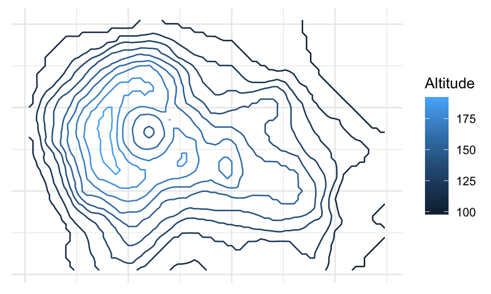
Here’s an example of a 3D drawing of a volcano (taken directly out of the example in the documentation of rgl::surface3d()):
You must enable Javascript to view this page properly.
And, a contour plot rendering:
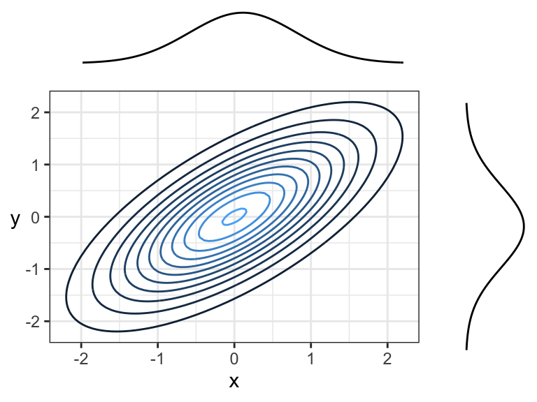
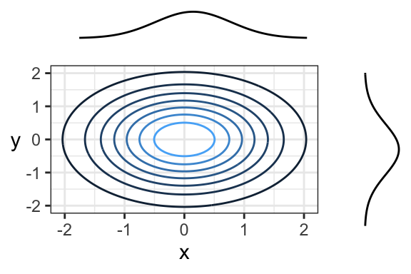
When it comes to bivariate density functions (pdf’s), it’s informative to plot the marginal densities on each axis. Here’s an example where marginals are Gaussian, and the joint distribution is also Gaussian (we’ll see what this means later today):
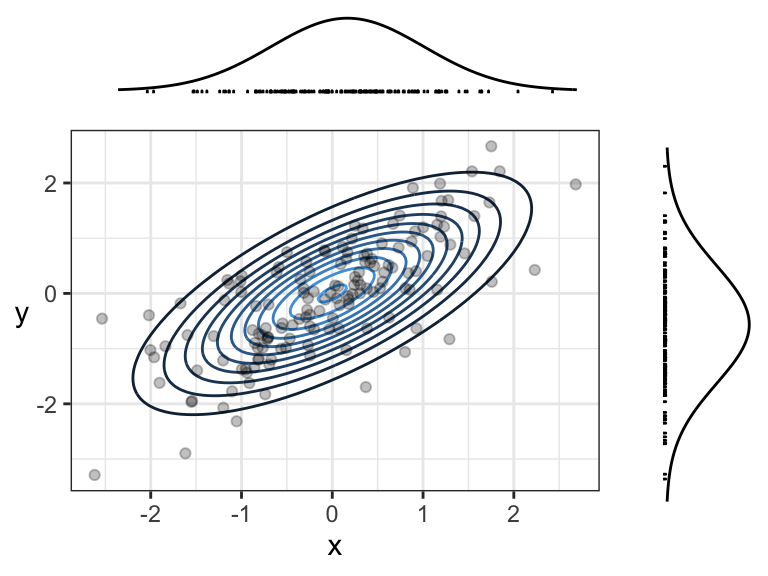
Remember, the density function tells us how “densely packed” data coming from this distribution will be. Here’s the same plot, but with a sample of size 150 plotted overtop. The individual \(x\) and \(y\) coordinates are also plotted below their corresponding densities. Notice that points are more densely packed near the middle, where the density function is biggest.
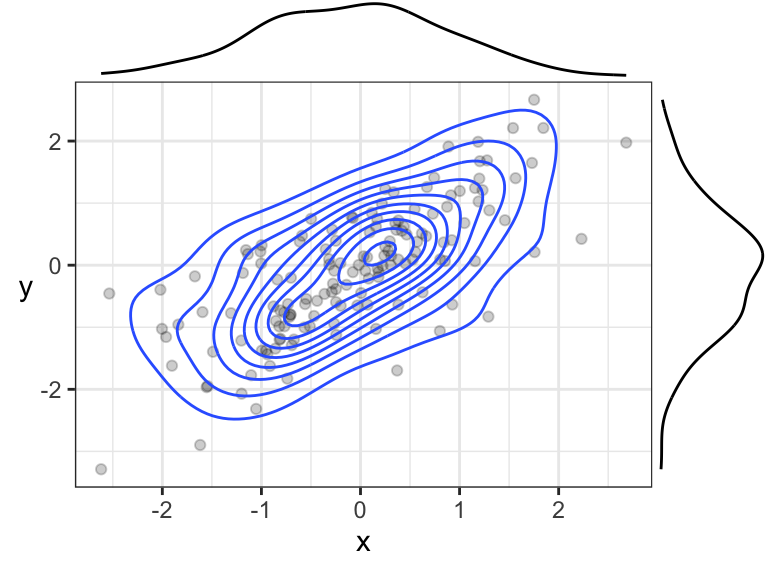
7.2.1 A possible point of confusion: empirical contour plots
The contour + simulated data plot is meant to show you the relationship between the joint density function and the density of data points. In practice, we don’t know the joint density function nor the marginals, so we use an empirical version instead. You’ll learn about these in DSCI 531.
Here’s an example of a contour plot of an empirical joint density function, and empirical marginal densities:
7.3 Independence Revisited (10 min)
7.3.1 Definition in the Continuous Case
Recall that independence of random variables \(X\) and \(Y\) means that knowledge about one variable tells us nothing about another variable.
In the discrete case, this means that a joint probability distribution (when depicted as a table) has each row/column as a multiple of the others, because (by definition of independence) \[P(X = x, Y = y) = P(X = x) P(Y = y).\] In the continuous case, as usual, probabilities become densities. A definition of independence then becomes \[f_{X,Y}(x, y) = f_Y(y) \ f_X(x).\] This means that, when slicing the joint density at various points along the x-axis (also for the y-axis), the resulting one-dimensional function will be the same, except for some multiplication factor.
Perhaps a more intuitive definition of independence is when \(f_{Y \mid X}(y \mid x) = f_Y(y)\) for all possible \(x\) – that is, knowing \(X\) does not tell us anything about \(Y\). The same could be said about the reverse. To see why this definition is equivalent to the above definition, consider a more general version of the above formula, which holds regardless of whether have have independence (we’ve seen this formula before): \[f_{X,Y}(x, y) = f_{Y \mid X}(y \mid x) \ f_X(x).\] Setting \(f_{Y \mid X}\) equal to \(f_Y\) results in the original definition above.
7.3.2 Independence Visualized
In general, just by looking at a contour plot of a bivariate density, it’s hard to tell whether this distribution is of two independent random variables. But, we can tell by looking at “slices” of the distribution.
Here is an example of two independent random variables, where \(X \sim \text{Exp}(1)\) and \(Y \sim N(0,1)\). We’re going to slice the density along the dotted lines:
Here are the slices. In each case:
- The slice axis gets put on the x-axis, and
- The “z-axis” (the one coming “out of the page”) gets put on the y-axis.
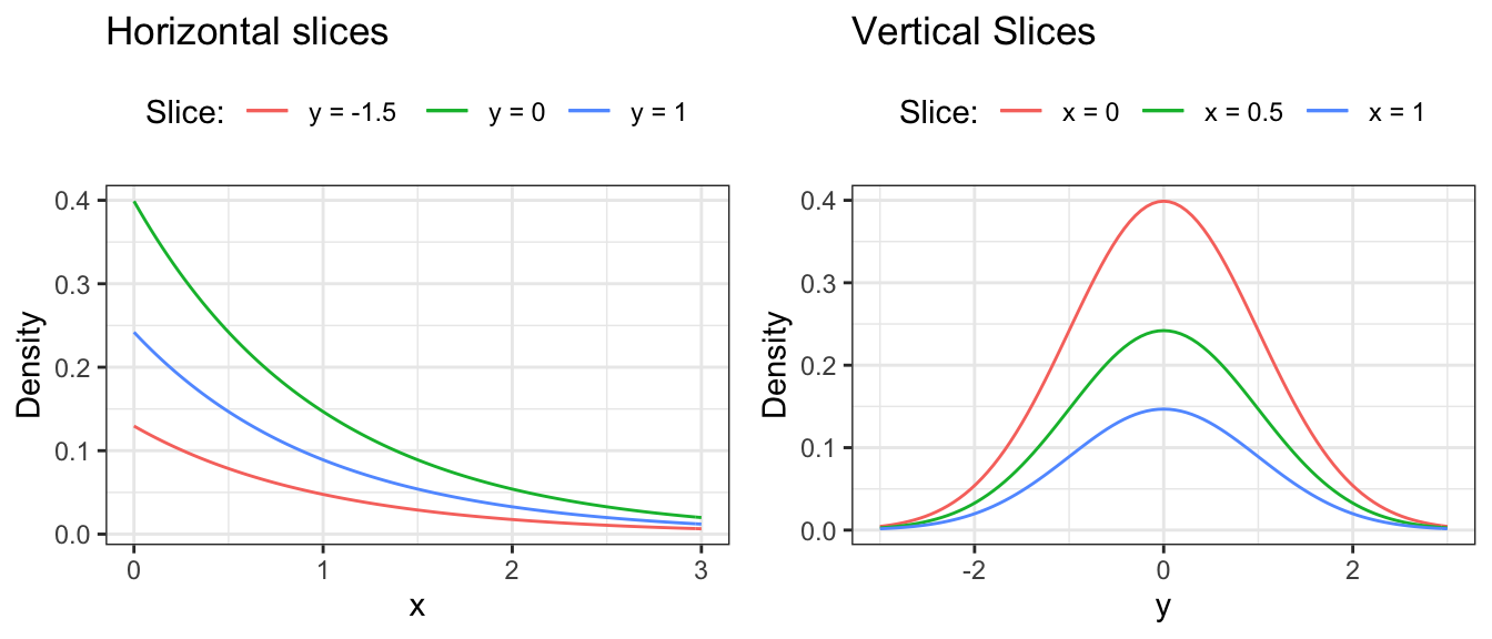
Again, looking above, it’s not that each vertical (or horizontal) slice is the same, but they are all the same when the slice is normalized. In other words, every slice has the same shape.
What do we get when we normalize these slices so that the curves have an area of 1 underneath? We get the conditional distributions given the slice value, by definition. And, these conditional distributions will be the exact same (one for each axis \(X\) and \(Y\)), since the sliced densities only differ by a multiple anyway. What’s more, this common distribution is just the marginal. Mathematically, what we’re saying is \[f_{Y \mid X}(y \mid x) = \frac{f_{X,Y}(x,y)}{f_X(x)} = \frac{f_{X}(x) f_{Y}(y)}{f_X(x)} = f_Y(y)\] (and the same for \(X \mid Y\)). Again, we’re back to the definition of independence!
Here’s another example of an independent joint distribution:
7.3.3 Activity
The following are different scenarios of a bivariate density being sliced along different values of \(X\), and plotting the resulting surface overtop of the slice. Which of the following are examples of independence between \(X\) and \(Y\)?
7.4 Harvesting Dependence (20 min)
The opposite of independence is dependence: when knowing something about \(X\) tells us something about \(Y\) (or vice versa). Extracting this “signal” that \(X\) contains about \(Y\) is at the heart of supervised learning (regression and classification), covered in DSCI 571/561 and beyond.
Usually, we reserve the letter \(X\) to be the variable that we know something about (usually an exact value), and \(Y\) to be the variable that we want to learn about. These variables go by many names – usually, \(Y\) is called the response variable, and \(X\) is sometimes called a feature, or explanatory variable, or predictor, etc.
To extract the information that \(X\) holds about \(Y\), we simply use the conditional distribution of \(Y\) given what we know about \(X\). This is as opposed to just using the marginal distribution of \(Y\), which corresponds to the case where we don’t know anything about \(X\).
Sometimes it’s enough to just communicate the resulting conditional distribution of \(Y\), but usually we reduce this down to some of the distributional properties that we saw earlier, like mean, median, or quantiles. We communicate uncertainty also using methods we saw earlier, like prediction intervals and standard deviation.
Let’s look at an example.
7.4.1 Example: River Flow
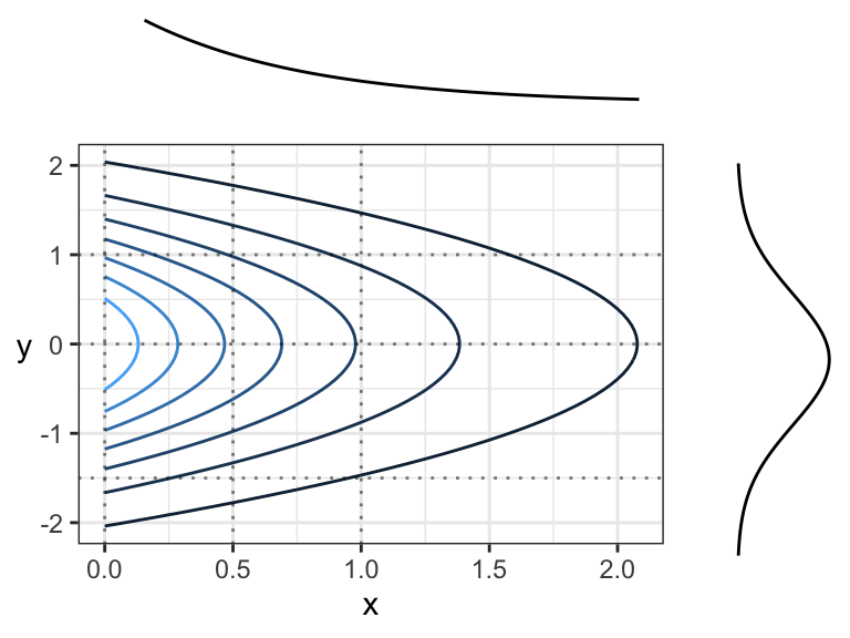
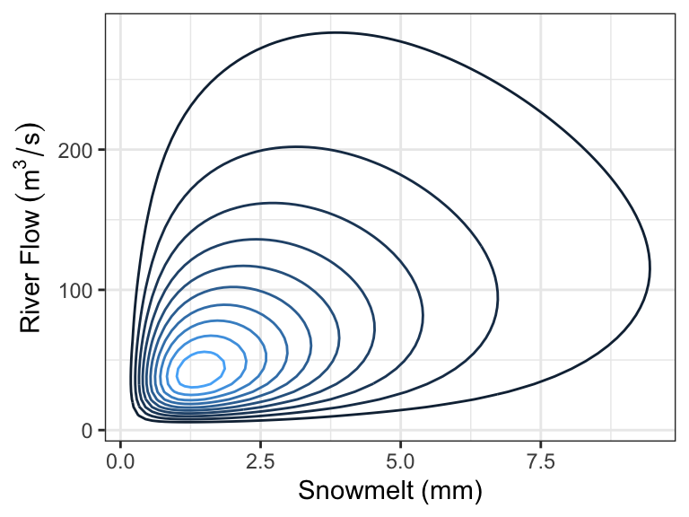
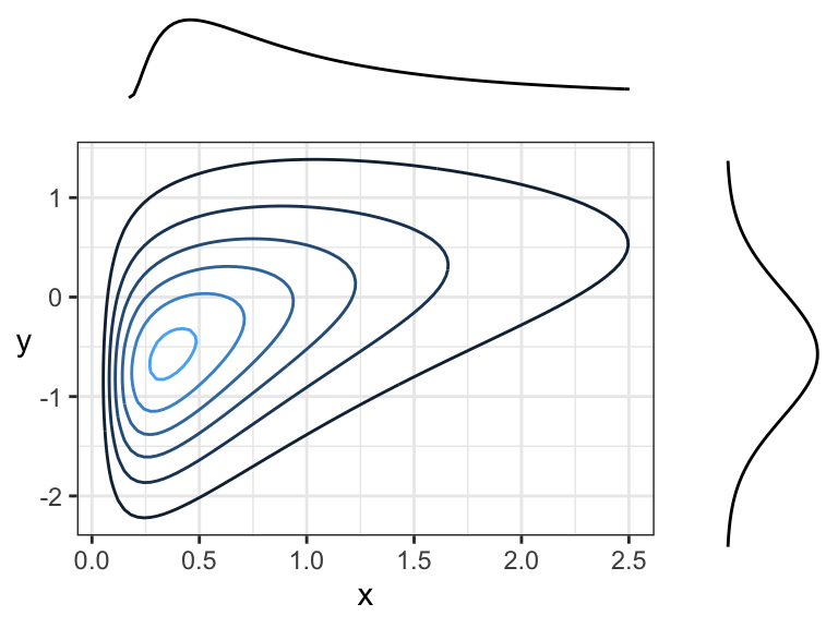
In the Rocky Mountains, snowmelt \(X\) is a major driver of river flow \(Y\). Suppose the joint density can be depicted as follows:
Every day, a measurement of snowmelt is obtained. To predict the river flow, usually the conditional mean of river flow given snowmelt is used as a prediction, but median is also used. Here are the two quantities as a function of snow melt:
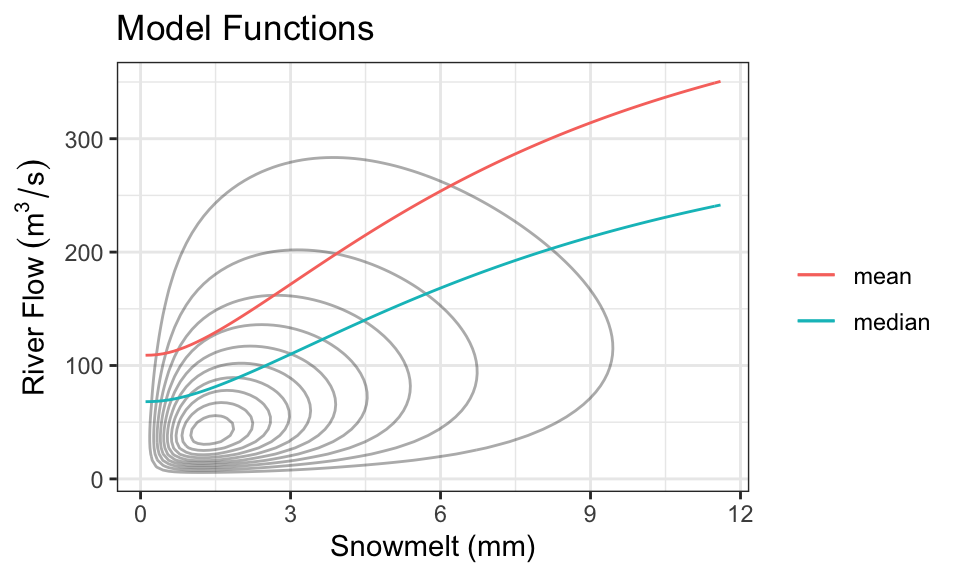
These functions are called model functions, and there are a ton of methods out there to help us directly estimate these model functions without knowing the density. This is the topic of supervised learning – even advanced supervised learning methods like deep learning are just finding a model function like this (although, usually when there are more than one \(X\) variable).
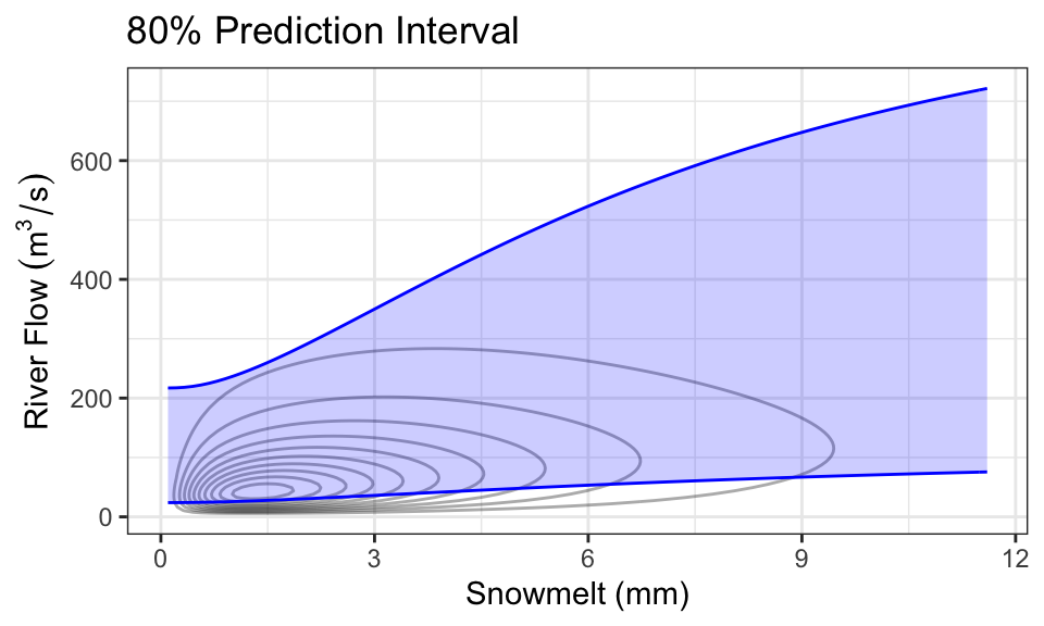
It’s also quite common to produce prediction intervals. Here is an example of an 80% prediction interval, using the 0.1- and 0.9-quantiles as the lower and upper limits:
As a concrete example, consider the case where we know there’s been 1mm of snowmelt. To obtain the conditional distribution of flow (\(Y\)) given this information, we just “slice” the joint density at \(x =\) 1, and renormalize. Here is that density (which is now univariate!), compared with the marginal distribution of \(Y\) (representing the case where we know nothing about snowmelt, \(X\)):
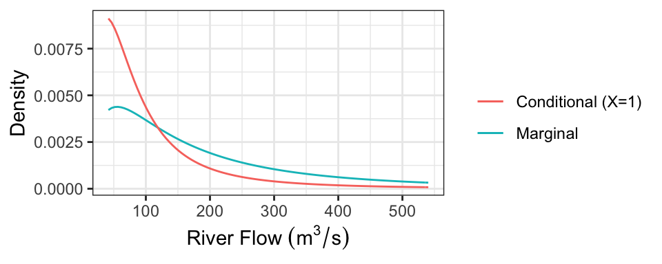
The following table presents some properties of these distributions:
| Quantity | Marginal | Conditional |
|---|---|---|
| Mean | 247.31 | 118.16 |
| Median | 150 | 74.03 |
| 80% PI | [41.64, 540.33] | [25.67, 236.33] |
Notice that we actually only need the conditional distribution of \(Y\) given \(X=x\) for each value of \(x\) to produce these plots! In practice, we usually just specify these conditional distributions. So, having the joint density is actually “overkill”.
7.4.2 Direction of Dependence
Two variables can be dependent in a multitude of ways, but usually there’s an overall direction of dependence:
- Positively related random variables tend to increase together. That is, larger values of \(X\) are associated with larger values of \(Y\).
- Negatively related random variables have an inverse relationship. That is, larger values of \(X\) are associated with smaller values of \(Y\).
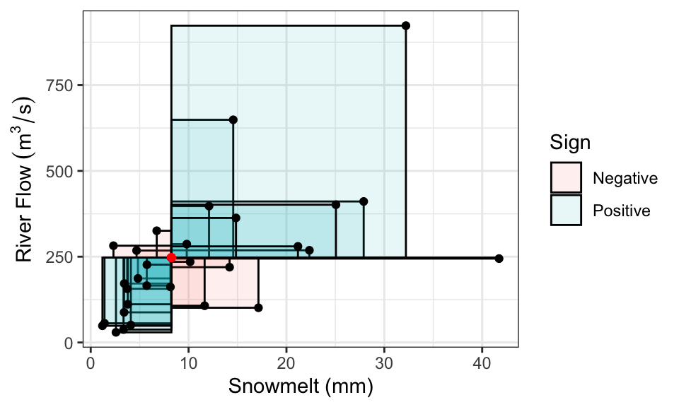
We’ve already seen some measures of dependence in the discrete setting: covariance, correlation, and Kendall’s tau. These definitions carry over. It’s a little easier to visualize the definition of covariance as the signed sum of rectangular area:
Correlation, remember, is also the signed sum of rectangles, but after converting \(X\) and \(Y\) to have variances of 1.
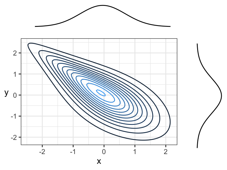
Here are two positively correlated variables, because there is overall tendency of the contour lines to point up and to the right (or down and to the left):
Here are two negatively correlated variables, because there is overall tendency for the contour lines to point down and to the right (or up and to the left):
Another example of negative correlation. Although contour lines aren’t pointing in any one direction, there’s more density along a line that points down and to the right (or up and to the left) than there is any other direction.
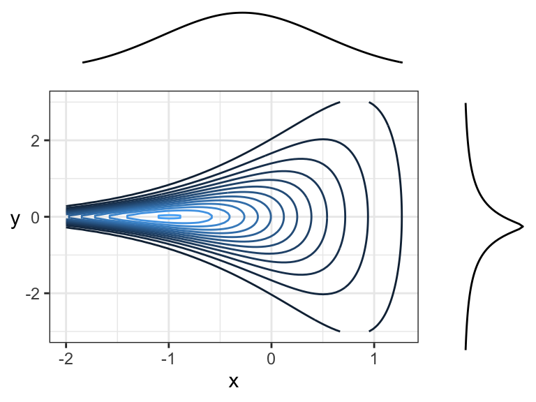
Here are two random variables that are dependent, yet have 0 correlation (both Pearson’s and Kendall’s) because the overall trend is flat (pointing left or right). You can think of this in terms of slicing: slicing at \(x = -2\) would result in a highly peaked distribution near \(y = 0\), whereas slicing at \(x = 1\) would result in a distribution with a much wider spread – these are not densities that are multiples of each other! Prediction intervals would get wider with larger \(x\).
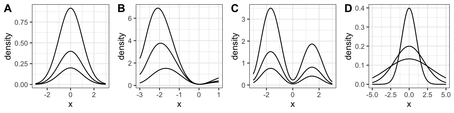
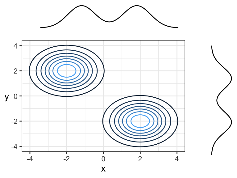
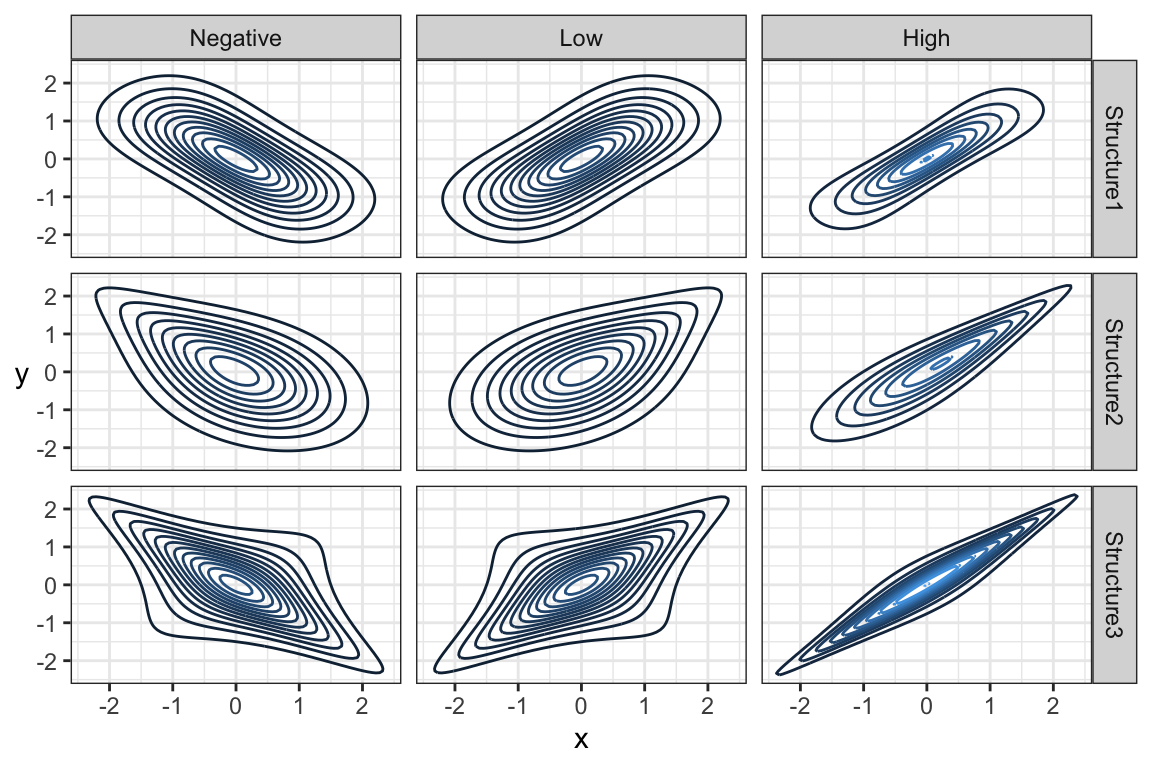
Note that the marginal distributions have nothing to do with the dependence between random variables. Here are some examples of joint distributions that all have the same marginals (\(N(0,1)\)), but different dependence structures and strengths of dependence:
7.5 Marginal Distributions (20 min)
In the river flow example, we used snowmelt to inform river flow by communicating the conditional distribution of river flow given snowmelt. But, this requires knowledge of snowmelt! What if one day we are missing an observation on snowmelt? Then, the best we can do is communicate the marginal distribution of river flow. But how can we get at that distribution? Usually, aside from the data, we only have information about the conditional distributions. But this is enough to calculate the marginal distribution!
7.5.1 Marginal Distribution from Conditional
We can use the law of total probability to calculate a marginal density. Recall that for discrete random variables \(X\) and \(Y\), we have \[P(Y = y) = \sum_x P(X = x, Y = y) = \sum_x P(Y = y \mid X = x) P(X = x).\] The same thing applies in the continuous case, except probabilities become densities and sums become integrals (as usual in the continuous world): for continuous \(X\) and \(Y\), \[f_Y(y) = \int_x f_{X,Y}(x,y)\ \text{d}x = \int_x f_{Y\mid X}(y \mid x)\ f_X(x)\ \text{d}x.\]
Notice that this is just an average of the conditional densities! If we have the conditional densities and a sample of \(X\) values \(x_1, \ldots, x_n\), then using the empirical approximation of the mean, we have \[f_Y(y) \approx \frac{1}{n} \sum_{i = 1}^n f_{Y\mid X}(y \mid x_i).\]
A similar result holds for the cdf. We have \[F_Y(y) = \int_x F_{Y \mid X}(y \mid x)\ f_X(x) \ \text{d}x,\] and empirically, \[F_Y(y) \approx \frac{1}{n}\sum_{i = 1}^n F_{Y\mid X}(y \mid x_i).\]
7.5.2 Marginal Mean from Conditional
Perhaps more practical is finding the marginal mean, which we can obtain using the law of total expectation (similar to the discrete case we saw in a previous lecture): \[E(Y) = \int_x m(x) \ f_{X}(x) \ \text{d}x = E(m(X)),\] where \(m(x) = E(Y \mid X = x)\) (i.e., the model function or regression curve).
When you fit a model using supervised learning, you usually end up with an estimate of \(m(x)\). From the above, we can calculate the marginal mean as the mean of \(m(X)\), which we can do empirically using a sample of \(X\) values \(x_1, \ldots, x_n\). Using the empirical mean, we have \[E(Y) \approx \frac{1}{n} \sum_{i=1}^n m(x_i).\]
7.5.3 Marginal Quantiles from Conditional
Unfortunately, if you have the \(p\)-quantile of \(Y\) given \(X = x\), then there’s no convenient way of calculating the \(p\)-quantile of \(Y\) as an average. To obtain this marginal quantity, you would need to calculate \(F_Y(y)\) (as above), and then find the value of \(y\) such that \(F_Y(y) = p\).
7.5.4 Activity
You’ve observed the following data of snowmelt and river flow:
| Snowmelt (mm) | Flow (m^3/s) |
|---|---|
| 1 | 140 |
| 3 | 150 |
| 3 | 155 |
| 2 | 159 |
| 3 | 170 |
From this, you’ve deciphered that the mean flow given snowmelt is \[E(\text{Flow} \mid \text{Snowmelt} = x) = 100 + 20x.\]
You also decipher that the conditional standard deviation is constant, and is: \[SD(\text{Flow} \mid \text{Snowmelt} = x) = 15\ m^3/s\] It also looks like the conditional distribution of river flow given snowmelt follows a Lognormal distribution.
Part 1: A new reading of snowmelt came in, and it’s 4mm.
- Make a prediction of river flow.
- What distribution describes your current understanding of what the river flow will be?
Part 2: Your snowmelt-recording device is broken, so you don’t know how much snowmelt there’s been.
- Make a prediction of river flow.
- What distribution describes your current understanding of what the river flow will be?
- Someone tells you that a 90% prediction interval is [70, 170]. What do we know about the median?
7.6 Multivariate Gaussian/Normal Family (20 min)
Moved to Lecture 8