Causality and Experimentation Cheatsheet#
This cheatsheet includes different theoretical concepts along with useful formulas.
ANOVA Basics#
In Lecture 2 - Confounding and Randomized versus Non-randomized Studies, we firstly mentioned Analysis of Variance (ANOVA) as one possible A/B testing approach. ANOVA is just one specific class of Ordinary Least-squares (OLS) model (a continuous response versus a categorical and nominal regressor). That said, ANOVA can also be used in A/B/n testing (i.e., a experiment with more than two treatments).
We will explore experimental terminology via an example.
The Website Dataset#
In your A/B/n testing, the next \(n = 72\) visitors to your website will get assigned to a random version that varies in six possible ways according to combinations of the following variables:
Font: A factor-type variable with three levels (small,medium, andlarge).Button
Colour: A factor-type variable with two levels (RedandBlue).
Your outcome of interest \(Y\) is the continuous Duration of the visit recorded for each visitor in minutes. The experimental data is contained in AB_data.
ABn_data
| Duration | Colour | Font |
|---|---|---|
| <dbl> | <fct> | <fct> |
| 90 | Red | Small |
| 95 | Red | Large |
| 107 | Red | Medium |
| 92 | Red | Small |
| 89 | Red | Large |
| 92 | Red | Medium |
| 81 | Red | Small |
| ⋮ | ⋮ | ⋮ |
| 114 | Blue | Medium |
| 109 | Blue | Small |
| 131 | Blue | Large |
| 126 | Blue | Medium |
| 116 | Blue | Small |
| 136 | Blue | Large |
| 133 | Blue | Medium |
Experimental Terminology#
The field of Design and Analysis of Experiments has some key jargon we need to learn. In the context of this problem, we will introduce some experimental design terminology.
Note that each subgroup of visitors sees one version of the website (all possible six pairwise combinations of Small/Medium/Large fonts and Blue/Red button colours). Therefore, let us make a list of experimental characteristics:
The variables
FontandColourare called experimental factors.We consider an experiment with six treatments (i.e., the six possible pairwise level combinations of
FontandColour). This characteristic makes our experiment an A/B/n testing (more than two treatments!).
Each visitor is called an experimental unit.
Since we have more than one experimental unit by treatment, the experiment involves replicates (\(72 / 6 = 12\) per treatment).
Because the same number of experimental units is assigned to each treatment, the experiment is balanced.
The experimental units were randomized to either one of the six experimental treatments.
All six possible combinations of factor levels were used, so the experimental design is called a full factorial design.
We might specifically call this a \(2 \times 3\) full factorial design, since there are two factors (
Colourwith two levels andFontwith three levels).
Two-way ANOVA with main effects only#
We will proceed with some statistical modelling. The first model is called a two-way ANOVA with main effects only.
Important
A main effect refers to a standalone regressor in our model.
In experimental notation, the response \(Y_{i, j, k}\) for the \(i\)th Font level, the \(j\)th Colour level, and the \(k\)th experimental unit is decomposed as:
where:
\(\mu_i\) is the main effect on the mean response of the \(i\)th
Fontlevel (for \(i = 1, 2, 3\)),\(\tau_{j}\) is the main effect on the mean response of the \(j\)th
Colourlevel (for \(j = 1, 2\)), and\(\varepsilon_{i, j, k}\) is the error component assumed as independent, normally distributed, with mean zero and common variance \(\sigma^2\) (for \(k = 1, \dots, 12\)).
We can fit this model with the lm() function.
# Releveling factors according to the control treatment
ABn_data$Colour <- fct_relevel(
  ABn_data$Colour,
  c("Blue", "Red")
)
ABn_data$Font <- fct_relevel(
  ABn_data$Font,
  c("Small", "Medium", "Large")
)
OLS_ABn_main_effects <- lm(formula = Duration ~ Font + Colour, data = ABn_data)
tidy(OLS_ABn_main_effects, conf.int = TRUE) %>% mutate_if(is.numeric, round, 2)
| term | estimate | std.error | statistic | p.value | conf.low | conf.high |
|---|---|---|---|---|---|---|
| <chr> | <dbl> | <dbl> | <dbl> | <dbl> | <dbl> | <dbl> |
| (Intercept) | 103.64 | 3.32 | 31.20 | 0.00 | 97.01 | 110.27 |
| FontMedium | 12.75 | 4.07 | 3.13 | 0.00 | 4.63 | 20.87 |
| FontLarge | 7.67 | 4.07 | 1.88 | 0.06 | -0.45 | 15.78 |
| ColourRed | -21.44 | 3.32 | -6.46 | 0.00 | -28.07 | -14.82 |
The above tidy() output only sheds light on the fact that the medium Font and red Colour are statistically significant with \(\alpha = 0.05\) to the baseline levels (small and blue). Nonetheless, we might better use an ANOVA table.
Important
ANOVA tables go hand-in-hand with randomized experiments. They are helpful to organize regression fits to factorial experiment data. The table decomposes the sum of squares (i.e., variability) for each experimental factor. To obtain these tables, we can use the function anova().
anova(OLS_ABn_main_effects) %>% mutate_if(is.numeric, round, 2)
| Df | Sum Sq | Mean Sq | F value | Pr(>F) | |
|---|---|---|---|---|---|
| <dbl> | <dbl> | <dbl> | <dbl> | <dbl> | |
| Font | 2 | 1977.44 | 988.72 | 4.98 | 0.01 |
| Colour | 1 | 8277.56 | 8277.56 | 41.69 | 0.00 |
| Residuals | 68 | 13501.44 | 198.55 | NA | NA |
The previous table will allow us to test the following composite hypotheses (i.e., we test more than one parameter at the same time) by experimental factor:
Font
Colour
With \(\alpha = 0.05\), we can state that at least one pair of factor levels in Font is statistically different in terms of their mean responses. In the case of Colour, its two levels are statistically different in terms of their mean responses.
Two-way ANOVA with interactions#
As a general experimental guideline, we should consider the potential for interactions with two or more factors. A two-factor interaction plot will give us a graphical insight into a statistically significant interaction.
Important
A two-factor interaction plot has the continuous outcome of interest on the \(y\)-axis and the first factor levels on the \(x\)-axis. The plot illustrates lines whose nodes correspond to mean responses by factor level. We can also plot error bars by a node. There will be as many coloured lines as levels in the second factor.
options(repr.plot.height = 8, repr.plot.width = 14)

ABn_int_plots <- ABn_data %>%
  ggplot(aes(x = Font, colour = Colour, group = Colour, y = Duration)) +
  stat_summary(fun = mean, geom = "point", size = 5) +
  stat_summary(fun = mean, geom = "line") +
  stat_summary(fun.data = mean_se, geom = "errorbar", width = 0.1) +
  theme(
    plot.title = element_text(size = 24, face = "bold"),
    axis.text = element_text(size = 17),
    axis.title = element_text(size = 21),
    legend.position = "bottom",
    legend.title = element_text(size = 21, face = "bold", margin = margin(r = 1, unit = "cm")),
    legend.text = element_text(size = 17, margin = margin(r = 1, unit = "cm"))
  ) +
  ggtitle("Interaction Plots") +
  xlab("Font") +
  ylab("Visit Duration (min)") +
  scale_color_manual(values = c("blue", "red"))
The interaction plot below corresponds to our case study. A graphical interaction will occur if one factor level (Font) differs by the level of the other factor (Colour) while the lines cross.
ABn_int_plots
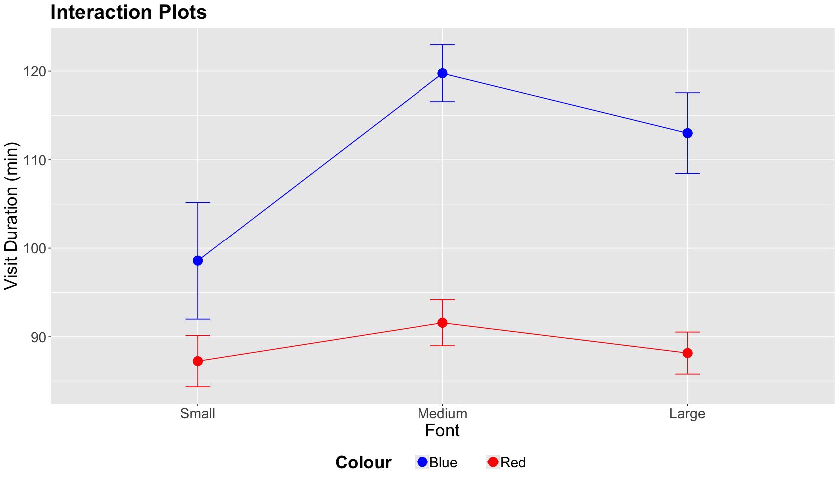
In this case, the lines by Colour level do not cross while we vary Font sizes. Hence, we do not have graphical evidence of a two-factor interaction.
Now let us confirm the previous graphical result by fitting an OLS model that includes an interaction term, as shown below. This model is called a two-way ANOVA with interaction effects. This model includes both main effects and two-factor interaction terms. In experimental notation, the response \(Y_{i, j, k}\) for the \(i\)th Font level, the \(j\)th Colour level, and the \(k\)th experimental unit is decomposed as:
where:
\(\mu_i\) is the main effect on the mean response of the \(i\)th
Fontlevel (for \(i = 1, 2, 3\)),\(\tau_{j}\) is the main effect on the mean response of the \(j\)th
Colourlevel (for \(j = 1, 2\)),\((\mu \tau)_{i, j}\) is the interaction effect of both factors on the mean response of the \(i\)th and \(j\)th levels, and
\(\varepsilon_{i, j, k}\) is the error component assumed as independent, normally distributed, with mean zero and common variance \(\sigma^2\) (for \(k = 1, \dots, 12\)).
Caution
The term \((\mu \tau)_{i, j}\) DOES NOT indicate that the main effects are multiplying each other. Mathematically, it is another modelling term.
We use Duration ~ Colour * Font as a formula argument in lm().
OLS_ABn_interaction <- lm(formula = Duration ~ Colour * Font, data = ABn_data)
tidy(OLS_ABn_interaction) %>% mutate_if(is.numeric, round, 2)
| term | estimate | std.error | statistic | p.value |
|---|---|---|---|---|
| <chr> | <dbl> | <dbl> | <dbl> | <dbl> |
| (Intercept) | 98.58 | 3.98 | 24.77 | 0.00 |
| ColourRed | -11.33 | 5.63 | -2.01 | 0.05 |
| FontMedium | 21.17 | 5.63 | 3.76 | 0.00 |
| FontLarge | 14.42 | 5.63 | 2.56 | 0.01 |
| ColourRed:FontMedium | -16.83 | 7.96 | -2.11 | 0.04 |
| ColourRed:FontLarge | -13.50 | 7.96 | -1.70 | 0.09 |
Again, the tidy() output might not be entirely informative. Hence, we use the function anova() to obtain the ANOVA table for this interaction model.
anova(OLS_ABn_interaction) %>% mutate_if(is.numeric, round, 2)
| Df | Sum Sq | Mean Sq | F value | Pr(>F) | |
|---|---|---|---|---|---|
| <dbl> | <dbl> | <dbl> | <dbl> | <dbl> | |
| Colour | 1 | 8277.56 | 8277.56 | 43.54 | 0.00 |
| Font | 2 | 1977.44 | 988.72 | 5.20 | 0.01 |
| Colour:Font | 2 | 953.44 | 476.72 | 2.51 | 0.09 |
| Residuals | 66 | 12548.00 | 190.12 | NA | NA |
The previous table will allow us to test the same composite hypotheses for the previous main effects plus the ones corresponding to the two-factor interaction terms:
The null hypothesis indicates that all interaction terms are on the status quo.
With \(\alpha = 0.05\), we have evidence to reject the null hypotheses for the main effects but not for the interaction effects. Hence, any specific interaction (among the six possible ones) DOES NOT stand out as statistically significant.
Interlude: Counting parameters for main effects and two-factor interactions
The column Df in the ANOVA table represents the degrees of freedom for each class of modelling term. In a two-way ANOVA with interaction effects, if factor 1 has \(p_{1}\) levels and factor 2 has \(p_{2}\) levels then:
\(p_1 - 1\) degrees of freedom are needed for the main effect of factor 1.
\(p_2 - 1\) degrees of freedom are needed for the main effect of factor 2.
\((p_1 - 1) \times (p_2 - 1)\) degrees of freedom are needed for the interaction between factor 1 and factor 2.
Post-Hoc Tests#
Recall our main statistical inquiry:
What experimental treatment maximizes the
Durationof the visit? Suppose the control treatment corresponds to the small font and blue colour.
We will use the two-way ANOVA with interaction effects to answer this. However, we have only been able to answer whether the main or interaction effects are statistically significant or not in general. Therefore, we need to run post-hoc tests.
Important
The term “post hoc” means “after this” in Latin. A post hoc test in this class of experimental models refers to all possible pairwise comparisons among the levels of the main and interactions effects after the model is estimated. This matter involves multiple testing corrections.
As discussed in Lecture 1 - Multiple Comparisons, there is more than one multiple testing correction method. The same situation applies in ANOVA models. We will use the Tukey’s honestly significant differences (HSD).
Attention
Tukey’s HSD keeps the family-wise error rate (FWER) at \(\alpha\) or below. This method is only designed for ANOVA models.
We will use the function TukeyHSD() to run this method. The function needs an aov() object as an input. Function aov() is just an lm() wrapper specifically programmed for ANOVA models. It also has formula and data arguments. The tidy() output is an ANOVA table.
Important
TukeyHSD() function also has a tidy() output. We highlight the following:
The output will show all the pairwise difference estimates (column
estimate) among all main and interaction effect levels along with their corresponding confidence intervals (CIs) and adjusted \(p\)-values.The column
null.valuecorresponds to the hypothesized status quo difference, i.e., a difference equal to zero in \(H_0\).An adjusted \(p\text{-value} < \alpha\) indicates a statistically significant difference in a given level pair (column
contrast) with significance level \(\alpha\).
options(repr.matrix.max.rows = 20)
OLS_aov_ABn_interaction <- aov(formula = Duration ~ Colour * Font, data = ABn_data)
tidy(OLS_aov_ABn_interaction) %>% mutate_if(is.numeric, round, 2)
| term | df | sumsq | meansq | statistic | p.value |
|---|---|---|---|---|---|
| <chr> | <dbl> | <dbl> | <dbl> | <dbl> | <dbl> |
| Colour | 1 | 8277.56 | 8277.56 | 43.54 | 0.00 |
| Font | 2 | 1977.44 | 988.72 | 5.20 | 0.01 |
| Colour:Font | 2 | 953.44 | 476.72 | 2.51 | 0.09 |
| Residuals | 66 | 12548.00 | 190.12 | NA | NA |
tidy_tukey <- tidy(TukeyHSD(OLS_aov_ABn_interaction, conf.level = 0.95)) %>% mutate_if(is.numeric, round, 2)
tidy_tukey
| term | contrast | null.value | estimate | conf.low | conf.high | adj.p.value |
|---|---|---|---|---|---|---|
| <chr> | <chr> | <dbl> | <dbl> | <dbl> | <dbl> | <dbl> |
| Colour | Red-Blue | 0 | -21.44 | -27.93 | -14.96 | 0.00 |
| Font | Medium-Small | 0 | 12.75 | 3.21 | 22.29 | 0.01 |
| Font | Large-Small | 0 | 7.67 | -1.88 | 17.21 | 0.14 |
| Font | Large-Medium | 0 | -5.08 | -14.63 | 4.46 | 0.41 |
| Colour:Font | Red:Small-Blue:Small | 0 | -11.33 | -27.86 | 5.19 | 0.35 |
| Colour:Font | Blue:Medium-Blue:Small | 0 | 21.17 | 4.64 | 37.69 | 0.00 |
| Colour:Font | Red:Medium-Blue:Small | 0 | -7.00 | -23.52 | 9.52 | 0.81 |
| Colour:Font | Blue:Large-Blue:Small | 0 | 14.42 | -2.11 | 30.94 | 0.12 |
| Colour:Font | Red:Large-Blue:Small | 0 | -10.42 | -26.94 | 6.11 | 0.44 |
| Colour:Font | Blue:Medium-Red:Small | 0 | 32.50 | 15.98 | 49.02 | 0.00 |
| Colour:Font | Red:Medium-Red:Small | 0 | 4.33 | -12.19 | 20.86 | 0.97 |
| Colour:Font | Blue:Large-Red:Small | 0 | 25.75 | 9.23 | 42.27 | 0.00 |
| Colour:Font | Red:Large-Red:Small | 0 | 0.92 | -15.61 | 17.44 | 1.00 |
| Colour:Font | Red:Medium-Blue:Medium | 0 | -28.17 | -44.69 | -11.64 | 0.00 |
| Colour:Font | Blue:Large-Blue:Medium | 0 | -6.75 | -23.27 | 9.77 | 0.84 |
| Colour:Font | Red:Large-Blue:Medium | 0 | -31.58 | -48.11 | -15.06 | 0.00 |
| Colour:Font | Blue:Large-Red:Medium | 0 | 21.42 | 4.89 | 37.94 | 0.00 |
| Colour:Font | Red:Large-Red:Medium | 0 | -3.42 | -19.94 | 13.11 | 0.99 |
| Colour:Font | Red:Large-Blue:Large | 0 | -24.83 | -41.36 | -8.31 | 0.00 |
Let us focus on the significant difference corresponding to the two-factor interaction, specifically that containing the control treatment blue Colour and small Font (our CONTROL treatment). We can see that the largest positive estimated difference corresponds to Blue:Medium-Blue:Small with \(21.17\) and a 95% CI of \([4.64, 37.69]\).
tidy_tukey %>%
  filter(adj.p.value < 0.05 & grepl("Blue:Small", contrast))
| term | contrast | null.value | estimate | conf.low | conf.high | adj.p.value |
|---|---|---|---|---|---|---|
| <chr> | <chr> | <dbl> | <dbl> | <dbl> | <dbl> | <dbl> |
| Colour:Font | Blue:Medium-Blue:Small | 0 | 21.17 | 4.64 | 37.69 | 0 |
Hence, given the results of the A/B/n testing, the experimental treatment that maximizes the outcome of interest compared to the control treatment is the blue Colour with medium Font. Note Colour did not make any difference but the Font. This fact is consistent with our interaction plot!
Attention
Other aov() post hoc tests are available through the PostHocTest() function via the package DescTools. Bonferroni correction is one of these alternative methods.
Blocking#
A blocking factor allows us to group our experimental units by common characteristics. Note that the experimenter does not have control over the blocking factor. They just consider it as a grouping factor.
These are some examples of blocking:
Grouping the experimental units as batches of material.
Grouping the experimental units by time periods during which the A/B testing occurs.
Grouping our experimental units by working shifts.
One of the greatest statisticians who made important contributions to the field of Design and Analysis of Experiments was George E. P. Box (1919-2013). He is famous for his phrase: “Essentially all models are wrong, but some are useful.” However, he also has another great phrase: “Block what you can, randomize what you cannot.”
Hint
Essentially, this phrase implicates the following:
The core idea of blocking is removing the effect of secondary measurable variables from our response of interest. Hence, our statistical model could shed light on some statistical association/causation between the levels of a secondary blocking factor and our response of interest.
On the other hand, experimental treatment randomization takes care of other nuisance variables, which we cannot measure.
Blocking Procedure#
So far, we have been discussing experiments where all of our experimental units are directly randomized to some treatment. Nevertheless, blocking involves a two-step process as follows.
Stratify your experimental units into homogeneous blocks. For instance, this stratification might be some relevant demographic variable in the case of human beings. Each stratum will be a block.
Randomize the units to the experimental treatments of interest within each block.
Bonferroni Correction#
The Bonferroni correction conservatively guards against \(p\)-hacking! The idea is simple:
If \(m\) comparisons (hypothesis tests) are to be carried out, use significance level \(\alpha/m\) for each.
The Bonferroni Guarantee#
The Bonferroni correction comes from a well-known result in probability theory known as the Bonferroni inequality. Suppose you have \(m\) hypothesis testings and in reality, for some, \(H_0\) is true; and for others, \(H_0\) is false. Let \(R_i\) be event of rejecting the \(i\)th \(H_0\) when in fact is true (for \(i = 1, \dots, m\)). The inequality is the following:
Now, this inequality will pave the way to the family-wise error rate (FWER). The FWER is the chance that one or more of the true null hypotheses are rejected. If each comparison is made at significance level \(\alpha/m\), then the FWER is guaranteed to be \(\alpha\) or less.
Attention
Note the following punchline from the mathematical expression above: the Bonferroni correction (i.e., \(\alpha / m\)) lets us guarantee that we wrongly reject a null hypothesis with probability less than \(\alpha\).
Is there a price to pay?#
Let \(R_j\) be event of rejecting the \(j\)th \(H_0\) when in fact is true (for \(j = 1, 2\)). Hence, the Bonferroni inequality, when we only have two comparisons yielding two events \(R_1\) and \(R_2\), is
The above inequality will be equal to \(\alpha\) only when \(R_1\) and \(R_2\) are mutually exclusive! Recall that two events are mutually exclusive when:
The expression above indicates that the events \(R_1\) and \(R_2\) cannot happen at the same time since their intersection is equal to zero.
However, what are implications on the Bonferroni correction when \(R_1\) and \(R_2\) could happen at the same time, i.e., \(P(R_1 \; \cap \; R_2) > 0\)? We will revisit the inequality:
and the corresponding
Since
we would be penalizing the standalone probabilities \(P(R_1)\) and \(P(R_2)\) too much with the correction \(\alpha / 2\). This issue makes the Bonferroni correction too conservative.
Suppose we generalize this matter to \(m\) hypothesis testings, where some of them could happen simultaneously. In that case, this becomes a more conservative issue yielding adjusted \(p\)-values that are too penalized.
We might need to use an alternative tool then such as the false discovery rate.
Causality in Non-randomized Studies#
In many different case studies, treatment randomization is impossible to address causality. Hence, we need to apply certain statistical concepts and tools to address our specific inquiries.
Example#
Pharmaco-epidemiology problems and electronic health records:
We might encounter different data pipelines for massive healthcare utilization databases to obtain knowledge about drug efficacy and safety.
Causality in Randomized Studies#
In this class of studies, the researcher can randomly allocate the subjects to one of the experimental treatments to address causality. An experimental treatment is a given testing strategy (e.g., in pharmaceutical trials, a placebo is a control treatment whereas the experimental drug is the treatment of interest). Specifically, in Data Science, we could encounter the example below.
Example#
A/B testing for website optimization:
Does a tweak to a website improve user experience and/or generate more sales? (i.e., control website A versus experimental website B).
Can we end a test early? This is called early-stopping in statistical jargon.
Confounding#
Let us start by formally explaining what a confounder is. Mann and Wood (2012) provide the following definition in a medical context:
*In general, for a variable to be a confounder in a particular study, the formal definition requires that it must meet two criteria: the first is that it must be related to the outcome of interest in terms of prognosis or susceptibility. The second criteria, which explains why it is more commonly seen outside the setting of RCTs, is that the distribution of the confounding factor is different in the groups being compared. More broadly, confounding can be defined as a mixing of effects between the exposure of interest, the disease, and a third factor (i.e., the confounder) that is associated with the exposure that independently affects the risk of developing the disease.
Roughly speaking, in a regresssion framework where \(X\) is the regressor and \(Y\) is the response, another regressor \(C\) confounds the \(X\)-\(Y\) relationship if \(C\) and \(X\) are associated, and \(C\) and \(Y\) are associated as shown in Fig. 4.
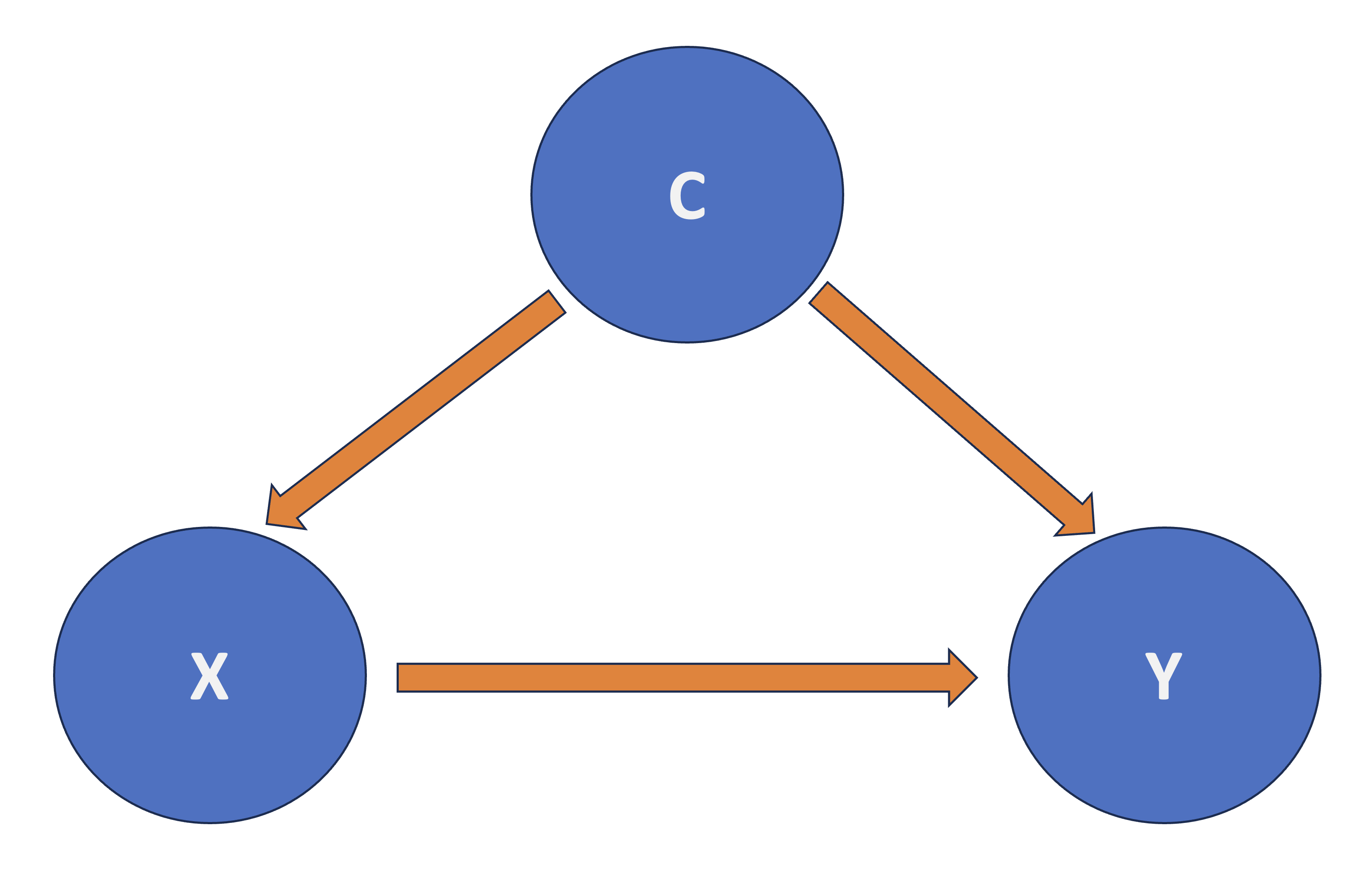
Fig. 4 Diagram of Confounding.#
Strategies to Deal with Confounding#
There is more than one way to deal with confounding if we want to detect a causal relationship between \(X\) and \(Y\). Depending on the nature of the study, one could do the following:
In the case of observational studies, stratification is a good strategy. It implies checking the association between \(X\) and \(Y\) within subgroups of observations that share common values for the confounders. In a linear regression context with \(m\) confounders \(C_j\), we would regress \(Y\) on \(X\) and \(C_1, C_2, \dots, C_m\).
In an experimental study, such as A/B testing, we would randomize each subject to a particular level of factor \(X\). Then, we compare \(Y\) across the different levels of \(X\). For instance, one could use an Analysis of Variance (ANOVA), which is just one specific class of OLS model (a continuous response versus a categorical and nominal regressor).
Important
The second strategy is the golden standard in causal inference and design and analysis of experiments. Nonetheless, it might implicate different statistical, practical, and ETHICAL matters.
What is the beauty of a randomized experiment?
The regressor \(X\) is guaranteed to be independent of all possible confounders! Whether or not you can measure these confounders, or even know the identity of each \(C_j\).
Thus, we no longer need to be concerned with confounding, and we can interpret the association between \(X\) and \(Y\) in a causal manner.
False Discovery Rate#
Suppose someone tells you they did a given hypothesis test using some data and got a \(p\text{-value} = 0.023\). In isolation, you do not know whether to be impressed or not! You need some information about how much “hunting” was done to find this result.
Moreover, there is a trade-off between types of error: false discoveries (i.e. false positives!) and missing real effects (i.e. false negatives!). Depending on the situation/goals, one might be preferable to the other.
A Simple Thought Experiment#
Let us consider a simple thought experiment:
Assume there is an ensemble of research studies on different scientific questions.
Moreover, suppose that every study in the ensemble did a good job of type I (false positive) error control.
Finally, there was only one comparison per study such that:
There is an available method to control the expected proportion of false positives (i.e., type I error) from all this ensemble of research studies. This is what we call the false discovery rate (FDR).
Unlike FWER, FDR is less strict because it controls for this expected proportion of false positives instead of the probability of producing at least one false positive.
Benjamini-Hochberg#
Suppose you have \(m\) hypothesis testings. The method has four steps:
Specify a maximum tolerable FDR, \(\delta\).
Sort the \(m\) p-values from lowest to highest (most significant to least):
Let \(k^*\) be the biggest \(k\) for which \(p_{(k)} < (\delta / m) k\)
Take \(p_{(1)}, \dots, p_{(k^*)}\) as your significant findings.
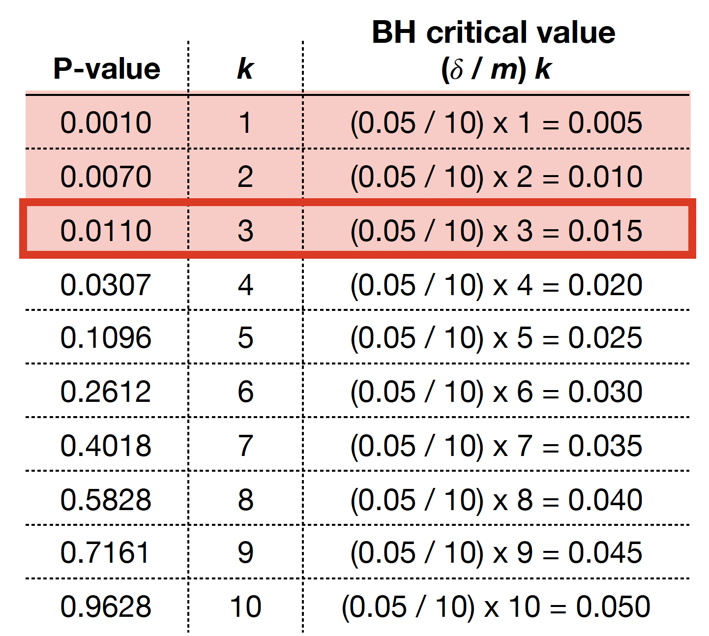
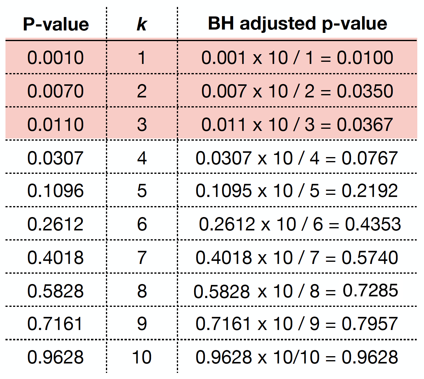
Let us illustrate this procedure with the following raw \(p\)-values:
raw_pvalues <- c(
  0.0010, 0.0070, 0.0110, 0.0307, 0.1096,
  0.2612, 0.4018, 0.5828, 0.7161, 0.9628
)
The previous four steps are shown in the table below. Using BH, with \(\delta = 0.05\), we label \(0.0010\), \(0.0070\), and \(0.0110\) as statistically significant via \(k^* = 3\).
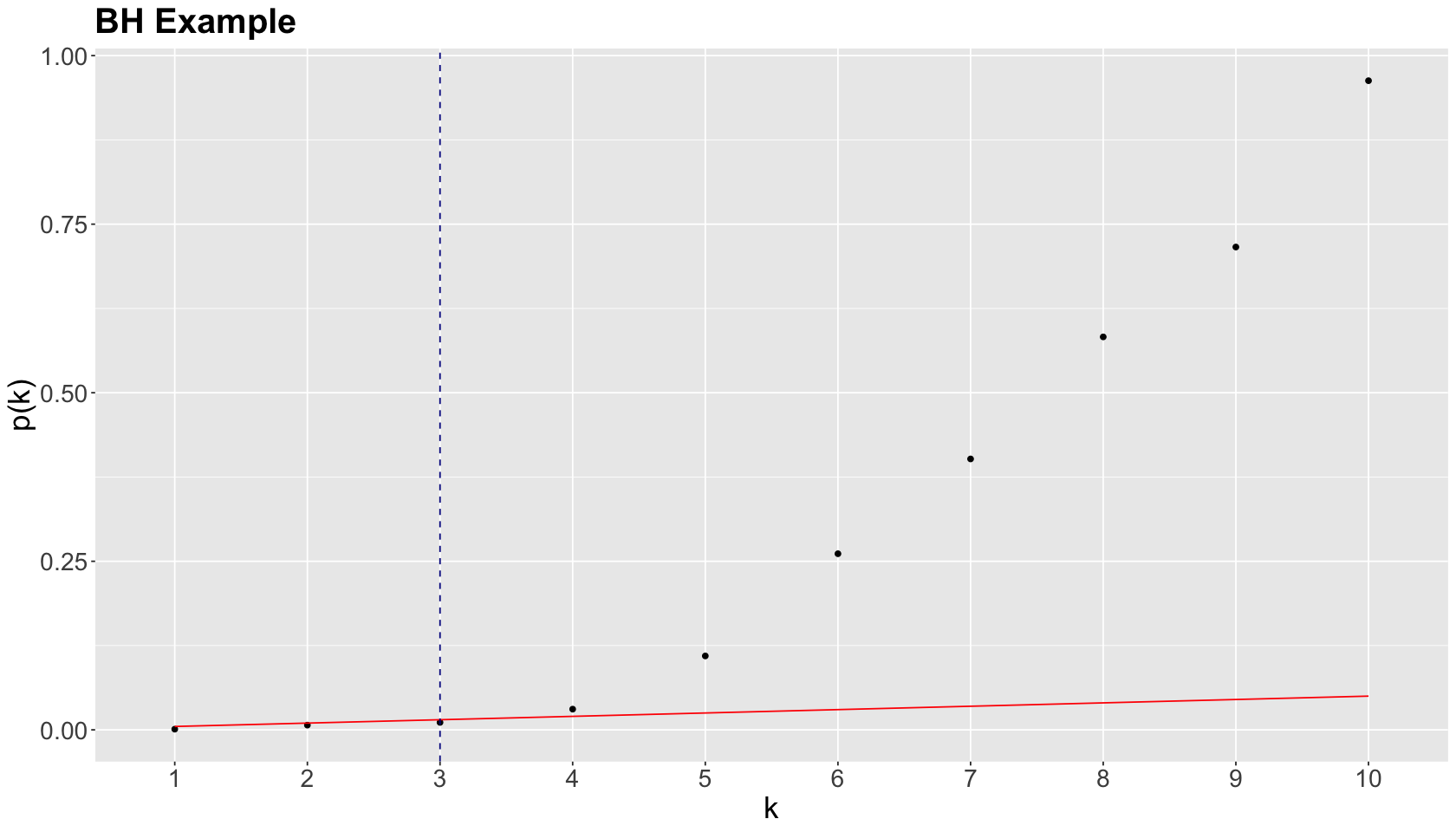
We graphically show the previous BH example below, where each point represents an ordered \(p\)-value. Note the cutoff value is at \(k^* = 3\) (vertical dashed blue line) while the red line corresponds to \((\delta / m) k\) with \(\delta = 0.05\) and \(m = 10\).
As in the case of the Bonferroni correction, we can obtain BH adjusted \(p\)-values as
where:
\(i\) is the rank of the raw \(p\)-value.
\(m\) is the number of tests.
We can obtain the BH adjusted \(p\)-values via p.adjust() as we can see below.
round(p.adjust(raw_pvalues, method = "fdr"), 4)
- 0.01
- 0.035
- 0.0367
- 0.0768
- 0.2192
- 0.4353
- 0.574
- 0.7285
- 0.7957
- 0.9628
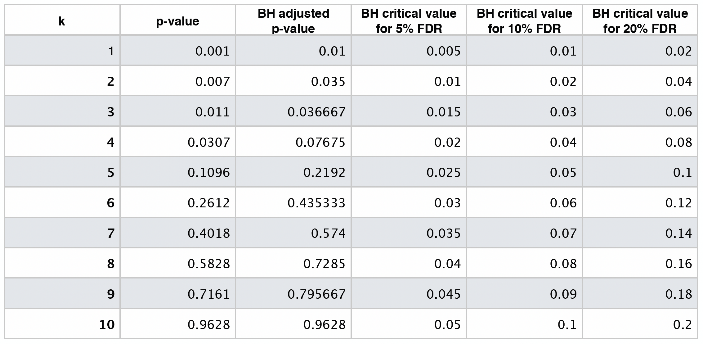
By checking these adjusted \(p\)-values, using a maximum tolerable FDR \(\delta = 0.05\), we would label the first three values (from left to right) as statistically significant.
If we want to be even less conservative, i.e. increasing \(\delta\) to 0.10, we would label the first four values as statistically significant.
The table below shows different BH critical values by \(\delta = 0.05, 0.10, 0.20\).
Hypothesis Testing Basics#
In statistical inference, we have two hypotheses: the null \(H_0\) and the alternative \(H_a\).
\(H_0\) represents the status quo in our case study, whereas \(H_a\) represents our hypothesis of interest. Furthermore, recall there are two types of errors shown in the table below.
\(H_0\) is true |
\(H_0\) is not true |
|
|---|---|---|
Fail to reject \(H_0\) |
Correct (TRUE NEGATIVE) |
Type II Error (FALSE NEGATIVE) |
Reject \(H_0\) |
Type I Error (FALSE POSITIVE) |
Correct (TRUE POSITIVE) |
These errors are I (false positive) and II (false negative). Their setup is targeted towards rejecting or not rejecting \(H_0\), given that \(H_0\) is true or not. Moreover, these errors are measured in probabilities.
The frequentist hypothesis testing process is the following:
We need to set up a pre-specified significance level (usually \(\alpha = 0.05\)). The significance level \(\alpha\) will be our tolerance to type I error: rejecting the null hypothesis when in fact is true.
Compute a test statistic from our sampled data. This test statistic will have a sampling distribution under \(H_0\).
Compare the test statistic against a certain quantile threshold under \(H_0\), then:
Reject \(H_0\) in favour of \(H_a\) if the test statistic exceeds this quantile threshold under \(H_0\).
Do not reject \(H_0\) otherwise.
Attention
The quantile threshold is chosen such that
\(p\)-value#
An alternative way of performing Step 3 is computing the \(p\)-value associated to the test statistic under \(H_0\). For this Step 3, in general let the test statistic be \(T\) (note the random variable notation as an uppercase!) and the quantile threshold \(c_\alpha\). Thus, we would reject \(H_0\) if
Now, for our observed data, the test statistic will be \(t_{\text{obs}}\) (note the lowercase notation!). In probability notation, the \(p\)-value can be represented as:
Attention
The \(p\)-value is the chance of getting a test statistic as or more extreme than what you actually got as observed data, presuming \(H_0\) is true. We will reject \(H_0\) if
Graphical Overview of the Hypothesis Testing#
All the previous process can also be put as in the diagram below.
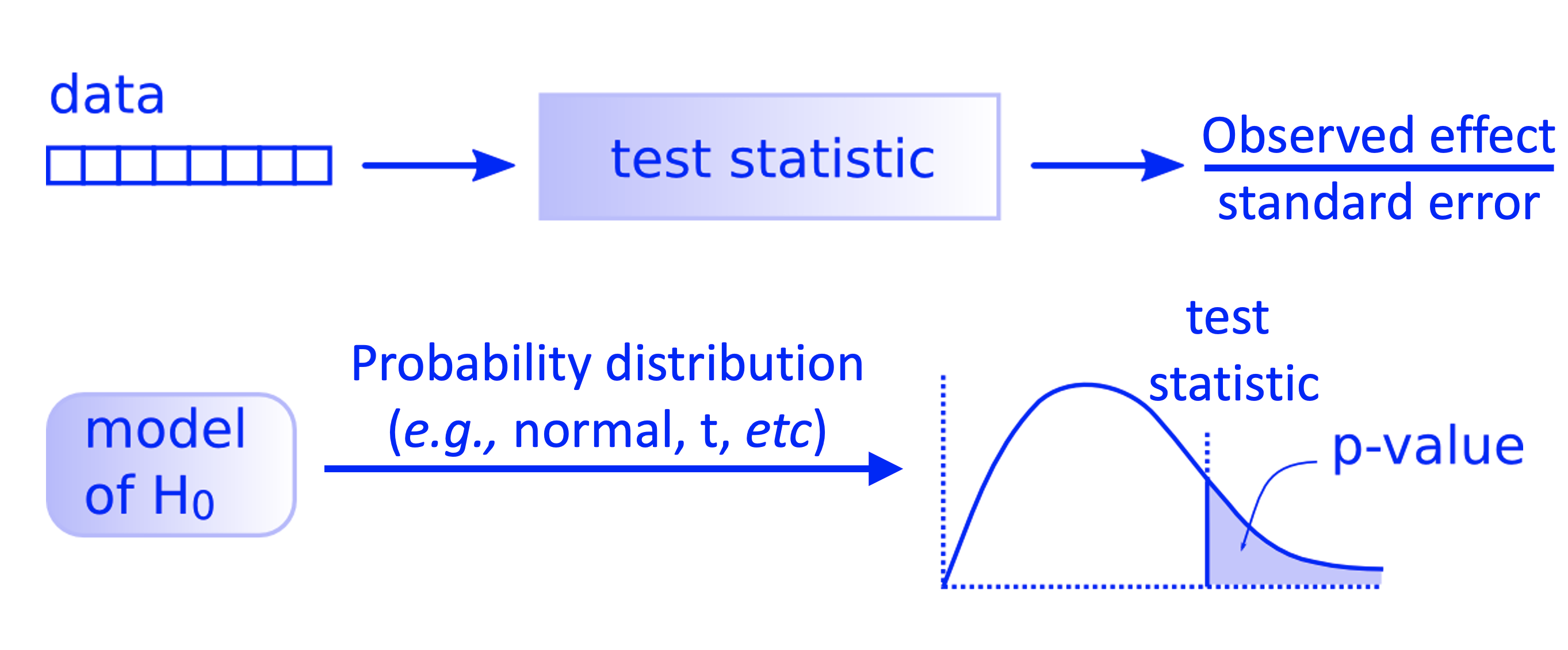
Fig. 5 Workflow of a theory-based hypothesis testing.#
Type I Error (\(\alpha\))#
We commit this error if we reject \(H_0\) when in fact, it is true for the population of interest. It is identified as \(\alpha\), i.e., the significance level in our hypothesis testing. This is the main reason why we use the rule of \(p\text{-value} < \alpha\) in our testing conclusion to reject \(H_0\): it is in our best interest to control (and minimize!) this error. Again, recall the hypothesis testing is developed under a null framework.
Type II Error (\(\beta\))#
Now, we introduce the type II error. We commit type II error if we fail to reject \(H_0\), when in fact, it is not true for the population. It is identified as \(\beta\). This class of error has a particular role in our hypothesis testing since it is part of Power Analysis in what we call the power of test \(1 - \beta\). It is the power of our test that could break the status quo denoted by our null model.
Attention
Interestingly, maximizing the power of the test implicates pulling more than one string.
The Power of the Test#
This is \(1 - \beta\), the true positive or correctly rejecting \(H_0\). The key aspects to maximize the power of the test are the following:
Sample size. The larger the sample size \(n\), the larger the power of the test. This guideline sounds easy to follow, but it is not when we have limited sampling resources.
Significance level. The larger the significance level \(\alpha\), the larger the power of the test. Nevertheless, this implies a test more prone to committing Type I error!
How far are the population parameters of interest between the null and alternative models? This is related to what we call the effect size. For instance, in our so-called A/B testing example, the effect size implicates how much we aim to increase the click-through rates (CTRs) between the control and experimental treatment.
Pulling different strings in the power of a test!#
Let us set an example on which we can verify what we mean by pulling different strings to obtain the power of the test.
Suppose we are interested in inferring the population mean height \(\mu\) in meters of adults identified as male (between 21 and 30 years old) in Mexico City. Previous studies have concluded that the population mean is around \(1.70\)m (for the practical purpose of the null model: \(\color{blue}{\mu = 1.70}\)). Nonetheless we hypothesize that \(\color{red}{\mu > 1.70}\). Therefore:
Note we color in blue all those elements belonging to our null model, whereas in red those ones for our alternative model. Furthermore, in our hypothesis testing, we will use the sample mean \(\bar{X}\) as our estimator.
Without loss of generality, let us work under a classical theory-based approach. Assume we have an incredibly well-behaved estimator, i.e., the approximate sampling distribution of \(\bar{X}\) is supported by the Central Limit Theorem (CLT) with a large enough sample size \(n\). Moreover, suppose we know the real population standard deviation \(\sigma\).
Hence:
Let us check different scenarios given this framework.
Attention
Symbol \(\mathrel{\dot\sim}\) means “is approximately distributed as”.
Baseline Scenario#
We have the following hypotheses:
Attention
For this scenario, and subsequent ones, assume that \(H_a\) is true in fact for the population, but we do not know it beforehand in real life. That is why we are performing statistical inference via a random sample!
Moreover, let us define the alternative model for the sampling distribution of \(\bar{X}\) as:
versus the null model
As additional assumptions, let us set a population \(\sigma = 0.2 \text{ m}\) (for both models) and a sample size \(n = 50\).
Function plotting_power_function() will provide the corresponding null and alternative distributions under each set of scenario parameters. Let us focus on the plots and not the coding syntax.
Show code cell source
options(repr.plot.height = 8, repr.plot.width = 14)

library(tidyverse)
library(ggplot2)
library(cowplot)

plotting_power_function <- function(mean_null, mean_alt, sd, n, alpha_level, x_coord, x_coord_2,
                                    y_coord_alpha, y_coord_power) {
  data_null <- tibble(
    x = seq(mean_null - 3.5 * (sd / sqrt(n)), mean_null + 3.5 * (sd / sqrt(n)), 0.0001),
    f_null = dnorm(x, mean = mean_null, sd = sd / sqrt(n))
  )

  data_alternative <- tibble(
    x = seq(mean_alt - 3.5 * (sd / sqrt(n)), mean_alt + 3.5 * (sd / sqrt(n)), 0.0001),
    f_alternative = dnorm(x, mean = mean_alt, sd = sd / sqrt(n))
  )

  power <- round(pnorm(
    q = qnorm(1 - alpha_level, mean = mean_null, sd = sd / sqrt(n)),
    mean = mean_alt, sd = sd / sqrt(n), lower.tail = FALSE
  ), 3)

  plot_power <- data_null %>%
    ggplot() +
    geom_line(aes(x, f_null), colour = "blue") +
    geom_line(data = data_alternative, aes(x, f_alternative), colour = "red") +
    geom_segment(aes(x = x, y = 0, xend = x, yend = dnorm(x, mean = mean_null, sd = sd / sqrt(n))),
      color = "blue",
      data = data_null %>% filter(x >= qnorm(1 - alpha_level, mean = mean_null, sd = sd / sqrt(n))), alpha = 0.05
    ) +
    geom_vline(xintercept = qnorm(1 - alpha_level, mean = mean_null, sd = sd / sqrt(n)), linetype = "dashed", color = "blue") +
    geom_segment(aes(x = x, y = 0, xend = x, yend = dnorm(x, mean = mean_alt, sd = sd / sqrt(n))),
      color = "red",
      data = data_alternative %>% filter(x >= qnorm(1 - alpha_level, mean = mean_null, sd = sd / sqrt(n))), alpha = 0.05
    ) +
    geom_vline(xintercept = mean_null, linetype = "solid", color = "blue") +
    geom_vline(xintercept = mean_alt, linetype = "solid", color = "red") +
    geom_hline(yintercept = 0) +
    theme(
      axis.title.y = element_blank(),
      axis.text.y = element_blank(),
      axis.ticks.y = element_blank(),
      plot.title = element_text(face = "bold", size = 24),
      axis.title.x = element_text(face = "bold", size = 21),
      axis.text.x = element_text(size = 17),
      legend.title = element_text(face = "bold", size = 21),
      legend.text = element_text(size = 17),
      legend.position = "bottom",
    ) +
    xlab("Height (m)") +
    annotate("text", x = x_coord, y = y_coord_alpha, label = bquote(alpha == ~ .(alpha_level)), color = "blue", size = 8) +
    annotate("text", x = x_coord, y = y_coord_power, label = bquote(1 - beta == ~ .(power)), color = "red", size = 8) +
    annotate("text", x = x_coord_2, y = y_coord_alpha, label = bquote(n == ~ .(n)), color = "darkgreen", size = 10) +
    ggtitle("Sampling Distribution of Sample Mean")
}
Show code cell output
Attaching package: ‘cowplot’
The following object is masked from ‘package:lubridate’:

    stamp
Show code cell source
baseline_power <- plotting_power_function(
   mean_null = 1.70, mean_alt = 1.75, sd = 0.2, n = 50, alpha_level = 0.05,
   x_coord = 1.65, x_coord_2 = 1.80,
   y_coord_alpha = 17.5, y_coord_power = 15
  ) + ggtitle("Baseline Scenario")
suppressWarnings(print(baseline_power))
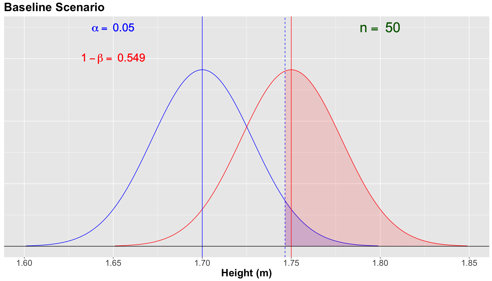
Note that the blue vertical solid line denotes the null population mean \(\mu = 1.70\), whereas the red vertical solid line denotes the alternative population mean \(\mu = 1.75\). Moreover, the blue vertical dashed line is our threshold for the significance level \(\alpha = 0.05\) (our tolerance level to commit Type I error, i.e., the shaded blue area under the null curve).
For the scenario above, the power of the test \(1 - \beta = 0.549\) (shaded red area under the alternative curve) is not too high. This number is critical since we know that \(H_a\) is true in fact. We need to do something to increase the power of our test!
Increasing the Sample Size to \(n = 100\)#
Attention
Assume that \(H_a\) is true in fact for the population.
What if we have more budget to double our sample size to \(n = 100\)? Will this increase the power of our test? Suppose we still have the same null and alternative models for \(\bar{X}\) with the same population \(\sigma = 0.2\) (for both models).
Recall the alternative model for the sampling distribution of \(\bar{X}\) as:
versus the null model
This will narrow both normal curves, since the standard deviation of the sampling distribution is \(\sigma/\sqrt{n}\). Therefore, the power \(1 - \beta\) will increase while holding \(\alpha = 0.05\).
Show code cell source
larger_sample_size_n100 <- plotting_power_function(
   mean_null = 1.70, mean_alt = 1.75, sd = 0.2, n = 100, alpha_level = 0.05,
   x_coord = 1.65, x_coord_2 = 1.80,
   y_coord_alpha = 17.5, y_coord_power = 15
  ) + ggtitle("Larger Sample Size")
suppressWarnings(print(larger_sample_size_n100))
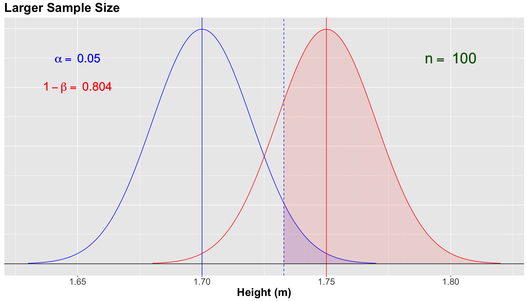
The blue vertical solid line denotes the null population mean \(\mu = 1.70\), whereas the red vertical solid line denotes the alternative population mean \(\mu = 1.75\). Moreover, the blue vertical dashed line is our threshold for the significance level \(\alpha = 0.05\) (our tolerance level to commit Type I error, i.e., the shaded blue area under the null curve).
For the scenario above, we increased the power of the test to \(1 - \beta = 0.804\) (shaded red area under the alternative curve). Great!
Decreasing the Significance Level to \(\alpha = 0.01\)#
Attention
Assume that \(H_a\) is true in fact for the population.
With the same previous sample size \(n = 100\), and assuming the same population \(\sigma = 0.2\) (for both models), suppose we still have the same null and alternative models for \(\bar{X}\). Moreover, what if the research team is stricter in terms of controlling the tolerance to type I error?
Note
Even though \(H_a\) is true in fact for the population as in this case, we always have to control the significance level \(\alpha\)! Recall we will not know what is exactly going on with the parameters that govern a population, thus we infer.
Show code cell source
stricter_alpha <- plotting_power_function(
   mean_null = 1.70, mean_alt = 1.75, sd = 0.2, n = 100, alpha_level = 0.01,
   x_coord = 1.65, x_coord_2 = 1.80,
   y_coord_alpha = 17.5, y_coord_power = 15
  ) + ggtitle("Stricter Significance Level")
suppressWarnings(print(stricter_alpha))
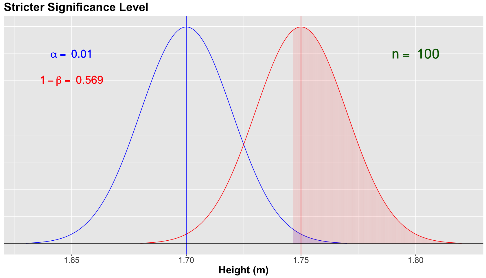
The blue vertical solid line denotes the null population mean \(\mu = 1.70\), whereas the red vertical solid line denotes the alternative population mean \(\mu = 1.75\). Moreover, the blue vertical dashed line is our threshold for the significance level \(\alpha = 0.01\) (our tolerance level to commit Type I error, i.e., the shaded blue area under the null curve). Note how this vertical dashed line moved more to the right since we are decreasing to \(\alpha = 0.01\).
For the scenario above, we decreased the power of the test to \(1 - \beta = 0.569\) (shaded red area under the alternative curve). This is the trade-off for controlling, even more, our type I error.
Hold on! What if the alternative model changes?#
Attention
Assume that \(H_a\) is true in fact for the population.
Nonetheless, let us define the alternative model for the sampling distribution of \(\bar{X}\) as:
versus the null model
Attention
Now, \(\mu = 1.78\). Therefore, we are increasing the difference between the means of both models (i.e., the so-called effect size).
Let us set a population \(\sigma = 0.2 \text{ m}\) (for both models) and a sample size \(n = 100\) with \(\alpha = 0.01\).
Show code cell source
larger_mu_A <- plotting_power_function(
  mean_null = 1.70, mean_alt = 1.78, sd = 0.2, n = 100, alpha_level = 0.01,
  x_coord = 1.65, x_coord_2 = 1.825,
  y_coord_alpha = 17.5, y_coord_power = 15
) + ggtitle("Larger Effect Size")
suppressWarnings(print(larger_mu_A))
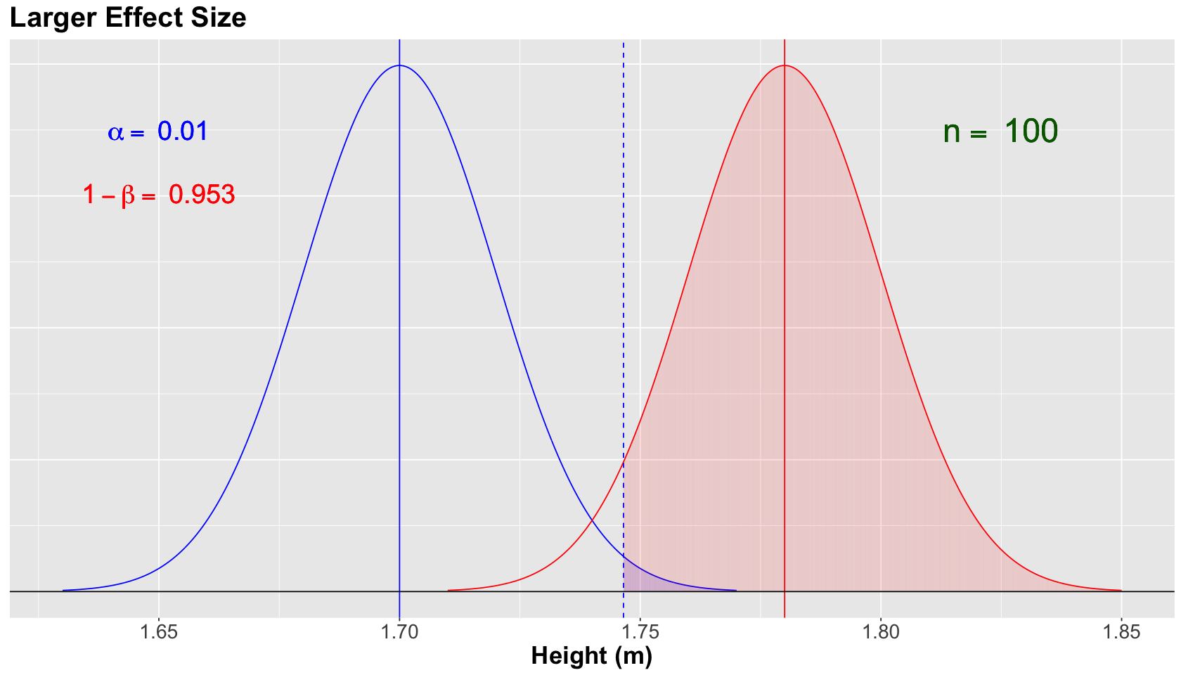
The blue vertical solid line denotes the null population mean \(\mu = 1.70\), whereas the red vertical solid line denotes the alternative population mean \(\mu = 1.78\). Moreover, the blue vertical dashed line is our threshold for the significance level \(\alpha = 0.01\) (our tolerance level to commit Type I error, i.e., the shaded blue area under the null curve).
For the scenario above, we increase the power of the test to \(1 - \beta = 0.953\) (shaded red area under the alternative curve). Since the alternative model got moved more to the right given its \(\mu = 1.78\). In other words, we have a larger effect size.
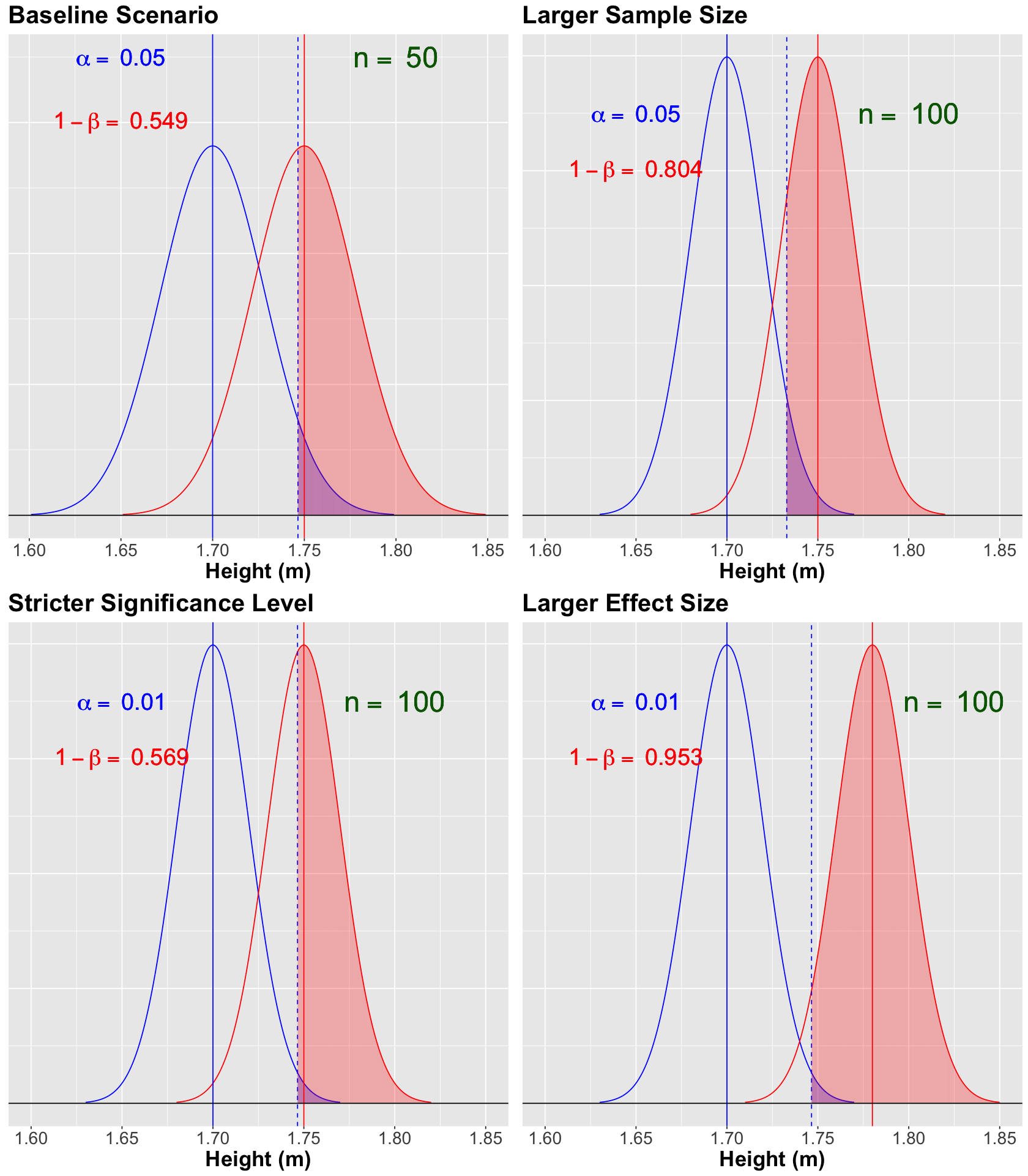
Scenario Summary#
Let us use plot_grid() to summarize our four scenarios so we can have the big picture in this Power Analysis. Note how the phenomenon “pulling more than one string” comes into play.
Show code cell source
options(repr.plot.height = 16, repr.plot.width = 14)

baseline_power <- baseline_power
larger_sample_size_n100 <- larger_sample_size_n100 + xlim(c(1.60, 1.85))
stricter_alpha <- stricter_alpha + xlim(c(1.60, 1.85))
larger_mu_A <- larger_mu_A + xlim(c(1.60, 1.85))

suppressWarnings(print(plot_grid(baseline_power, larger_sample_size_n100, stricter_alpha, larger_mu_A)))
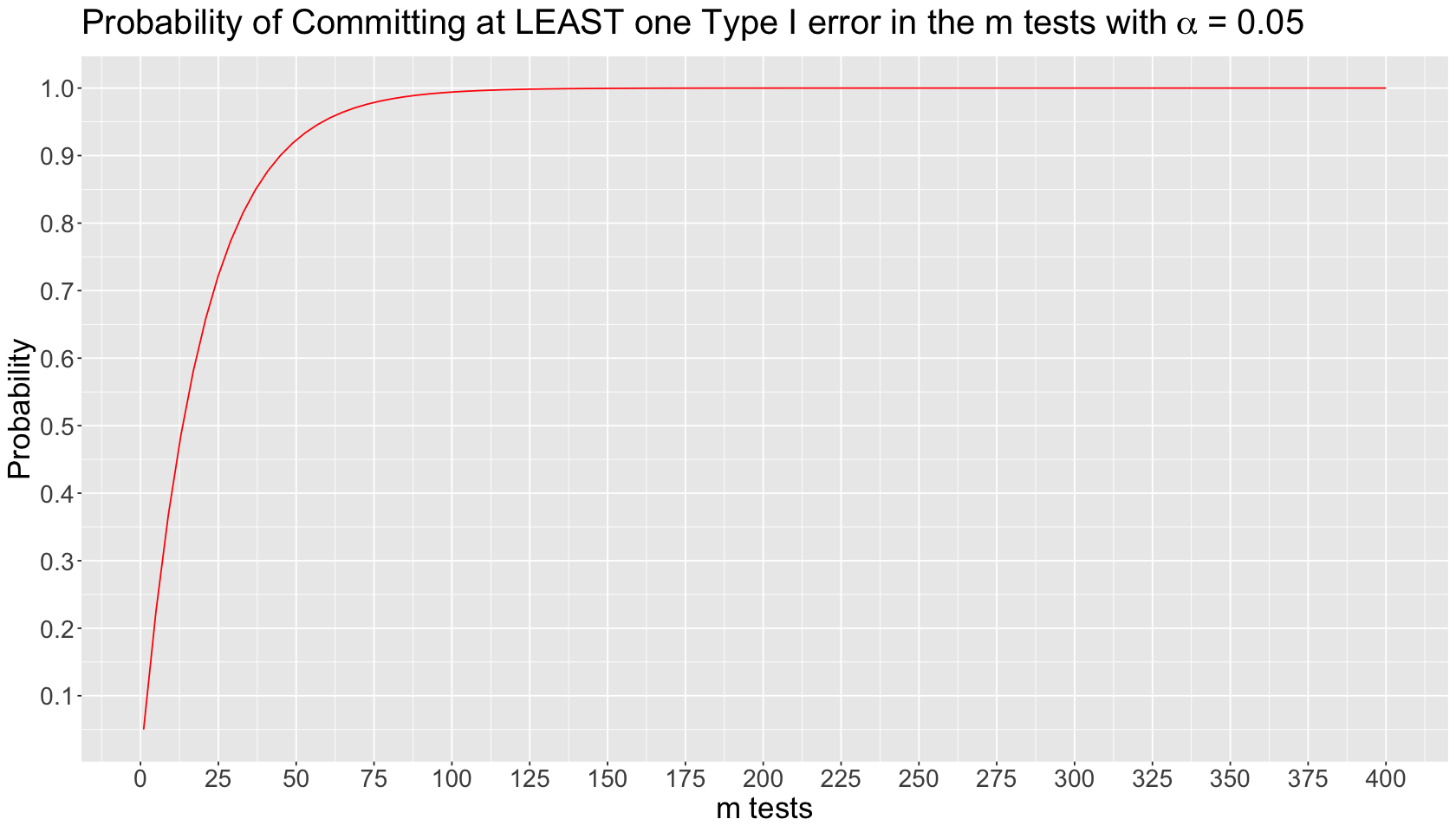
Inflation of Type I Error in Multiple Comparisons#
Suppose we run \(m\) independent tests on the same dataset. Each \(i\)th test \((i = 1, \dots m)\) has the following probability of committing Type I error:
The probability of NOT committing Type I error in the \(i\)th test is the following:
The probability of NOT committing Type I error in ALL the \(m\) tests is an intersection of complements:
Finally, the probability of committing AT LEAST one Type I error in the \(m\) tests is the complement of the previous intersection:
The inflated probability corresponds to committing AT LEAST one Type I error in the \(m\) tests. We can plot this theoretical behaviour by varying \(m\) on the \(x\)-axis as follows:
inflated_error_plot
\(p\)-hacking#
We have to avoid a practice known as \(p\)-hacking in which we perform many different tests on our data to obtain any significant result to publish. By doing this, multiple testing occurs, which inflates our type I error if we do not control it with some available correction (e.g., Bonferroni correction).
Simpson’s Paradox#
Simpson’s paradox occurs when we see a trend in aggregated data (between two variables \(X\) and \(Y\)), but this trend reverses when we separate the data into specific groups (i.e., we take into account another variable \(Z\)).** It was first addressed by Edward Simpson in 1951 in his paper “The Interpretation of Interaction in Contingency Tables