Lecture 2 - Confounding and Randomized versus Non-randomized Studies#
Today’s Learning Objectives#
Define the Simpson’s paradox.
Illustrate the Simpson’s paradox occurrence via simulated and real data.
Provide a basic guideline to avoid the Simpson’s paradox.
Provide a definition of a confounding variable.
Argue why evidence from a randomized study is of a higher grade than evidence from an observational study.
Loading R Packages#
options(repr.matrix.max.rows = 8)
library(tidyverse)
library(infer)
library(broom)
library(cowplot)
library(bayestestR)
1. Simpson’s Paradox#
We have seen the benefits of making an appropriate and thoughtful exploratory data analysis (EDA) throughout the statistical courses. EDA allows you to detect graphical trends in the data that could be confirmed at a statistical level via a suitable model. Nevertheless, what are the implications of a limited and poor EDA?
Limitations in an EDA can lead to misleading graphical conclusions that have the potential to bias our data modelling, which will also lead to deceptive statistical conclusions! Simpson’s paradox basically arises when we have a poor EDA and data modelling.
Important
Simpson’s paradox occurs when we see a trend in aggregated data (between two variables \(X\) and \(Y\)), but this trend reverses when we separate the data into specific groups (i.e., we take into account another variable \(Z\)). It was first addressed by Edward Simpson in 1951 in his paper “The Interpretation of Interaction in Contingency Tables.”
1.1. A Simulated Example#
The package bayestestR offers a useful function to simulate data so we can graphically understand the Simpson’s paradox. The function simulate_simpson() simulates some data coming from four groups of size 200 each where the within-group positive linear correlation is 0.4. The two continuous variables of interest are \(X\) and \(Y\).
set.seed(554) # Reproducibility

simpson_data <- simulate_simpson(
  n = 200,
  groups = 4,
  r = 0.4,
  group_prefix = "Group "
)

colnames(simpson_data) <- c("X", "Y", "Group")
simpson_data
| X | Y | Group |
|---|---|---|
| <dbl> | <dbl> | <chr> |
| 0.301913 | -1.3353848 | Group 1 |
| 1.973782 | -0.9160513 | Group 1 |
| 1.113595 | -1.7805183 | Group 1 |
| 2.872386 | 0.6106858 | Group 1 |
| ⋮ | ⋮ | ⋮ |
| 5.569538 | -2.856632 | Group 4 |
| 3.394598 | -4.470594 | Group 4 |
| 3.751953 | -4.837983 | Group 4 |
| 3.898065 | -2.540426 | Group 4 |
Let us start with a naive EDA where we do not use Group and just create a scatterplot of \(X\) versus \(Y\). Moreover, suppose you want to statistically assess whether \(X\) is linearly associated with \(Y\) and how.
options(repr.plot.height = 8, repr.plot.width = 14)

naive_EDA <- ggplot(simpson_data, aes(x = X, y = Y)) +
  geom_point() +
  geom_smooth(method = "lm", se = FALSE, formula = y ~ x, colour = "red") +
  theme(
    plot.title = element_text(size = 24, face = "bold"),
    axis.text = element_text(size = 17),
    axis.title = element_text(size = 21),
    legend.title = element_text(size = 21),
    legend.text = element_text(size = 17)
  ) +
  ggtitle("Aggregated Scatterplot of X versus Y")
naive_EDA
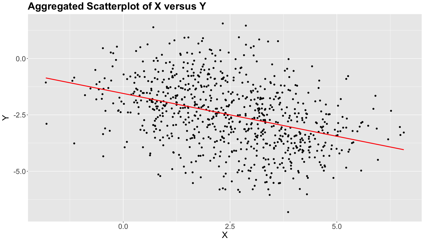
Note there is an overall negative graphical relation between \(X\) and \(Y\), which is confirmed by a linear correlation coefficient \(\rho = -0.38\) (see the below code). Also, the ordinary least-squares (OLS) estimated red line statistically confirms this trend.
round(cor(simpson_data$X, simpson_data$Y), 2)
Let us be more clever in our EDA and consider Group in another scatterplot along with \(X\) and \(Y\). This scatterplot now shows upward trends within the groups! Moreover, as previously specified, the within-group linear correlation \(\rho = 0.4\) (the opposite from the aggregated negative correlation).
simpson_data %>% group_by(Group) %>%
  summarise(corr = round(cor(X, Y), 2))
| Group | corr |
|---|---|
| <chr> | <dbl> |
| Group 1 | 0.4 |
| Group 2 | 0.4 |
| Group 3 | 0.4 |
| Group 4 | 0.4 |
clever_EDA <- ggplot(simpson_data, aes(x = X, y = Y)) +
  geom_point(aes(color = Group)) +
  geom_smooth(method = "lm", formula = y ~ x, se = FALSE, colour = "red") +
  geom_smooth(aes(color = Group), method = "lm", formula = y ~ x, se = FALSE) +
  theme(
    plot.title = element_text(size = 24, face = "bold"),
    axis.text = element_text(size = 17),
    axis.title = element_text(size = 21),
    legend.title = element_text(size = 21),
    legend.text = element_text(size = 17)
  ) +
  ggtitle("Disaggregated Scatterplot of X versus Y by Groups") +
  scale_colour_brewer(palette = "Paired")

clever_EDA
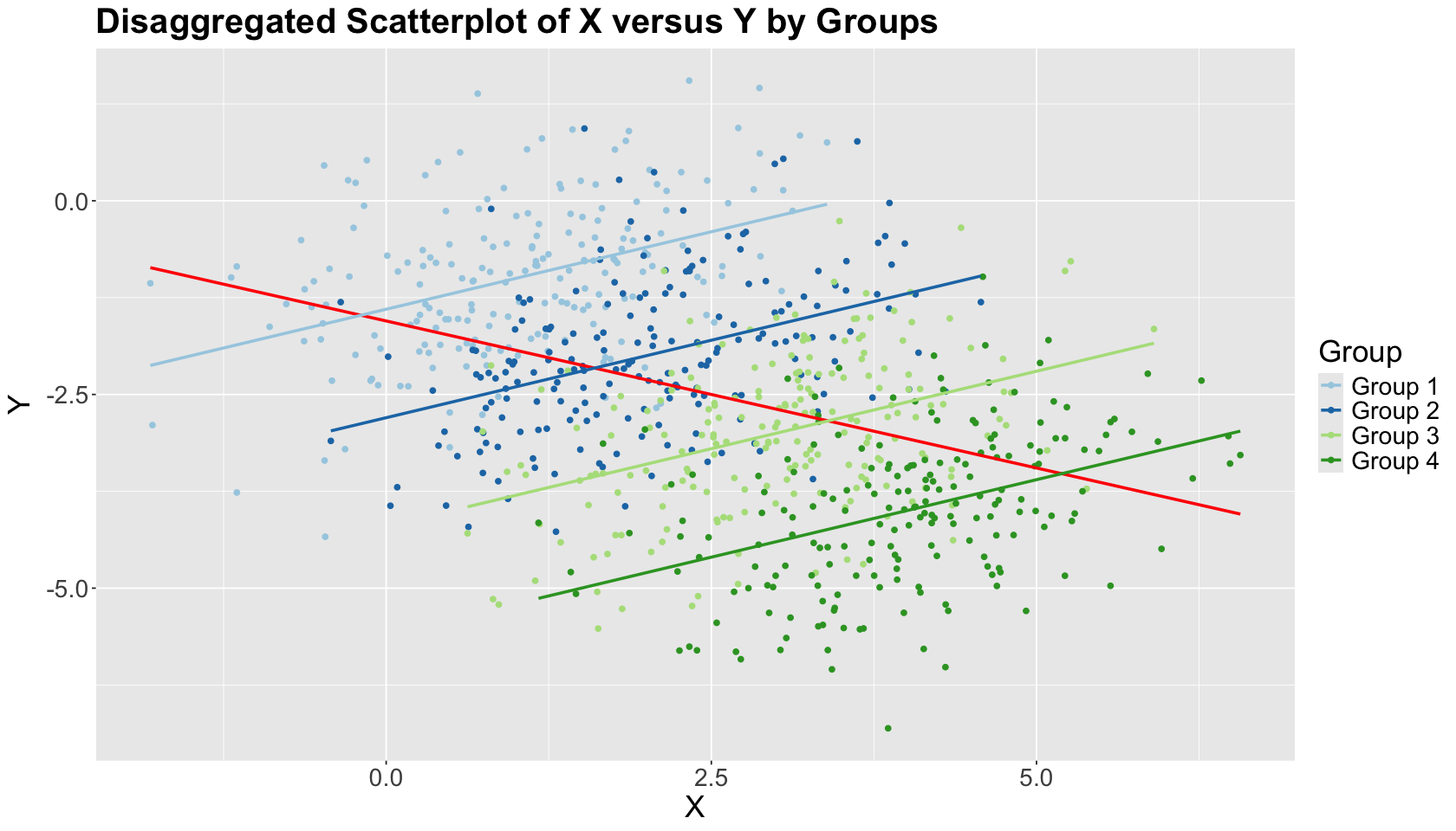
The within-group estimated OLS lines have positive slopes, unlike the overall OLS estimated blue line. This is the Simpson’s paradox in action!
What is the main takeaway?
This toy example shows us why taking into account the right variables in our studies is critical in any association or causal analysis. Now, let us check a real example involving one continuous variable of interest \(Y\), a categorical \(X\), and another categorical \(Z\).
1.2. A COVID-19 Example#
This case comes from the work by Kügelgen et al. (2021). The authors point out the Simpson’s paradox when comparing aggregated case fatality rates between two countries: China and Italy. But, then, the data trends reverse once they control by age groups. This is data from the earlier pandemic months (February 2020 for China and March 2020 for Italy). The original dataset has more countries.
Firstly, let us define the continuous case fatality rate:
Then, we check the data frames by country. Note data is aggregated by nine age groups.
covid19_data_china <-
  read_csv("../data/Covid-19_age-stratified_dataset_for_different_countries.csv", show_col_types = FALSE) %>%
  filter(Country == "China") %>%
  mutate(`Fatality rate` = `Confirmed fatalities` / `Confirmed cases`)

covid19_data_italy <-
  read_csv("../data/Covid-19_age-stratified_dataset_for_Italy_at_different_points_in_time.csv", show_col_types = FALSE) %>%
  filter( `Date of reporting` == "9 March2020" ) %>%
  mutate(`Fatality rate` = `Confirmed fatalities` /  `Confirmed cases`)
New names:
• `` -> `...1`
New names:
• `` -> `...1`
covid19_data_china
| ...1 | Country | Date of reporting | Age group | Confirmed cases | Confirmed fatalities | Fatality rate |
|---|---|---|---|---|---|---|
| <dbl> | <chr> | <chr> | <chr> | <dbl> | <dbl> | <dbl> |
| 9 | China | 17 February2020 | 0-9 | 416 | 0 | 0.000000000 |
| 10 | China | 17 February2020 | 10-19 | 549 | 1 | 0.001821494 |
| 11 | China | 17 February2020 | 20-29 | 3619 | 7 | 0.001934236 |
| 12 | China | 17 February2020 | 30-39 | 7600 | 18 | 0.002368421 |
| ⋮ | ⋮ | ⋮ | ⋮ | ⋮ | ⋮ | ⋮ |
| 14 | China | 17 February2020 | 50-59 | 10008 | 130 | 0.01298961 |
| 15 | China | 17 February2020 | 60-69 | 8583 | 309 | 0.03600140 |
| 16 | China | 17 February2020 | 70-79 | 3918 | 312 | 0.07963247 |
| 17 | China | 17 February2020 | 80+ | 1408 | 208 | 0.14772727 |
covid19_data_italy
| ...1 | Country | Date of reporting | Age group | Confirmed cases | Confirmed fatalities | Fatality rate |
|---|---|---|---|---|---|---|
| <dbl> | <chr> | <chr> | <chr> | <dbl> | <dbl> | <dbl> |
| 0 | Italy | 9 March2020 | 0-9 | 43 | 0 | 0 |
| 1 | Italy | 9 March2020 | 10-19 | 85 | 0 | 0 |
| 2 | Italy | 9 March2020 | 20-29 | 296 | 0 | 0 |
| 3 | Italy | 9 March2020 | 30-39 | 470 | 0 | 0 |
| ⋮ | ⋮ | ⋮ | ⋮ | ⋮ | ⋮ | ⋮ |
| 5 | Italy | 9 March2020 | 50-59 | 1453 | 3 | 0.002064694 |
| 6 | Italy | 9 March2020 | 60-69 | 1471 | 37 | 0.025152957 |
| 7 | Italy | 9 March2020 | 70-79 | 1785 | 114 | 0.063865546 |
| 8 | Italy | 9 March2020 | 80+ | 1532 | 202 | 0.131853786 |
Then, let us combine both data frames.
covid19_data <- bind_rows(covid19_data_china, covid19_data_italy)
covid19_data
| ...1 | Country | Date of reporting | Age group | Confirmed cases | Confirmed fatalities | Fatality rate |
|---|---|---|---|---|---|---|
| <dbl> | <chr> | <chr> | <chr> | <dbl> | <dbl> | <dbl> |
| 9 | China | 17 February2020 | 0-9 | 416 | 0 | 0.000000000 |
| 10 | China | 17 February2020 | 10-19 | 549 | 1 | 0.001821494 |
| 11 | China | 17 February2020 | 20-29 | 3619 | 7 | 0.001934236 |
| 12 | China | 17 February2020 | 30-39 | 7600 | 18 | 0.002368421 |
| ⋮ | ⋮ | ⋮ | ⋮ | ⋮ | ⋮ | ⋮ |
| 5 | Italy | 9 March2020 | 50-59 | 1453 | 3 | 0.002064694 |
| 6 | Italy | 9 March2020 | 60-69 | 1471 | 37 | 0.025152957 |
| 7 | Italy | 9 March2020 | 70-79 | 1785 | 114 | 0.063865546 |
| 8 | Italy | 9 March2020 | 80+ | 1532 | 202 | 0.131853786 |
The data does not have the aggregated case fatality rates by country. So let us compute them and bind them to covid19_data.
covid19_data_agg_by_country <- covid19_data %>%
  group_by(`Country`) %>%
  summarise(
    `Confirmed fatalities` = sum(`Confirmed fatalities`),
    `Confirmed cases` = sum(`Confirmed cases`)
  ) %>%
  mutate(
    `Fatality rate` = `Confirmed fatalities` / `Confirmed cases`,
    `Age group` = "Total"
  )
covid19_data_agg_by_country
| Country | Confirmed fatalities | Confirmed cases | Fatality rate | Age group |
|---|---|---|---|---|
| <chr> | <dbl> | <dbl> | <dbl> | <chr> |
| China | 1023 | 44672 | 0.02290025 | Total |
| Italy | 357 | 8026 | 0.04448044 | Total |
covid19_data <- bind_rows(covid19_data, covid19_data_agg_by_country) %>%
  mutate(`Age group` = as.factor(`Age group`))
covid19_data
| ...1 | Country | Date of reporting | Age group | Confirmed cases | Confirmed fatalities | Fatality rate |
|---|---|---|---|---|---|---|
| <dbl> | <chr> | <chr> | <fct> | <dbl> | <dbl> | <dbl> |
| 9 | China | 17 February2020 | 0-9 | 416 | 0 | 0.000000000 |
| 10 | China | 17 February2020 | 10-19 | 549 | 1 | 0.001821494 |
| 11 | China | 17 February2020 | 20-29 | 3619 | 7 | 0.001934236 |
| 12 | China | 17 February2020 | 30-39 | 7600 | 18 | 0.002368421 |
| ⋮ | ⋮ | ⋮ | ⋮ | ⋮ | ⋮ | ⋮ |
| 7 | Italy | 9 March2020 | 70-79 | 1785 | 114 | 0.06386555 |
| 8 | Italy | 9 March2020 | 80+ | 1532 | 202 | 0.13185379 |
| NA | China | NA | Total | 44672 | 1023 | 0.02290025 |
| NA | Italy | NA | Total | 8026 | 357 | 0.04448044 |
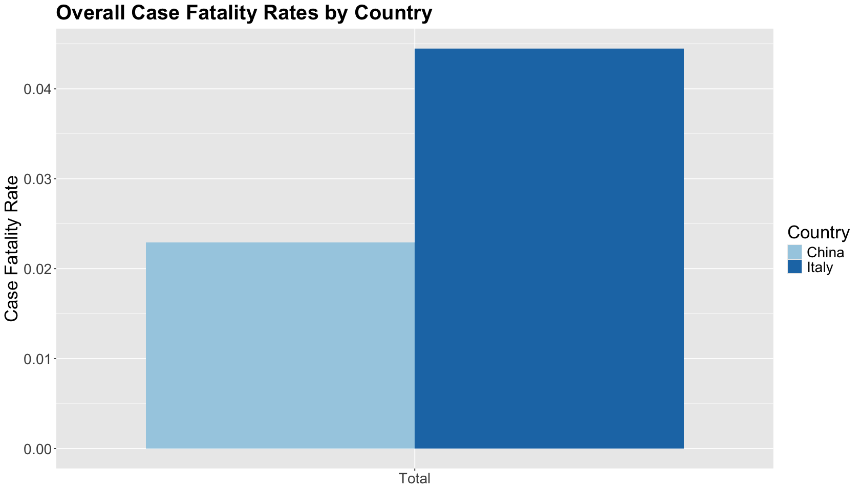
Then, we plot this case fatality rates by country in a histogram. The overall case fatality rate was considerably lower in China than in Italy. This, of course, ignores the many challenging questions about estimating (and reporting!) the true number of COVID-19 cases.
hist_covid19_fatality_by_country <- filter(covid19_data, `Age group` == "Total") %>%
  ggplot(aes(x = `Age group`, y = `Fatality rate`, fill = `Country`)) +
  geom_bar(position = "dodge", stat = "identity") +
  theme(
    plot.title = element_text(size = 24, face = "bold"),
    axis.text = element_text(size = 17),
    axis.title = element_text(size = 21),
    axis.title.x = element_blank(),
    legend.title = element_text(size = 21),
    legend.text = element_text(size = 17)
  ) +
  ggtitle("Overall Case Fatality Rates by Country") +
  ylab("Case Fatality Rate") +
  scale_fill_brewer(palette = "Paired")
hist_covid19_fatality_by_country
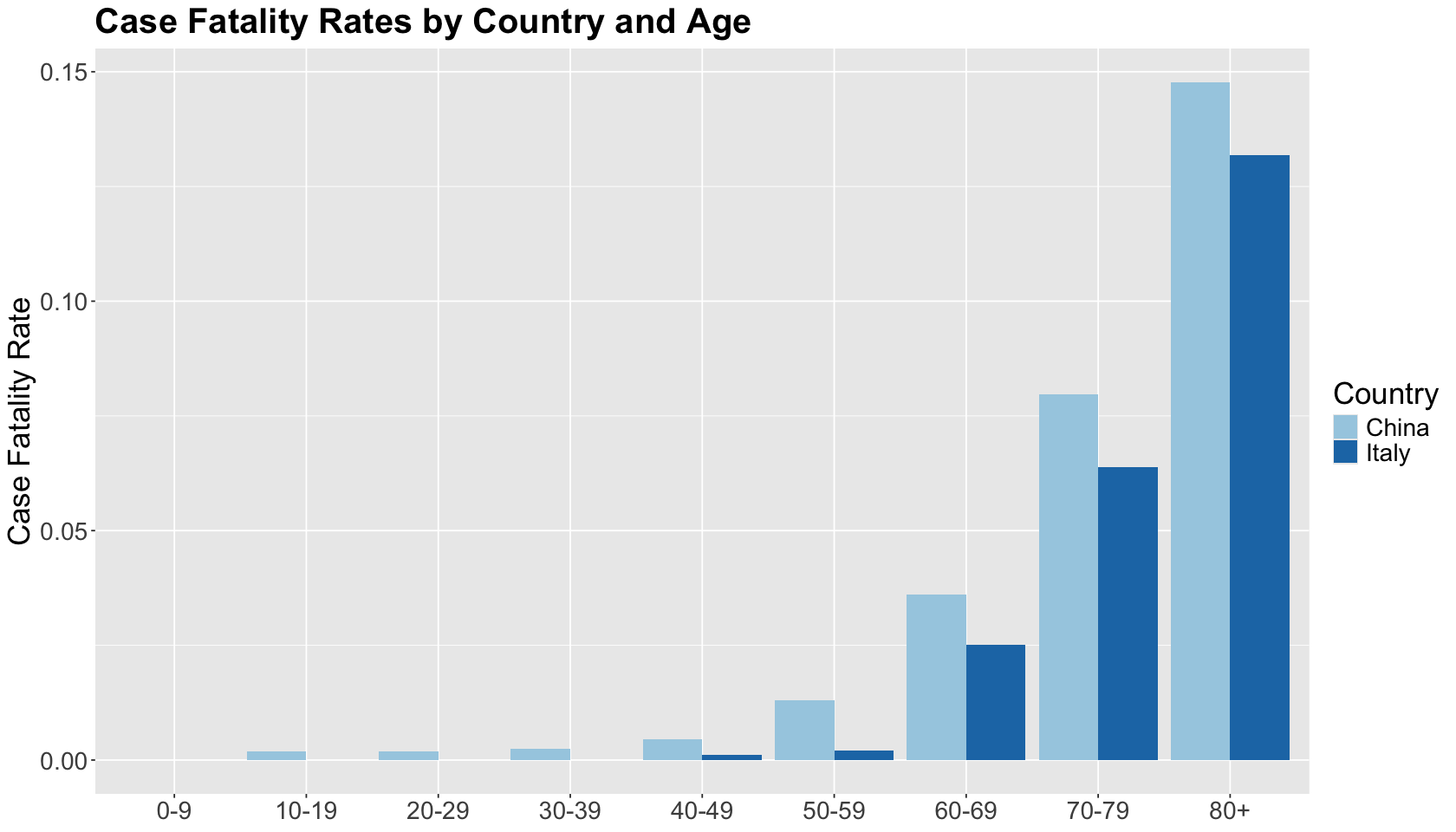
Let us dig into this a little bit by age group. At each age group, the case fatality rate in Italy was lower than in China. The trend flips compared to the overall case fatality rates!
hist_covid19_fatality_by_country_and_age <- filter(covid19_data, `Age group` != "Total") %>%
  ggplot(aes(x = `Age group`, y = `Fatality rate`, fill = `Country`)) +
  geom_bar(position = "dodge", stat = "identity") +
  theme(
    plot.title = element_text(size = 24, face = "bold"),
    axis.text = element_text(size = 17),
    axis.title = element_text(size = 21),
    axis.title.x = element_blank(),
    legend.title = element_text(size = 21),
    legend.text = element_text(size = 17)
  ) +
  ggtitle("Case Fatality Rates by Country and Age") +
  ylab("Case Fatality Rate") +
  xlab("Age Group") +
  scale_fill_brewer(palette = "Paired")
hist_covid19_fatality_by_country_and_age
This is contradictory! What is happening here? We will obtain the proportion of cases by age group to the total sum by country to answer this.
covid19_data_perc_by_country_and_age <- filter(covid19_data, `Age group` != "Total") %>%
  group_by(`Country`) %>%
  mutate(`Proportion of cases` = `Confirmed cases` / sum(`Confirmed cases`))
covid19_data_perc_by_country_and_age
| ...1 | Country | Date of reporting | Age group | Confirmed cases | Confirmed fatalities | Fatality rate | Proportion of cases |
|---|---|---|---|---|---|---|---|
| <dbl> | <chr> | <chr> | <fct> | <dbl> | <dbl> | <dbl> | <dbl> |
| 9 | China | 17 February2020 | 0-9 | 416 | 0 | 0.000000000 | 0.009312321 |
| 10 | China | 17 February2020 | 10-19 | 549 | 1 | 0.001821494 | 0.012289577 |
| 11 | China | 17 February2020 | 20-29 | 3619 | 7 | 0.001934236 | 0.081012715 |
| 12 | China | 17 February2020 | 30-39 | 7600 | 18 | 0.002368421 | 0.170128940 |
| ⋮ | ⋮ | ⋮ | ⋮ | ⋮ | ⋮ | ⋮ | ⋮ |
| 5 | Italy | 9 March2020 | 50-59 | 1453 | 3 | 0.002064694 | 0.1810366 |
| 6 | Italy | 9 March2020 | 60-69 | 1471 | 37 | 0.025152957 | 0.1832793 |
| 7 | Italy | 9 March2020 | 70-79 | 1785 | 114 | 0.063865546 | 0.2224022 |
| 8 | Italy | 9 March2020 | 80+ | 1532 | 202 | 0.131853786 | 0.1908796 |
Once we plot the percentage of confirmed cases by age group and country (bars of the same color add up to 1), we can see that the cases in Italy are more skewed to older age groups, unlike the cases in China, which are more centred around the 50s.
hist_covid19_perc_by_country_and_age <- filter(covid19_data_perc_by_country_and_age, `Age group` != "Total") %>%
  ggplot(aes(x = `Age group`, y = `Proportion of cases`, fill = `Country`)) +
  geom_bar(position = "dodge", stat = "identity") +
  theme(
    plot.title = element_text(size = 24, face = "bold"),
    axis.text = element_text(size = 17),
    axis.title = element_text(size = 21),
    axis.title.x = element_blank(),
    legend.title = element_text(size = 21),
    legend.text = element_text(size = 17)
  ) +
  ggtitle("Proportion of Cases by Country and Age") +
  ylab("Proportion of Cases") +
  xlab("Age Group") +
  scale_fill_brewer(palette = "Paired")
hist_covid19_perc_by_country_and_age
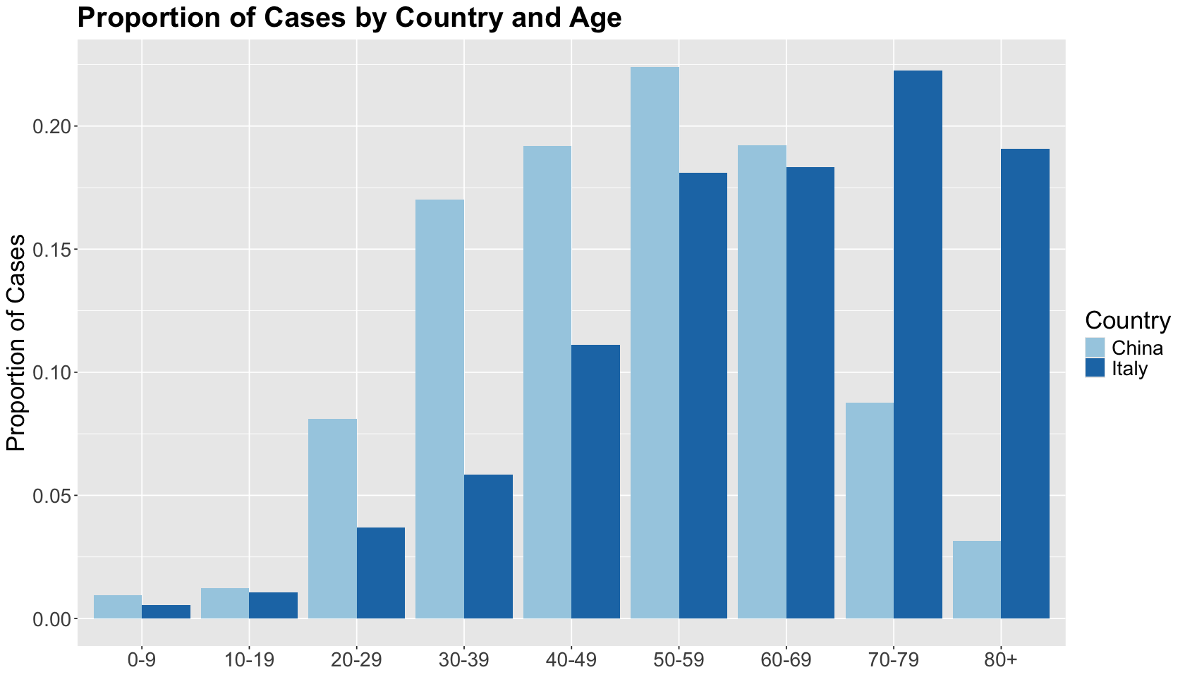
Moreover, the literature has addressed another fact: higher age is correlated with higher fatality rates for COVID-19 cases. There is strong scientific evidence that this correlation is causal. We might say that age is a confounder of the country-COVID fatality rate relationship.
The correlation coefficients below come from the age groups by country between case fatality rate and proportion of cases. China’s cases are mostly younger than Italy’s cases, hence its negative coefficient.
covid19_data_perc_by_country_and_age %>%
  group_by(Country) %>%
  dplyr::summarise(corr = round(cor(`Fatality rate`, `Proportion of cases`), 2))
| Country | corr |
|---|---|
| <chr> | <dbl> |
| China | -0.26 |
| Italy | 0.63 |
1.3. How to Avoid Misleading Conclusions#
Let us focus on the COVID-19 data. Suppose you are doing your analysis with the overall case fatality rates between China and Italy. One might be tempted to say that “Italy did a bad job treating its COVID-19 compared to China.” Nevertheless, you would miss another important variable which is age.
If Italy has a larger proportion of cases in older age groups, compared to China, and other literature has already addressed that older people are more prone to COVID-19 fatalities, then the previous statement is misleading! You would be falling into the Simpson’s paradox trap!
Caution
To avoid misleading conclusions, it is extremely important to know how our data was collected. Moreover, even before collecting any data, we need to define what variables are relevant to our study. For example, if we want to infer causality, we must determine the possible causes for our outcome of interest.
We cannot start collecting data if we do not carefully design our sampling plan!
2. Two Big-Picture Strategies for Dealing With Confounding#
We will introduce the concept of confounders and their role in causal inference when performing observational AND experimental studies such as randomized clinical trials (RCTs) or A/B testings.
We will do this exercise via different simulations with OLS.
But first, let us start by formally explaining what a confounder is. Mann and Wood (2012) provide the following definition in a medical context:
In general, for a variable to be a confounder in a particular study, the formal definition requires that it must meet two criteria: the first is that it must be related to the outcome of interest in terms of prognosis or susceptibility. The second criteria, which explains why it is more commonly seen outside the setting of RCTs, is that the distribution of the confounding factor is different in the groups being compared. More broadly, confounding can be defined as a mixing of effects between the exposure of interest, the disease, and a third factor (i.e., the confounder) that is associated with the exposure that independently affects the risk of developing the disease.
The previous definition might sound too wordy. Thus, by using our aforementioned Simpson paradox’s example, let us untangle the elements of confounding:
Exposure of interest. A specific country (China or Italy) that could involve environmental conditions, health infrastructure, etc.
Disease. COVID-19 via its case fatality rate.
Confounder. Age group.
Roughly speaking, in a regresssion framework where \(X\) is the regressor and \(Y\) is the response, another regressor \(C\) confounds the \(X\)-\(Y\) relationship if \(C\) and \(X\) are associated, and \(C\) and \(Y\) are associated as shown in Fig. 2.
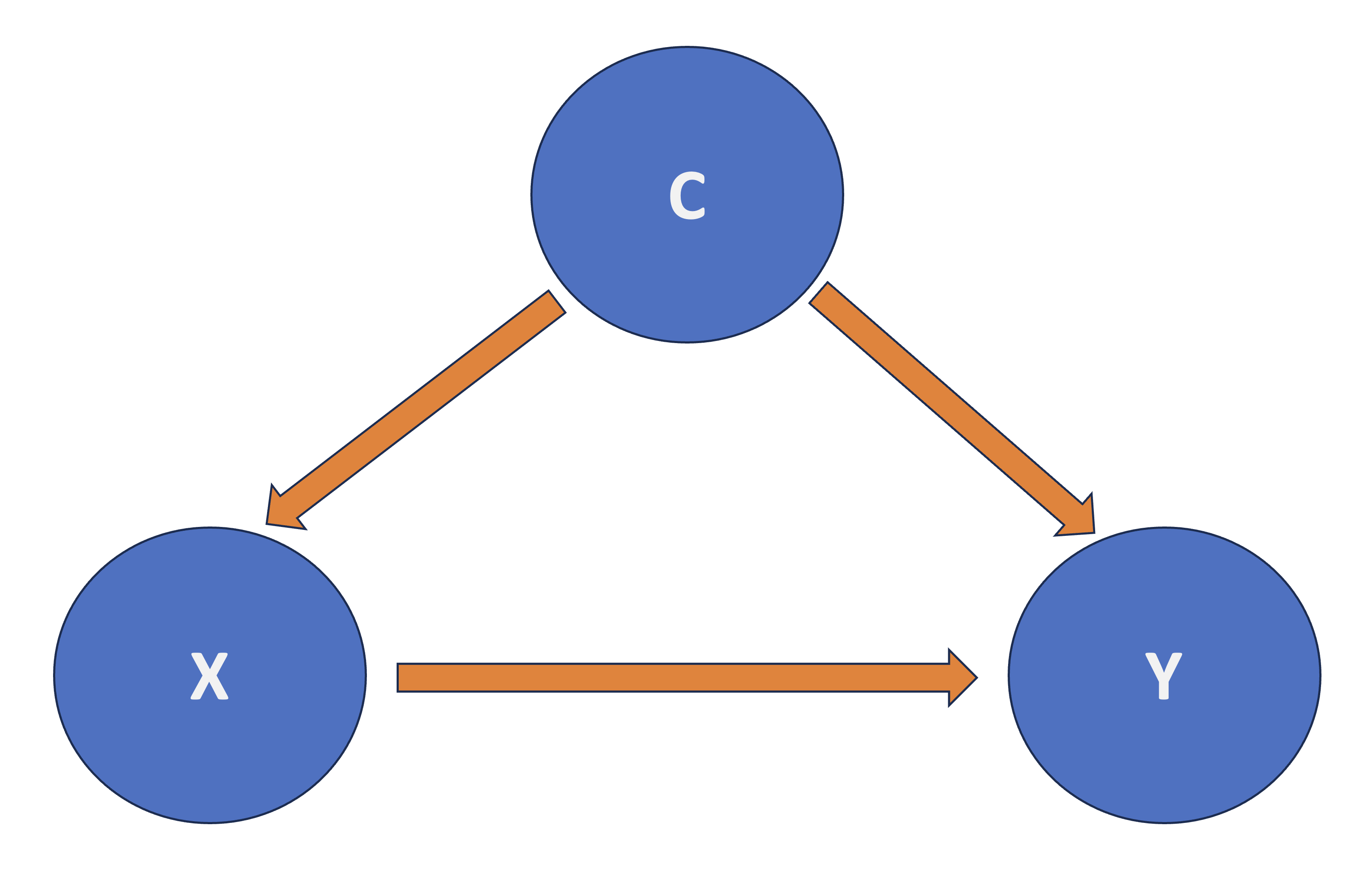
Fig. 2 Diagram of Confounding.#
2.1. The TikTok® Simulation#
Copyright © 2025 TikTok
You are part of a team of data scientists working for a given company. The team is in charge of an A/B testing involving a TikTok® ad. The case study’s framework is the following:
Main statistical inquiry
Suppose the company’s marketing team has developed a new ad for TikTok®. They want to know if this NEW AD will INCREASE the ad engagement (which they will measure via the ad dwell time in seconds) compared to the CURRENT AD they are running in a given customer population.
Furthermore, let us make the framework more complex. Suppose your customer population is located in two cities: Vancouver and Victoria. Moreover, customers from Victoria have larger dwell times. The dwell times also increase in older customers regardless of their city.
Exercise 4
Under this framework, what is the response \(Y\)?
A. Customer’s age.
B. City.
C. Ad dwell time.
D. Type of TikTok® ad.
Exercise 5
Under this framework, what is the main regressor of interest \(X\)?
A. Customer’s age.
B. City.
C. Ad dwell time.
D. Type of TikTok® ad.
Exercise 6
Under this framework, what regressors are the confounders \(C_1\) and \(C_2\)?
A. Customer’s age.
B. City.
C. Customer’s age and city.
2.2. The Strategies#
There is more than one way to deal with confounding if we want to detect a causal relationship between \(X\) and \(Y\). Depending on the nature of the study, one could do the following:
In the case of observational studies, stratification is a good strategy. It implies checking the association between \(X\) and \(Y\) within subgroups of observations that share common values for the confounders. In a linear regression context with \(m\) confounders \(C_j\), we would regress \(Y\) on \(X\) and \(C_1, C_2, \dots, C_m\).
In an experimental study, such as A/B testing, we would randomize each subject to a particular level of factor \(X\). Then, we compare \(Y\) across the different levels of \(X\). For instance, one could use an Analysis of Variance (ANOVA), which is just one specific class of OLS model (a continuous response versus a categorical and nominal regressor).
Important
The second strategy is the golden standard in causal inference and design and analysis of experiments. Nonetheless, it might implicate different statistical, practical, and ETHICAL matters.
What is the beauty of a randomized experiment?
The regressor \(X\) is guaranteed to be independent of all possible confounders! Whether or not you can measure these confounders, or even know the identity of each \(C_j\).
Thus, we no longer need to be concerned with confounding, and we can interpret the association between \(X\) and \(Y\) in a causal manner.
2.3. Building a Synthetic Population#
Before approaching the previous two strategies, let us build our synthetic population for the TikTok® ad case.
Suppose this population has 1000000 customers (pop.size), where 50% are from Victoria and the other 50% are from Vancouver (i.e., a regressor called city). Moreover, let us assume that the regressor age is uniformly distributed across the whole customer population between 16 and 24 years old.
The code below builds a tibble containing all the customers in the population called pop.pool with two columns: one for city and another for age. As explained above, the values in these two columns need to be simulated.
set.seed(554) # Reproducibility

pop.size <- 1000000

pop.pool <- tibble(
  city = sample(c(rep("Vancouver", pop.size / 2), rep("Victoria", pop.size / 2))),
  age = runif(pop.size, 16, 24) # Random number generator from uniform distribution
)
pop.pool
| city | age |
|---|---|
| <chr> | <dbl> |
| Victoria | 20.30095 |
| Victoria | 23.53586 |
| Victoria | 19.09438 |
| Vancouver | 19.51355 |
| ⋮ | ⋮ |
| Vancouver | 23.98407 |
| Vancouver | 18.06687 |
| Vancouver | 22.71233 |
| Victoria | 16.74671 |
Once we have our synthetic population pool of customers, we need to simulate their corresponding dwell times \(Y\) if they see the current or the new ad. Hence, each customer in the population will have their pair of potential responses: one for the current ad and one for the new ad in seconds.
Caution
Everyone has a potential response that will manifest if they watch the current OR new ad.
Within the population, both responses will have their own means per customer as follows:
mean_current_ad <- 15 + 5 * (pop.pool$city == "Victoria") + 0.2 * pop.pool$age
round(head(mean_current_ad), 4)

mean_new_ad <- mean_current_ad + 8
round(head(mean_new_ad), 4)
- 24.0602
- 24.7072
- 23.8189
- 18.9027
- 19.0822
- 23.9516
- 32.0602
- 32.7072
- 31.8189
- 26.9027
- 27.0822
- 31.9516
The previous code is computing response means in seconds for each customer within pop.pool, according to their specific values in city and age, and storing them in two vectors:
mean_current_ad: This is the vector of1000000response means corresponding to the current video. It has a baseline of15seconds for each customer, plus5additional seconds if the customer is fromVictoria, and0.2seconds per year inageregardless of where the customer is located.mean_new_ad: This is the vector of1000000response means corresponding to the new video. It is just the vectormean_current_adplus8seconds for ALL the customers.
Attention
Note that the value of 8 in mean_new_ad is the one we aim to estimate via an observational or experimental study, which denotes that the new ad increases the dwell time by 8 seconds for the customer population in general. The effect 8 seconds refers to our main statistical inquiry!
Once we have these vectors of means, we can simulate the corresponding responses y_current_ad and y_new_ad and incorporate them in pop.pool as two new columns. These responses will be normally distributed (i.e., rnorm()) with means mean_current_ad and mean_new_ad and fixed standard deviations of 1 second.
set.seed(554) # Reproducibility

pop.pool$y_current_ad <- rnorm(pop.size, mean = mean_current_ad, sd = 1)
pop.pool$y_new_ad <- rnorm(pop.size, mean = mean_new_ad, sd = 1)

pop.pool
| city | age | y_current_ad | y_new_ad |
|---|---|---|---|
| <chr> | <dbl> | <dbl> | <dbl> |
| Victoria | 20.30095 | 24.87506 | 29.23864 |
| Victoria | 23.53586 | 23.84210 | 32.29992 |
| Victoria | 19.09438 | 23.78396 | 33.55232 |
| Vancouver | 19.51355 | 17.20327 | 27.84733 |
| ⋮ | ⋮ | ⋮ | ⋮ |
| Vancouver | 23.98407 | 18.85700 | 28.33902 |
| Vancouver | 18.06687 | 18.83784 | 26.85744 |
| Vancouver | 22.71233 | 19.44461 | 27.68320 |
| Victoria | 16.74671 | 22.46434 | 31.84106 |
2.4. Study 1: Observational and Naive#
Let us suppose we run a naive observational study. In this case, we will obtain a sample of customers. They will be able to choose the ad they want to see (i.e., we just conduct an observational study).
The upcoming code will create a factor-type column called x_self_choice with:
the value of
1(relabeled to levelNew Ad), denoting that the customer inpop.pool(if observed) would choose to watch the new ad, and0(relabeled to levelCurrent Ad) for the current ad.
These values are random numbers coming from a Bernoulli distribution (rbinom() with size = 1) whose probability of success (i.e., choosing the new ad) increases when the customer is from Victoria while slightly decreasing for older customers in general (check argument prob in rbinon()).
set.seed(554) # Reproducibility

pop.pool$x_self_choice <- as.factor(rbinom(pop.size,
  size = 1,
  prob = 0.5 + 0.5 * (pop.pool$city == "Victoria") - 0.005 * pop.pool$age
))
pop.pool$x_self_choice <- fct_recode(pop.pool$x_self_choice, "Current Ad" = "0", "New Ad" = "1")
pop.pool
| city | age | y_current_ad | y_new_ad | x_self_choice |
|---|---|---|---|---|
| <chr> | <dbl> | <dbl> | <dbl> | <fct> |
| Victoria | 20.30095 | 24.87506 | 29.23864 | New Ad |
| Victoria | 23.53586 | 23.84210 | 32.29992 | New Ad |
| Victoria | 19.09438 | 23.78396 | 33.55232 | New Ad |
| Vancouver | 19.51355 | 17.20327 | 27.84733 | Current Ad |
| ⋮ | ⋮ | ⋮ | ⋮ | ⋮ |
| Vancouver | 23.98407 | 18.85700 | 28.33902 | Current Ad |
| Vancouver | 18.06687 | 18.83784 | 26.85744 | New Ad |
| Vancouver | 22.71233 | 19.44461 | 27.68320 | New Ad |
| Victoria | 16.74671 | 22.46434 | 31.84106 | New Ad |
Next, we will create another column in pop.pool called y_obs, which will contain the observed response by customer based on x_self_choice; i.e., IF the customer is more likely to choose the New Ad then the column y_obs will contain the value indicated in y_new_ad, ELSE otherwise. Then, from pop.pool, we will collect one sample of size 1000 and call it sample_TikTok.
set.seed(554) # Reproducibility

pop.pool$y_obs <- ifelse(pop.pool$x_self_choice == "Current Ad",
  pop.pool$y_current_ad, pop.pool$y_new_ad
)

sample_TikTok <- rep_sample_n(pop.pool, size = 1000)
sample_TikTok
| replicate | city | age | y_current_ad | y_new_ad | x_self_choice | y_obs |
|---|---|---|---|---|---|---|
| <int> | <chr> | <dbl> | <dbl> | <dbl> | <fct> | <dbl> |
| 1 | Victoria | 22.39433 | 23.08302 | 31.46239 | New Ad | 31.46239 |
| 1 | Vancouver | 22.37157 | 20.96466 | 26.64890 | New Ad | 26.64890 |
| 1 | Vancouver | 20.36378 | 19.25500 | 27.85650 | New Ad | 27.85650 |
| 1 | Vancouver | 16.82234 | 17.78648 | 26.91782 | New Ad | 26.91782 |
| ⋮ | ⋮ | ⋮ | ⋮ | ⋮ | ⋮ | ⋮ |
| 1 | Victoria | 19.70080 | 24.77803 | 32.58291 | New Ad | 32.58291 |
| 1 | Victoria | 20.65071 | 25.03055 | 31.85587 | New Ad | 31.85587 |
| 1 | Vancouver | 19.75119 | 19.86671 | 26.47666 | New Ad | 26.47666 |
| 1 | Victoria | 23.58678 | 24.31605 | 31.36179 | New Ad | 31.36179 |
table(sample_TikTok$x_self_choice) # Choices in observed sample (n = 1000)
Current Ad     New Ad
       343        657
2.4.1. Exploratory Data Analysis#
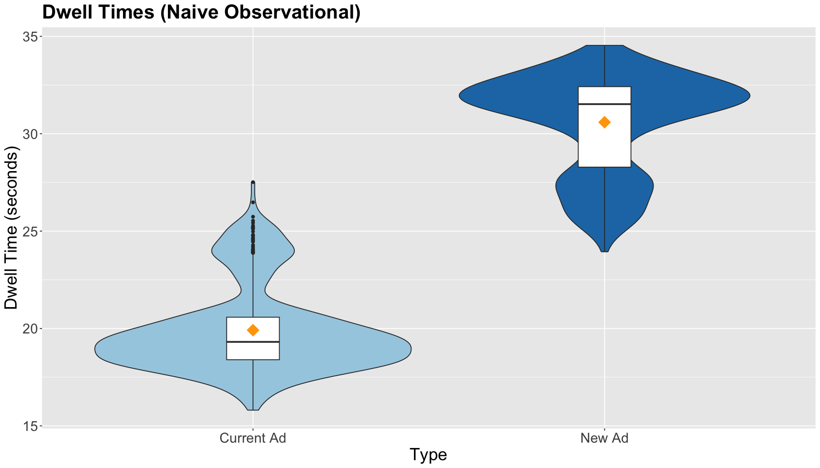
We must graphically compare the observed distributions and spread in both ads within sample_TikTok via side-by-side boxplots. We also include the sample average by type of ad (as a yellow point): Current Ad and New Ad. The EDA shows larger dwell times for the New Ad.
obs_dwell_time_boxplots <- sample_TikTok %>%
  ggplot(aes(x_self_choice, y_obs)) +
  geom_violin(aes(fill = x_self_choice)) +
  geom_boxplot(width = 0.15) +
  theme(
    plot.title = element_text(size = 24, face = "bold"),
    axis.text = element_text(size = 17),
    axis.title = element_text(size = 21),
    legend.position = "none"
  ) +
  ggtitle("Dwell Times (Naive Observational)") +
  xlab("Type") +
  ylab("Dwell Time (seconds)") +
  guides(fill = "none") +
  stat_summary(aes(x_self_choice, y_obs, fill = x_self_choice),
    fun = mean, colour = "orange", geom = "point",
    shape = 18, size = 7
  ) +
  scale_fill_brewer(palette = "Paired")
obs_dwell_time_boxplots
2.4.2. Regression Model#
Imagine that we only collect the dwell times and the type of chosen ad (as shown below) in sample_TikTok. Suppose you want to estimate the real population effect in the dwell time of the new ad compared to the current ad. Recall we set up our synthetic data so this effect is an increase of 8 seconds IN GENERAL.
sample_TikTok[, c("x_self_choice", "y_obs")]
| x_self_choice | y_obs |
|---|---|
| <fct> | <dbl> |
| New Ad | 31.46239 |
| New Ad | 26.64890 |
| New Ad | 27.85650 |
| New Ad | 26.91782 |
| ⋮ | ⋮ |
| New Ad | 32.58291 |
| New Ad | 31.85587 |
| New Ad | 26.47666 |
| New Ad | 31.36179 |
Using sample_TikTok, we estimate an OLS model called OLS_naive_obs_study_TikTok of the dwell time (y_obs) versus the chosen type of ad (x_self_choice). We include the corresponding asymptotic 95% confidence intervals (CIs) in our model’s summary. This is an ANOVA model.
OLS_naive_obs_study_TikTok <- lm(y_obs ~ x_self_choice,
  data = sample_TikTok
)

OLS_naive_obs_study_TikTok_results <- tidy(OLS_naive_obs_study_TikTok, conf.int = TRUE) %>% mutate_if(is.numeric, round, 2)
OLS_naive_obs_study_TikTok_results
| term | estimate | std.error | statistic | p.value | conf.low | conf.high |
|---|---|---|---|---|---|---|
| <chr> | <dbl> | <dbl> | <dbl> | <dbl> | <dbl> | <dbl> |
| (Intercept) | 19.91 | 0.13 | 151.68 | 0 | 19.66 | 20.17 |
| x_self_choiceNew Ad | 10.68 | 0.16 | 65.92 | 0 | 10.36 | 10.99 |
Note the estimated effect in dwell time, when switching from the current to the new ad, increases by 10.68 seconds and is statistically significant. The effect is clearly overestimated in this analysis, even when computing the 95% CI!
Exercise 7
Why are we overestimating the effect of the new ad in this naive observational study?
2.5. Study 2: Observational and Less Naive#
Now, let us suppose we ran a less naive study when collecting sample_TikTok. Hence, we also record the values of the confounders city and age when running our study.
sample_TikTok[, c("city", "age", "x_self_choice", "y_obs")]
| city | age | x_self_choice | y_obs |
|---|---|---|---|
| <chr> | <dbl> | <fct> | <dbl> |
| Victoria | 22.39433 | New Ad | 31.46239 |
| Vancouver | 22.37157 | New Ad | 26.64890 |
| Vancouver | 20.36378 | New Ad | 27.85650 |
| Vancouver | 16.82234 | New Ad | 26.91782 |
| ⋮ | ⋮ | ⋮ | ⋮ |
| Victoria | 19.70080 | New Ad | 32.58291 |
| Victoria | 20.65071 | New Ad | 31.85587 |
| Vancouver | 19.75119 | New Ad | 26.47666 |
| Victoria | 23.58678 | New Ad | 31.36179 |
We estimate another OLS model called OLS_obs_study_TikTok of the dwell time (y_obs) versus the type of ad and the respective confounders.
OLS_obs_study_TikTok <- lm(y_obs ~ x_self_choice + city + age,
  data = sample_TikTok
)

OLS_obs_study_TikTok <- tidy(OLS_obs_study_TikTok, conf.int = TRUE) %>% mutate_if(is.numeric, round, 2)
OLS_obs_study_TikTok
| term | estimate | std.error | statistic | p.value | conf.low | conf.high |
|---|---|---|---|---|---|---|
| <chr> | <dbl> | <dbl> | <dbl> | <dbl> | <dbl> | <dbl> |
| (Intercept) | 15.34 | 0.28 | 54.53 | 0 | 14.79 | 15.89 |
| x_self_choiceNew Ad | 8.03 | 0.08 | 103.48 | 0 | 7.87 | 8.18 |
| cityVictoria | 5.02 | 0.07 | 68.12 | 0 | 4.88 | 5.17 |
| age | 0.18 | 0.01 | 13.21 | 0 | 0.15 | 0.21 |
Note the estimated effect in dwell time, when switching from the current to the new ad, increases by 8.03 seconds and is statistically significant. Controlling for these causal covariates (confounders!), we get an accurate estimate for the effect of the new ad! We also have accurate estimates for city and age given how we created our artificial population.
2.6. Study 3: Randomized Study (Gold Standard)#
Finally, suppose we can run an experimental study (i.e., a TikTok A/B testing) with the customers in sample_TikTok under a balanced design (i.e., we allocate equal numbers of subjects by experimental treatment).
Therefore, we create a two-level factor-type column called x_randomized by randomly assign each customer to view either the Current Ad or the New Ad. Then, we create another column in sample_TikTok called y_exp, which will contain the obtained experimental response by customer based on x_randomized; i.e., if the customer is assigned to New Ad then the column y_exp will contain the value indicated in the potential y_new_ad, else otherwise.
set.seed(1234) # Reproducibility

sample_TikTok$x_randomized <- sample(c(
  rep("Current Ad", nrow(sample_TikTok) / 2),
  rep("New Ad", nrow(sample_TikTok) / 2)
))
sample_TikTok$y_exp <- ifelse(sample_TikTok$x_randomized == "Current Ad",
  sample_TikTok$y_current_ad, sample_TikTok$y_new_ad
)
sample_TikTok
| replicate | city | age | y_current_ad | y_new_ad | x_self_choice | y_obs | x_randomized | y_exp |
|---|---|---|---|---|---|---|---|---|
| <int> | <chr> | <dbl> | <dbl> | <dbl> | <fct> | <dbl> | <chr> | <dbl> |
| 1 | Victoria | 22.39433 | 23.08302 | 31.46239 | New Ad | 31.46239 | Current Ad | 23.08302 |
| 1 | Vancouver | 22.37157 | 20.96466 | 26.64890 | New Ad | 26.64890 | New Ad | 26.64890 |
| 1 | Vancouver | 20.36378 | 19.25500 | 27.85650 | New Ad | 27.85650 | New Ad | 27.85650 |
| 1 | Vancouver | 16.82234 | 17.78648 | 26.91782 | New Ad | 26.91782 | Current Ad | 17.78648 |
| ⋮ | ⋮ | ⋮ | ⋮ | ⋮ | ⋮ | ⋮ | ⋮ | ⋮ |
| 1 | Victoria | 19.70080 | 24.77803 | 32.58291 | New Ad | 32.58291 | Current Ad | 24.77803 |
| 1 | Victoria | 20.65071 | 25.03055 | 31.85587 | New Ad | 31.85587 | New Ad | 31.85587 |
| 1 | Vancouver | 19.75119 | 19.86671 | 26.47666 | New Ad | 26.47666 | Current Ad | 19.86671 |
| 1 | Victoria | 23.58678 | 24.31605 | 31.36179 | New Ad | 31.36179 | Current Ad | 24.31605 |
2.6.1. Exploratory Data Analysis#
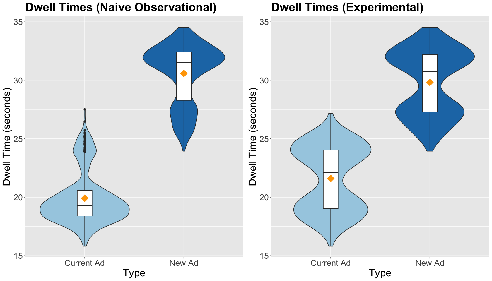
Before fitting the corresponding regression, let us compare the side-by-side boxplots of the naive observational study versus the experimental study. The treatment means are closer in the experimental study, and treatment data spread is graphically quite similar.
exp_dwell_time_boxplots <- sample_TikTok %>%
  ggplot(aes(x_randomized, y_exp)) +
  geom_violin(aes(fill = x_randomized)) +
  geom_boxplot(width = 0.15) +
  theme(
    plot.title = element_text(size = 24, face = "bold"),
    axis.text = element_text(size = 17),
    axis.title = element_text(size = 21),
    legend.position = "none"
  ) +
  ggtitle("Dwell Times (Experimental)") +
  xlab("Type") +
  ylab("Dwell Time (seconds)") +
  guides(fill = "none") +
  stat_summary(aes(x_randomized, y_exp, fill = x_randomized),
    fun = mean, colour = "orange", geom = "point",
    shape = 18, size = 7
  ) +
  scale_fill_brewer(palette = "Paired")
plot_grid(obs_dwell_time_boxplots, exp_dwell_time_boxplots)
2.6.2. Regression Model#
Finally, we estimate another OLS model called OLS_exp_study_TikTok of the experimental dwell time (y_exp) versus the assigned type of ad (x_randomized). This is an ANOVA model.
OLS_exp_study_TikTok <- lm(y_exp ~ x_randomized,
  data = sample_TikTok
)

OLS_exp_study_TikTok_results <- tidy(OLS_exp_study_TikTok, conf.int = TRUE) %>% mutate_if(is.numeric, round, 2)
OLS_exp_study_TikTok_results
| term | estimate | std.error | statistic | p.value | conf.low | conf.high |
|---|---|---|---|---|---|---|
| <chr> | <dbl> | <dbl> | <dbl> | <dbl> | <dbl> | <dbl> |
| (Intercept) | 21.60 | 0.12 | 174.77 | 0 | 21.36 | 21.85 |
| x_randomizedNew Ad | 8.22 | 0.17 | 47.05 | 0 | 7.88 | 8.57 |
OLS_naive_obs_study_TikTok_results
| term | estimate | std.error | statistic | p.value | conf.low | conf.high |
|---|---|---|---|---|---|---|
| <chr> | <dbl> | <dbl> | <dbl> | <dbl> | <dbl> | <dbl> |
| (Intercept) | 19.91 | 0.13 | 151.68 | 0 | 19.66 | 20.17 |
| x_self_choiceNew Ad | 10.68 | 0.16 | 65.92 | 0 | 10.36 | 10.99 |
Note the estimated experimental effect in dwell time, when switching from the current to the new ad, increases by 8.22 seconds and is statistically significant. Right on! According to the output above, we obtain more accurate estimations with a randomized study than a naive observational one.
Nevertheless, compared to the less naive observational study, the 95% CI of the effect estimate is less precise!
OLS_obs_study_TikTok
| term | estimate | std.error | statistic | p.value | conf.low | conf.high |
|---|---|---|---|---|---|---|
| <chr> | <dbl> | <dbl> | <dbl> | <dbl> | <dbl> | <dbl> |
| (Intercept) | 15.34 | 0.28 | 54.53 | 0 | 14.79 | 15.89 |
| x_self_choiceNew Ad | 8.03 | 0.08 | 103.48 | 0 | 7.87 | 8.18 |
| cityVictoria | 5.02 | 0.07 | 68.12 | 0 | 4.88 | 5.17 |
| age | 0.18 | 0.01 | 13.21 | 0 | 0.15 | 0.21 |
OLS_exp_study_TikTok_results
| term | estimate | std.error | statistic | p.value | conf.low | conf.high |
|---|---|---|---|---|---|---|
| <chr> | <dbl> | <dbl> | <dbl> | <dbl> | <dbl> | <dbl> |
| (Intercept) | 21.60 | 0.12 | 174.77 | 0 | 21.36 | 21.85 |
| x_randomizedNew Ad | 8.22 | 0.17 | 47.05 | 0 | 7.88 | 8.57 |
We can have a more precise effect estimate if we include city and age as in the experimental OLS model below.
OLS_full_exp_study_TikTok <- lm(y_exp ~ x_randomized + city + age,
  data = sample_TikTok
)

OLS_full_exp_study_TikTok_results <- tidy(OLS_full_exp_study_TikTok, conf.int = TRUE) %>% mutate_if(is.numeric, round, 2)
OLS_full_exp_study_TikTok_results
| term | estimate | std.error | statistic | p.value | conf.low | conf.high |
|---|---|---|---|---|---|---|
| <chr> | <dbl> | <dbl> | <dbl> | <dbl> | <dbl> | <dbl> |
| (Intercept) | 15.20 | 0.27 | 55.31 | 0 | 14.66 | 15.74 |
| x_randomizedNew Ad | 8.04 | 0.06 | 128.36 | 0 | 7.91 | 8.16 |
| cityVictoria | 5.08 | 0.06 | 80.97 | 0 | 4.96 | 5.20 |
| age | 0.19 | 0.01 | 13.91 | 0 | 0.16 | 0.21 |
Note the estimated effect in dwell time, when switching from the current to the new ad, increases by 8.04 seconds and is statistically significant. The model above is as precise as the less naive observational model.
OLS_obs_study_TikTok
| term | estimate | std.error | statistic | p.value | conf.low | conf.high |
|---|---|---|---|---|---|---|
| <chr> | <dbl> | <dbl> | <dbl> | <dbl> | <dbl> | <dbl> |
| (Intercept) | 15.34 | 0.28 | 54.53 | 0 | 14.79 | 15.89 |
| x_self_choiceNew Ad | 8.03 | 0.08 | 103.48 | 0 | 7.87 | 8.18 |
| cityVictoria | 5.02 | 0.07 | 68.12 | 0 | 4.88 | 5.17 |
| age | 0.18 | 0.01 | 13.21 | 0 | 0.15 | 0.21 |
From the previous results, we get similar estimates. Hence, we might wonder: why are we running an experiment when we can only execute a less naive observational study?
In this example, we know exactly how the synthetic population is structured. Therefore, we know what confounders to use in our observational OLS model. Nonetheless, in real life, different populations would get extremely complex with a whole set of counfounders. Identifying and measuring the right confounders is another complex sampling task.
Again, the beauty of randomized experiments (such as A/B testing) allows the accurate estimation of our experimental effect of interest without including confounders. But, of course, we can include some confounders in our experimental OLS, making our estimations more precise.
In this specific example, our second experimental OLS (OLS_full_exp_study_TikTok) has the following experimental components:
The continuous response
y_exp.The experimental factor of interest
x_randomizedwith two treatments:New AdandCurrent Ad.A categorical variable
citywith two levels:VictoriaandVancouver.A continuous covariate
age.
These elements make our OLS model an Analysis of Covariance (ANCOVA).
3. Wrapping Up#
We have covered a lot of ground:
The Simpson’s paradox and its relation with confounding (how to avoid this paradox).
Randomized experiments versus observational studies:
Accuracy of inference via proper regression modelling.
Proper validity of causal claims with the right variables.