User Interface
Overview
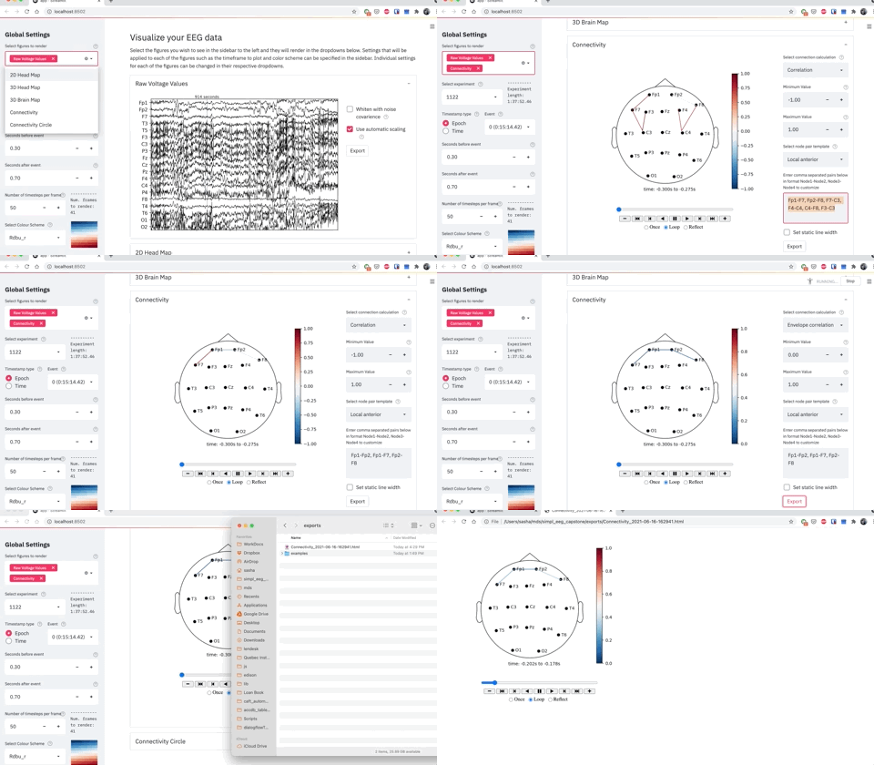
The user interface (UI) is designed to allow users to generate and customize visualizations with no coding required.
A selection of the most useful package features are available in the UI, although the customization options and visualizations available on the UI are not exhaustive. If you would like to heavily customize your visualization we recommend using the python package directly instead, as it allows more flexibility.
Features
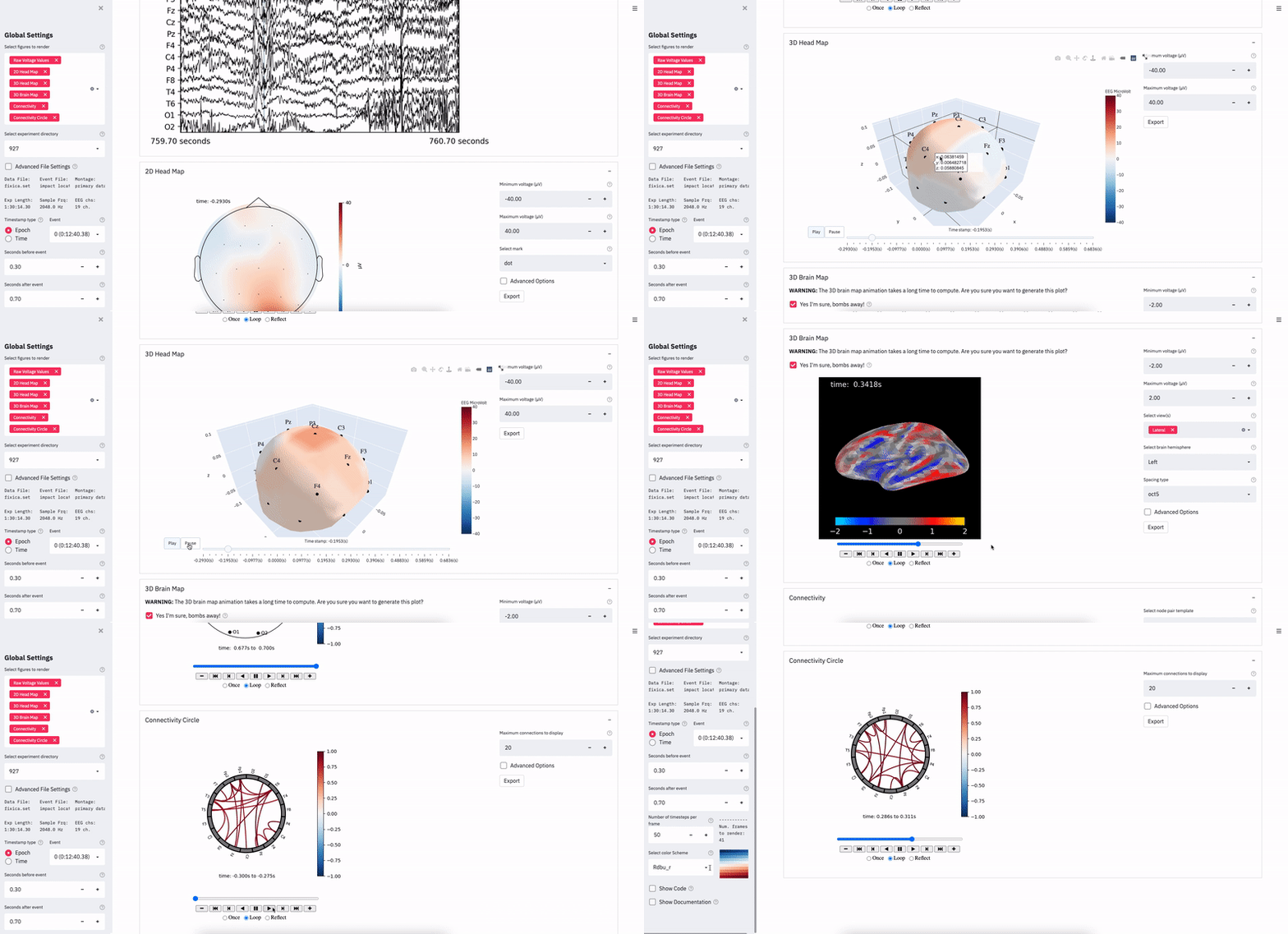
The UI contains over 40 customization options and 6 visualization options:
6) Connectivity Circle Animation
Features include customizing epochs, setting colour scheme, setting value scales, and more. Help messages have been added to all features, so hover over help button (which looks like a ? in a circle) if you are ever wondering what a specific feature does.
Demo Example 1
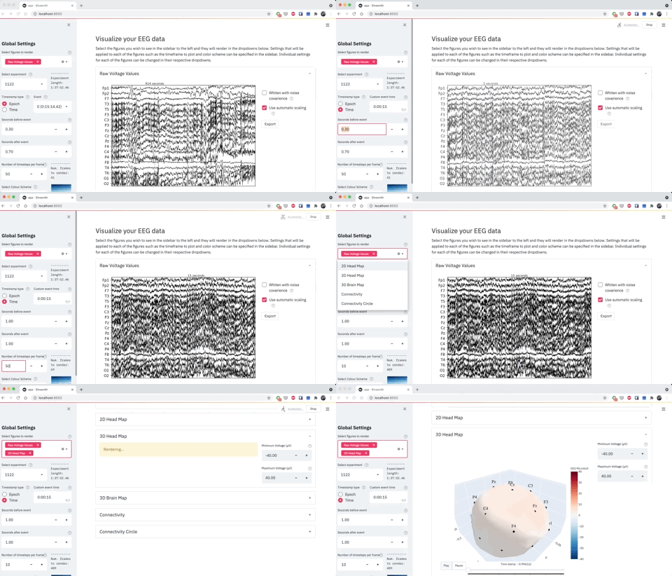
Selecting a custom time between 14 - 16 seconds and generating a 3D head map for every 10th frame.
Demo Example 2
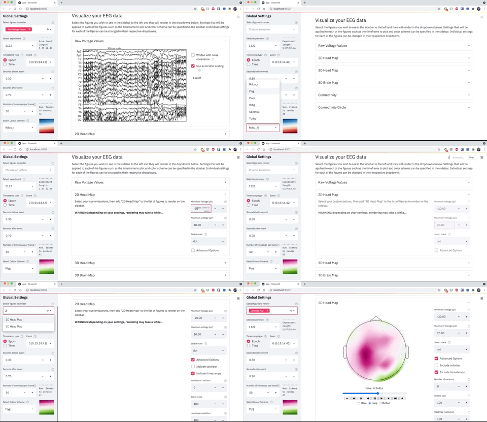
Creating a 2D head map with values between -30 to 30 with no colourbar and a pink green colour scheme.
Demo Example 3
Exporting a envelope correlation connectivity plot with custom node pairs “Fp1-Fp2, Fp1-F7, Fp2-F8”
