Lab 4: Quantile Regression
Setup
We will need to load the following packages before proceeding:
DoorDash ETAs — Thinking Like the ETA Team!
![]()
Imagine you have just joined the DoorDash ETA (Estimated Time of Arrival) team as a Data Scientist. Your manager does not care about “average delivery time” in the abstract; they care about customer promises:
-
“Most orders should arrive around ___ minutes.”
-
“But we should warn customers that it could take as long as ___ minutes.”
- “And we need to understand how staffing and congestion shift those numbers.”
This warmup is about learning the tool that matches that reality: Quantile regression.
Important Key Mindset Shift
In this setting, focusing only on the Ordinary Least-squares (OLS) conditional mean \(\mathbb{E}(Y \mid X)\) is often not the right target. Let us suppose that DoorDash lives and dies by the median (typical experience), upper quantiles (late orders, disappointed customers), and lower quantiles (early orders and possibly happier customers).
About the Dataset
The DoorDash ETA dataset contains historical delivery records from early 2015, where each observation corresponds to a single food delivery order. The response of interest is the total delivery duration, defined as the time between when an order is placed (created_at) and when it is delivered (actual_delivery_time).
The dataset includes a mix of order characteristics, marketplace conditions at order time (e.g., number of active and busy dashers nearby), and predictions from internal models (e.g., estimated driving time). Because delivery times are typically right-skewed and heterogeneous, this dataset is well-suited for Quantile regression, which allows us to model different parts of the conditional distribution of delivery time rather than just the mean. You can find the dataset in this Kaggle website. Suppose this dataset is representative enough for a given city of interest.
Setup: Load the Dataset
The raw dataset doordash.csv includes timestamps for when an order is placed and when it is delivered, plus features describing market conditions and order/store characteristics. We have 12969 raw data points.
Data Wrangling: Define the response we actually model!
In the raw data doordash_raw, columns created_at and actual_delivery_time are timestamps. For modelling and interpretation, we will convert these into an actual delivery duration in minutes. Note that we will overwrite actual_delivery_time to be the duration in min (suppose DoorDash people often casually call this “actual delivery time” anyway). The original delivery timestamp will be stored as actual_delivery_timestamp. The below chunk of code results in a data frame of \(n = 12700\) rows, which is enough data.
Let us now check summary of actual_delivery_time.
Now, let us plot the histogram of actual_delivery_time via training_doordash.
Q1.1. Initial Food for Thought
As a DoorDash Data Scientist, your manager asks about the above summary() and histogram for actual delivery times in minutes to report descriptive ETAs to customers:
“Should we report a single ‘typical ETA’ using the mean or the median?”
Q1.1.1. Based on the above descriptive statistics and histogram, which is the better “typical ETA” and why?
Q1.1.2. What does the fact that the mean exceeds the median suggest about the shape of the distribution?
Q1.1.3. Which statistic (mean or median) would be more robust to the maximum value 166.050 minutes, and how does that motivate using median (\(\tau = 0.5\)) Quantile regression instead of OLS for a central-tendency model?
Answers
Available for MDS students.
First Statistical Inquiry: “What’s ‘typical’ delivery time, and how do staffing plus congestion move it?”
Your manager asks:
“I don’t want the average — I want typical delivery time. Use staffing within 10 miles (
total_onshift_dashers, \(X_1\)) and congestion (total_busy_dashers, \(X_2\)) to explain what shifts that typical time.”
We will compare:
- OLS: models the conditional mean \(\mathbb{E}(Y \mid X_1, X_2)\).
- Parametric median Quantile regression (\(\tau = 0.5\)): models the conditional median \(Q_{Y \mid X_1, X_2}(\tau = 0.5 \mid X_1, X_2)\).
The exact regressor descriptions are the following:
-
total_onshift_dashers: Number of available dashers who are within 10 miles of the store at the time of order creation. -
total_busy_dashers: Subset of the abovetotal_onshift_dasherswho are currently working on an order.
Q1.2. Exploratory Data Analysis: Why the median matters here!
Let us recheck the histogram of actual delivery times from training_doordash:
Based on the above histogram, why might the median be a more appropriate “typical ETA” than the mean?
Answer
Available for MDS students.
Q1.3. Estimation: Fit OLS and Parametric Median Quantile Regressions
Important
We are intentionally skipping the data modelling stage in this inquiry; we will leave the equations for the next one with a more complex regressor arrangement.
Fit two models with the same response and regressors:
-
Response:
actual_delivery_time(min). -
Regressors:
total_onshift_dashersandtotal_busy_dashers.
First, fit an OLS model (ETA_OLS) to study how the regressors affect the mean actual_delivery_time \(\mathbb{E}(Y \mid X_1, X_2)\). Then, fit a parametric median Quantile regression model (\(\tau = 0.5\), called ETA_param_qr_50) to study how the regressors affect the median delivery time \(Q_{Y|X_1, X_2}(\tau = 0.5 \mid X_1, X_2)\), which is more robust to unusually late deliveries.
Answer
Q1.4. Inference
Using your fitted models ETA_OLS and ETA_param_qr_50, are total_onshift_dashers and total_busy_dashers statistically associated with actual_delivery_time? State your conclusions with a significance level \(\alpha = 0.05\).
Important
For parametric median Quantile regression, ensure to use the pairwise bootstrapping method to obtain the corresponding empirical values. Use 100 replicates and the simulation seed 562.
Answers
Available for MDS students.
Q1.5. Coefficient Interpretation
Now, let us interpret those significant estimated regression coefficients coming from both OLS and parametric median Quantile regression.
Answer
Available for MDS students.
Q1.6. Graphical comparison: OLS Fitted Line versus Parametric Median Quantile Fitted Line
To make a clean comparison against one regressor at a time between OLS and parametric median Quantile regression, we will:
- Vary one (either
total_onshift_dashersortotal_busy_dashers) across its range. - Hold the other regressor fixed at its median.
- Plot predicted mean (OLS) versus predicted median (\(\tau=0.5\)).
Plot A: Vary on-shift dashers and hold busy dashers fixed
Plot B: Vary busy dashers, hold on-shift dashers fixed
In these two plots, why might the fitted OLS and parametric median-quantile lines differ? What is the “business meaning” of that gap?
Answer
Available for MDS students.
Second Statistical Inquiry: Where do ETA ranges like the ones in the app come from?
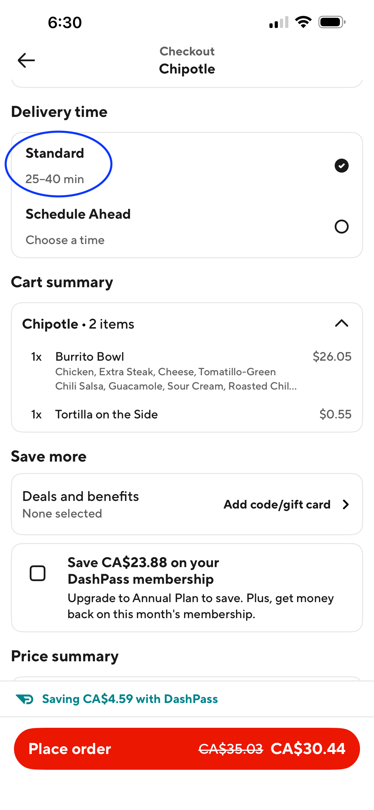
Below, you can see a DoorDash checkout screenshot from a Chipotle order by Alexi – yes, Chipotle isn’t real Mexican food… but he was hungry and desperate. The blue circled range (i.e., 25–40 minutes) is the key product question:
How could a range like 25–40 min be produced using regression ideas, without pretending that all customers experience the “mean”?
Answer
Available for MDS students.
Important
The above range-related matter is related to a predictive task, which will be the main scope of the third inquiry of this exercise. That said, for this second inquiry, we must understand the inferential facts related to estimating different Quantile regression models via the same training set.
What the Manager Wants!
The manager wants to assess whether there is a statistical association between the \(\tau = 0.1, 0.5, 0.9\) conditional quantiles of actual_delivery_time versus:
-
total_onshift_dashers: Number of available dashers who are within 10 miles of the store at the time of order creation. -
total_busy_dashers: Subset of the abovetotal_onshift_dasherswho are currently working on an order. -
store_primary_category: Cuisine category of the restaurant, e.g., Italian, Mexican, Chinese, Indian, etc.
… and by how much, if significant.
Important
Quantile regression will let us answer it across the distribution of actual delivery times. Moreover, there will be three fitted parametric Quantile regression models: \(\tau = 0.1\) (say, early deliveries, and possibly, happier customers), \(\tau = 0.5\) (say, typical experience), and \(\tau = 0.9\) (say, late orders with possible disappointed customers).
Data Wrangling
store_primary_category has many categories, which can be noisy for a warmup exercise. Thus, we will keep the most common categories and drop the rest into a factor level called “Other”. This will result in a factor-type column store_primary_category with nine categories only.
Q1.7. Exploratory Data Analysis: Quantile thinking!
Before we fit any model, we want to see how delivery times behave under different marketplace conditions and order characteristics. But here is the key DoorDash insight:
The mean can be a misleading summary because late deliveries create a long right tail.
-
What we really care about operationally is how regressors move:
- early deliveries (\(\tau = 0.1\)).
- typical deliveries (the median, \(\tau = 0.5\)).
- slow deliveries (\(\tau = 0.9\)).
So, in this exploratory data analysis (EDA), we will look at scatterplots and category comparisons, but instead of drawing a “best-fit mean line,” we will overlay fitted parametric Quantile regression lines for \(\tau = 0.1, 0.5, 0.9\). Think of these three lines as a first-pass picture of the ETA system:
- The \(\tau = 0.1\) fitted line is an early-delivery curve (ideal to have happier customers).
- The \(\tau = 0.5\) fitted line is a typical ETA curve (robust to late outliers).
- The \(\tau = 0.9\) fitted line is a late-delivery risk curve (what customers complain about).
- The gap between \(\tau = 0.1\) and \(\tau = 0.9\) fitted lines is a preview of an ETA interval.
With that mindset, let us visualize how staffing (total_onshift_dashers) and congestion (total_busy_dashers) relate to the lower, middle, and upper parts of delivery time. We will illustrate these fitted Quantile regression lines per regressor with respect to actual_delivery_time (just for EDA purposes, a more complete model fitting for inferential purposes will be explained later on).
Important
The usual geom_quantile(y ~ x) fits marginal quantile curves that only condition on the \(x\)-axis variable. Here, we would prefer conditional quantile curves from a model that takes into account both total_onshift_dashers and total_busy_dashers. So, we fit parametric Quantile regressions using both regressors, then plot predictions while varying one regressor and holding the other fixed (at its median). This makes the visual comparison meaningful.
Now, let us deliver a suitable plot for store_primary_category versus actual_delivery_time.
In the scatterplots with fitted parametric quantile lines (\(\tau = 0.1, 0.5, 0.9\)), which regressor seems to change the upper tail (slow deliveries, i.e., longer actual_delivery_time) more strongly: total_busy_dashers or total_onshift_dashers? Then use the store-type boxplots to identify one store_primary_category with especially high tail risk, and briefly explain how that store type might amplify or dampen the upper-tail effect you identified (in operational terms).
Answer
Available for MDS students.
Q1.8. Data Modelling
Why is parametric Quantile regression especially attractive for DoorDash to solve this second inquiry?
Answer
Available for MDS students.
Q1.9. Estimation
Fit the corresponding three parametric Quantile regression models of actual_delivery_time versus total_onshift_dashers, total_busy_dashers, and store_primary_category via training_doordash_2.
Heads-up: Ensure that
Otheris the baseline level in the factor-type columnstore_primary_category.
Answer
Q1.10. Inference
Using your fitted models second_param_qr_10, second_param_qr_50, and second_param_qr_90, are the regressors statistically associated to actual_delivery_time? State your conclusions with a significance level \(\alpha = 0.05\).
Important
Ensure to use the pairwise bootstrapping method to obtain the corresponding empirical \(p\)-values. Use 100 replicates and the simulation seed 562.
Answer
\(\tau = 0.1\) (early deliveries):
Significant:
-
total_onshift_dashers. -
total_busy_dashers. -
japanesecuisine when compared toOthercuisine. -
mexicancuisine when compared toOthercuisine. -
pizzacuisine when compared toOthercuisine. -
sandwichcuisine when compared toOthercuisine.
Not significant:
-
american,burger,chinese, anddessertcuisines when compared toOthercuisine.
\(\tau = 0.5\) (typical deliveries):
Significant:
-
total_onshift_dashers. -
total_busy_dashers. -
japanesecuisine when compared toOthercuisine. -
mexicancuisine when compared toOthercuisine. -
pizzacuisine when compared toOthercuisine. -
sandwichcuisine when compared toOthercuisine.
Not significant:
-
american,burger,chinese, anddessertcuisines when compared toOthercuisine.
\(\tau = 0.9\) (late deliveries / upper tail):
Significant:
-
total_onshift_dashers. -
total_busy_dashers. -
chinesecuisine when compared toOthercuisine. -
japanesecuisine when compared toOthercuisine. -
mexicancuisine when compared toOthercuisine. -
pizzacuisine when compared toOthercuisine.
Not significant:
-
american,burger,dessert, andsandwichcuisines when compared toOthercuisine.
Q1.11. Coefficient Interpretation
Your manager wants a clear explanation of what the second statistical inquiry found for early, typical, and late orders. Using the parametric Quantile regression results at \(\tau = 0.1, 0.5, 0.9\) (and the statistically significant coefficients you identified in Q1.10, with Other as the baseline cuisine):
- Staffing + congestion (dasher regressors): For each \(\tau = 0.1, 0.5, 0.9\), interpret the significant coefficients for:
-
total_busy_dashers(congestion). -
total_onshift_dashers(available supply).
Important
Write each interpretation as a manager-ready sentence of the form: “Holding everything else constant, \(+1\) ___ changes the \(\tau\)-quantile delivery time by ___ minutes (\(\approx\) ___ seconds).”
-
Cuisine / store type (relative to
Other): At each quantile where cuisine effects are significant, interpret the significantstore_primary_categorycoefficients as differences fromOther.
Important
Write each interpretation as: “Compared to Other, this cuisine shifts the \(\tau\)-quantile delivery time by ___ minutes while holding everything else constant.”
- Connect to the customer-facing ETA band: DoorDash often displays a range that can be viewed as
\[ \left[\widehat{Q}_{Y|X_1, \dots, X_{10}}(\tau = 0.1 \mid X_1, \dots, X_{10}), \widehat{Q}_{Y|X_1, \dots, X_{10}}(\tau = 0.9 \mid X_1, \dots, X_{10})\right] \]
Based on your interpretations above, explain in two or three sentences how the regressors: - move the lower bound (\(\tau = 0.1\), “early”), - move the median (\(\tau = 0.5\), “typical”), - move the upper bound (\(\tau = 0.9\), “conservative”), and whether they make the ETA range wider or narrower.
Answers
Available for MDS students.
Third Statistical Inquiry: Build a conservative ETA range for a specific order (probabilistic prediction)
Let us go back to the Chipotle screenshot (see below) to get the corresponding context:
Now, your manager says:
“We also need an actual ETA range for a specific order via Quantile regression, such as the one from the Chipotle screenshot. And I want it conservative so we don’t underestimate late deliveries.”
Here, we focus on prediction and its probabilistic interpretation. That said, instead of focusing on parametric modelling, let us switch to the non-parametric counterpart to capture local behaviours in our regressors with greater predictive accuracy.
Important
Why should we use \(\tau = 0.1\) and \(\tau = 0.9\)?
Because DoorDash would want an interval that roughly captures the middle 80% of outcomes. Suppose we have \(k\) regressors in our Quantile regression model:
\[ P\left[\widehat{Q}_{Y|X_1, \dots, X_k}(\tau = 0.1 \mid X_1, \dots, X_k) \le Y \le \widehat{Q}_{Y|X_1, \dots, X_k}(\tau = 0.9 \mid X_1, \dots, X_k)\right] \approx 0.8. \]
Using the word probability is valid here because quantiles correspond to probabilistic statements about the conditional distribution.
Q1.12. Exploratory Data Analysis with Estimated Non-parametric Quantile Regressions (\(\tau = 0.1, 0.9\))
This inquiry will involve EDA and estimation, all combined, since we need to both estimate and visualize our modelling approaches for predictions. We will use rqss() with smooth terms qss() (i.e., quantile smoothing splines).
Choosing the smoothing strength \(\lambda\): Here we pick \(\lambda\) using visual inspection (a practical “sanity check” to avoid obvious under/overfitting). In a more formal workflow, we can tune \(\lambda\) via \(K\)-fold cross-validation by minimizing the pinball loss (a.k.a. the fidelity function we saw in class), which measures how well the model predicts the target conditional quantile.
Smoothing tip:
Smaller
lambda= wigglier fitted curve (risk overfit).Larger
lambda= smoother fitted curve (risk underfit).We want a “Goldilocks” fit (i.e., a regression model that is flexible enough to capture the true pattern in the data while balancing bias and variance).
Before visualizing the non-parametric fitted curves for the \(0.1\) and \(0.9\)-quantiles, we need to fit our two non-parametric Quantile regressions for actual_delivery_time versus total_onshift_dashers, total_busy_dashers, store_primary_category. Note that we cannot use qss() on store_primary_category given it is a categorical regressor, and this function is only meant for numerical regressors.
Then, we will visualize the non-parametric quantile fits of actual_delivery_time versus total_onshift_dashers and total_busy_dashers (we vary one regressor and hold others fixed).
Check the above third_plot_delivery_time_vs_onshift and third_plot_delivery_time_vs_busy. If your \(\tau = 0.1\) and \(\tau = 0.9\) non-parametric curves look extremely wiggly, what should you change? If they look almost perfectly straight, what should you change?
Answer
Available for MDS students.
Q1.13. Prediction: Build an ETA interval for a specific order (with probabilistic meaning)
Let us create a “Chipotle-like” example order — again: not real Mexican food, but we move. Let us recall what the numeric regressors are:
-
total_onshift_dashers: Number of available dashers who are within 10 miles of the store at the time of order creation. -
total_busy_dashers: Subset of the abovetotal_onshift_dasherswho are currently working on an order.
Suppose it is dinner time, and there are 25 on-shift dashers within 10 miles of the UBC campus. Nevertheless, 15 of those dashers are already busy. Alexi just ordered his dinner from the Chipotle branch on campus. Compute the probabilistic prediction interval (i.e., the band) for the ETA using the already fitted non-parametric \(0.1\) and \(0.9\)-quantile regression models.
Answer
Write the final ETA interval and interpret it probabilistically.
Answer
Available for MDS students.